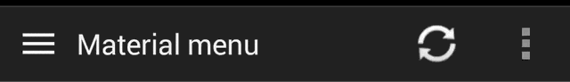
Animations for Android L drawer, back, dismiss and check icons

Overview

Material Menu

Morphing Android menu, back, dismiss and check buttons

Demo Image

Have full control of the animation:

Demo Drawer

Including in your project

compile 'com.balysv.materialmenu:material-menu:2.0.0'

Maven Central

Versions up to 2.0 (deprecated)

See README for setting up older versions of the library.

Usage

MaterialMenuDrawable

Use it as a standalone drawable in your Toolbar:

private MaterialMenuDrawable materialMenu;

protected void onCreate(Bundle savedInstanceState) {
    super.onCreate(savedInstanceState);
    setContentView(R.layout.toolbar);
    Toolbar toolbar = (Toolbar) findViewById(R.id.toolbar);
    setSupportActionBar(toolbar);
    toolbar.setNavigationOnClickListener(new View.OnClickListener() {
        @Override public void onClick(View v) {
        // Handle your drawable state here
        materialMenu.animateState(newState);
      }
    });
    materialMenu = new MaterialMenuDrawable(this, Color.WHITE, Stroke.THIN);
    toolbar.setNavigationIcon(materialMenu);
}

MaterialMenuView

A plain old View that draws the icon and provides an API to manipulate its state. You can embed it in any layout including a Toolbar.

Customisation is also available through xml attributes:

app:mm_color="color"               // Color of drawable
app:mm_visible="boolean"           // Visible
app:mm_transformDuration="integer" // Transformation animation duration
app:mm_scale="integer"             // Scale factor of drawable
app:mm_strokeWidth="integer"       // Stroke width of icons (can only be 1, 2 or 3)
app:mm_rtlEnabled="boolean"        // Enabled RTL layout support (flips all drawables)
app:mm_iconState="enum"            // Set the intial state of the drawable (burger, arrow, x or check)

API

There are four icon states:

BURGER, ARROW, X, CHECK

To morph the drawable state

MaterialMenu.animateIconState(IconState state)

To change the drawable state without animation

MaterialMenu.setIconState(IconState state)

To animate the drawable manually (i.e. on navigation drawer slide):

MaterialMenu.setTransformationOffset(AnimationState state, float value)

To hide or show the drawable:

MaterialMenu.setVisible(boolean visible)

where AnimationState is one of BURGER_ARROW, BURGER_X, ARROW_X, ARROW_CHECK, BURGER_CHECK, X_CHECK and value is between 0 and 2

Note: The icon state is resolved by current offset value. Make sure you use offset between 0 and 1 for forward animation and 1 and 2 for backwards to correctly save icon state on activity recreation.

NavigationDrawer slide interaction

Implement MaterialMenu into your ActionBar as described above and add a custom DrawerListener:

private DrawerLayout drawerLayout;
private boolean isDrawerOpened;
private MaterialMenuDrawable materialMenu;

@Override
protected void onCreate(Bundle savedInstanceState) {
    super.onCreate(savedInstanceState);
    toolbar = (Toolbar) findViewById(R.id.toolbar);
    setSupportActionBar(toolbar);
    materialMenu = new MaterialMenuDrawable(this, Color.WHITE, Stroke.THIN);
    toolbar.setNavigationIcon(materialMenu);

    drawerLayout = (DrawerLayout) findViewById(R.id.drawer_layout);
    drawerLayout.setDrawerListener(new DrawerLayout.SimpleDrawerListener() {
        @Override
        public void onDrawerSlide(View drawerView, float slideOffset) {
            materialMenu.setTransformationOffset(
                MaterialMenuDrawable.AnimationState.BURGER_ARROW,
                isDrawerOpened ? 2 - slideOffset : slideOffset
            );
        }

        @Override
        public void onDrawerOpened(View drawerView) {
            isDrawerOpened = true;
        }

        @Override
        public void onDrawerClosed(View drawerView) {
            isDrawerOpened = false;
        }
        
        @Override
        public void onDrawerStateChanged(int newState) {
            if(newState == DrawerLayout.STATE_IDLE) {
                if(isDrawerOpened) {
                   menu.setIconState(MaterialMenuDrawable.IconState.ARROW);
                } else {
                   menu.setIconState(MaterialMenuDrawable.IconState.BURGER);
                }
            }
        }
    });
}

Developed By

Balys Valentukevicius

License

Copyright 2016 Balys Valentukevicius

Licensed under the Apache License, Version 2.0 (the "License");
you may not use this file except in compliance with the License.
You may obtain a copy of the License at

   http://www.apache.org/licenses/LICENSE-2.0

Unless required by applicable law or agreed to in writing, software
distributed under the License is distributed on an "AS IS" BASIS,
WITHOUT WARRANTIES OR CONDITIONS OF ANY KIND, either express or implied.
See the License for the specific language governing permissions and
limitations under the License.
Comments
  • How to use outside of toolar/actionbar, as a normal view ?

    How to use outside of toolar/actionbar, as a normal view ?

    I wish to put the material menu into a simple layout, as such:

        <com.balysv.materialmenu.MaterialMenuView
            android:id="@+id/navButton"
            android:layout_width="wrap_content"
            android:layout_height="wrap_content"
            app:mm_color="#ffcc0000"
            app:mm_strokeWidth="2"
            app:mm_transformDuration="3000" />
    

    For some reason, it fails when doing so, and it always crashes, showing this error:

    12-31 15:03:27.215: E/AndroidRuntime(22572):    at android.view.LayoutInflater.createView(LayoutInflater.java:633)
    12-31 15:03:27.215: E/AndroidRuntime(22572):    at android.view.LayoutInflater.createViewFromTag(LayoutInflater.java:743)
    12-31 15:03:27.215: E/AndroidRuntime(22572):    at android.view.LayoutInflater.rInflate(LayoutInflater.java:806)
    12-31 15:03:27.215: E/AndroidRuntime(22572):    at android.view.LayoutInflater.rInflate(LayoutInflater.java:809)
    12-31 15:03:27.215: E/AndroidRuntime(22572):    at android.view.LayoutInflater.parseInclude(LayoutInflater.java:916)
    12-31 15:03:27.215: E/AndroidRuntime(22572):    at android.view.LayoutInflater.rInflate(LayoutInflater.java:802)
    12-31 15:03:27.215: E/AndroidRuntime(22572):    at android.view.LayoutInflater.inflate(LayoutInflater.java:504)
    12-31 15:03:27.215: E/AndroidRuntime(22572):    at android.view.LayoutInflater.inflate(LayoutInflater.java:414)
    

    can anyone help?

    opened by AndroidDeveloperLB 13
  • Maven Error(25,0)

    Maven Error(25,0)

    when i try to import this to my project in android studio 1.0 rc2 i have this error:

    Error:(25, 0) Could not read script 'C:\ADTBundle\StudioWorkspace\MyApplication\maven_push.gradle' as it does not exist.

    i dont know how to import this toolbar lib to my project can you help me with a step by step guide?

    opened by TurKurT656 10
  • Request: allow to show the clicking effect via code

    Request: allow to show the clicking effect via code

    If it's in "burger" mode, I'd like to make a clicking effect in case the user clicks on it.

    I've tried this:

    materialMenuView.animatePressedState(IconState.BURGER);

    but it doesn't do anything. Also tried to call "setState" before calling the above.

    Is there a way to allow clicking effect ?

    enhancement 
    opened by AndroidDeveloperLB 9
  • Adding to build.gradle issues

    Adding to build.gradle issues

    I'm running into this issue when I attempt to add this to my build.gradle.

    Error:(31, 13) Failed to resolve: com.balysv.materialmenu:material-menu-abc:2.0.0 Error:(28, 13) Failed to resolve: com.balysv.materialmenu:material-menu-toolbar:2.0.0 Error:(34, 13) Failed to resolve: com.balysv.materialmenu:material-menu-abs:2.0.0

    Here's my gradle code:

    apply plugin: 'com.android.application'
    
    android {
        compileSdkVersion 25
        buildToolsVersion "25.0.2"
        defaultConfig {
            applicationId "com.technologx.wallpaperzdash"
            minSdkVersion 21
            targetSdkVersion 25
            versionCode 1
            versionName "1.0"
            testInstrumentationRunner "android.support.test.runner.AndroidJUnitRunner"
        }
        buildTypes {
            release {
                minifyEnabled false
                proguardFiles getDefaultProguardFile('proguard-android.txt'), 'proguard-rules.pro'
            }
        }
    }
    
    dependencies {
        compile fileTree(dir: 'libs', include: ['*.jar'])
    
        // stock actionBar
        compile 'com.balysv.materialmenu:material-menu:2.0.0'
    
    // Toolbar and ActionBarCompat-v21 (includes support-v7:21.0.x)
        compile 'com.balysv.materialmenu:material-menu-toolbar:2.0.0'
    
    // actionBarCompat-v20 (up to support-v7:20.0.0 - does not support Toolbar)
        compile 'com.balysv.materialmenu:material-menu-abc:2.0.0'
    
    // actionBarSherlock
        compile 'com.balysv.materialmenu:material-menu-abs:2.0.0'
    }
    
    opened by Technologx 8
  • Problem when importing via Android-Studio

    Problem when importing via Android-Studio

    I get this error message:

    untitled20150107125419

    What should I do? I already have the latest version of Android-Studio, and I already have a lot of build-tools versions installed.

    opened by AndroidDeveloperLB 7
  • Padding is ignored

    Padding is ignored

    Padding isn't applyed at all.

    The icon with an scale of 1 is the needed for an standard ActionBar, but Android L guidelines have a larger ActionBar. So, when we're putting the icon in this larger ActionBar, some users fails to tap on the icon View, creating some bad sensations.

    BTW, thanks for your work, Balys!

    opened by rocboronat 7
  • nullpointer at MaterialMenuIconCompat.getActionBarUpView on v21

    nullpointer at MaterialMenuIconCompat.getActionBarUpView on v21

    Caused by: java.lang.NullPointerException at com.balysv.materialmenu.extras.abc.MaterialMenuIconCompat.getActionBarUpView(MaterialMenuIconCompat.java:74)

    basically the view isn't being found :/

    opened by MarsVard 6
  • Appear animation

    Appear animation

    Hello.

    Is it possible to animate appearance of material icon. I want to animate a situation when there was no icon in toolbar and animate, for example, appearance of arrow button.

    enhancement 
    opened by slaviki 5
  • New Feature: Set visibility of icon

    New Feature: Set visibility of icon

    This pull request allows set visibility of icon, also updates README.md and implement new visibility feature on demo project

    Customisation

    MaterialMenu.setVisibility(int visibility) or use attributes app:mm_visibility="integer

    Param: View.VISIBLE, View.INVISIBLE

    opened by mschez 4
  • Pre-Lollipop animation is weird

    Pre-Lollipop animation is weird

    When animating from burger to arrow, It looks like it's spinning, and then the burger is fading out and the arrow is fading in.

    Is it possible to change this?

    opened by AndroidDeveloperLB 4
  • Undeterministic icon state in Drawer Interaction

    Undeterministic icon state in Drawer Interaction

    Hello! This line isDrawerOpened ? 2 - slideOffset : slideOffset caused the icon to switch back to the menu from the arrow when the drawer was open every once in a while. I fixed it by doing: isDrawerOpened ? 2 - slideOffset : slideOffset-0.00001f

    Maybe you can elucidate me on why this could be happening. (I'm really using Scala and the line val offset = if(isDrawerOpened) 2-slideOffset else slideOffset-0.00001f but I don't really think that's got anything to do with it).

    opened by i-am-the-slime 4
  • Added Support for React Native Projects

    Added Support for React Native Projects

    Hi

    First of all I would like to appreciate for creating such a cool nice, library.

    I have created the React Native bridge plugin for using this library with React Native projects

    I have added the same in README. Can you please merge this request so that if someone is looking to use this library for React Native projects can easily do the same

    Please let me know in case any changes are required

    react-native-iconic

    Thanks Pranav

    opened by prscX 0
  • use in right of toolbar

    use in right of toolbar

    bt default toolbar.setNavigationIcon(materialMenu); attaching material menu in left side of toolbar, i have customize toolbar and i want to have that in right side. how can i implementing that?

    opened by pishguy 1
  • Scale should be a float

    Scale should be a float

    As described in other issues, the default size of the drawable is too small, but using mm_scale="2" makes it too big. A float scale would allow apps to pick a more sensible value.

    opened by paour 0
Releases(v2.0.0)
  • v2.0.0(Sep 13, 2016)

    Major update

    • Stripping main library classes to bare minimum - MaterialMenuDrawable and MaterialMenuView.
    • Removed all extras packages since ActionBarCompat or ActionBarSherlock are not being maintained for quite a while now. Most usages will be with Toolbar. Integrating the drawable into it will be up to the user of the library (see README or demo).
    • Removed nineoldadroids dependency - reduced method count by 929!
    • Bumped min api version to 14
    Source code(tar.gz)
    Source code(zip)
  • v1.5.5(Sep 12, 2016)

  • v1.5.4(May 30, 2015)

    • Use AppCompatActivity instead of ActionBarActivity for extras-toolbar package
    • BUG FIX: MaterialMenuView visibility is now preserved on SavedState
    Source code(tar.gz)
    Source code(zip)
  • v1.5.3(May 14, 2015)

    API break: Circle pressed state is no longer supported.

    MaterialMenu.animatePressedState(IconState) is now deprecated and should be replaced by MaterialMenu.animateState(IconState)

    MaterialMenu.setPressedDuration(int) has been removed.

    Source code(tar.gz)
    Source code(zip)
  • v1.5.2(May 14, 2015)

  • v1.5.1(Jan 31, 2015)

    • Added MaterielMenuIcon support for non-Toolbar ActionBarCompat v21

    Usage: MaterialMenuIconCompat in extras-toolbar package

    • Added API to set an animation listener to MaterialMenuDrawable

    Usage: MaterialMenu.setAnimationListener(Animator.AnimatorListener)

    • BUG FIX: Draw circle pressed state when switching to the same icon
    Source code(tar.gz)
    Source code(zip)
  • v1.5.0(Nov 19, 2014)

    • Revamped CHECK and X icons to suit Material design better.

    If old icons are required, use material-menu:1.4.0

    • BUG FIX: support all ActionBar Sherlock Activity classes
    Source code(tar.gz)
    Source code(zip)
  • v1.4.0(Oct 19, 2014)

    • Added EXTRAS: Toolbar support for MaterialMenuIcon.

    Usage:

    import com.balysv.materialmenu:material-menu-toolbar:1.x.x and use MaterielMenuIconToolbar

    • BUG FIX: left margin fix for Jellybean and ICS devices using MaterialMenuIcon
    Source code(tar.gz)
    Source code(zip)
  • v1.3.1(Oct 14, 2014)

    • UI fix: Remove up arrow indicator margins when using MaterialMenuIcon since you could see some extra space on the left side of the icon. If a different margin is required, find the 'Home' view of the ActionBar and apply them (example for stock ActionBar) :
    View view = activity.getWindow().getDecorView().findViewById(
        resources.getIdentifier("android:id/home", null, null)
    );
    ViewGroup.MarginLayoutParams params = (ViewGroup.MarginLayoutParams) view.getLayoutParams();
    params.leftMargin = someMargin;
    
    • MaterialMenuBase abstraction improvements
    Source code(tar.gz)
    Source code(zip)
  • v1.3.0(Oct 12, 2014)

    • Added new API to allow manual animation to any IconState. For example when sliding a navigation drawer.

    Usage:

    MaterialMenu.setTransformationOffset(AnimationState state, float value)
    

    where AnimationState is one of BURGER_ARROW, BURGER_X, ARROW_X, ARROW_CHECK, BURGER_CHECK, X_CHECK and value is between 0 and 2

    • Added RTL layout support. When enabled, it flips all icons horizontally.

    Usage: Use API MaterialMenu.setRTLEnabled(boolean enabled) or set an xml attribute mm_rtlEnabled="boolean"

    • Added new API to get current IconState.

    Usage: MaterialMenu.getIconState()

    Source code(tar.gz)
    Source code(zip)
  • v1.2.4(Oct 7, 2014)

  • v1.2.3(Oct 5, 2014)

  • v1.2.2(Sep 22, 2014)

    • BUG FIX: Added a prefix to ambiguous xml attributes https://code.google.com/p/android/issues/detail?id=22576

    Now:

    app:mm_color="color"             
    app:mm_transformDuration="integer" 
    app:mm_pressedDuration="integer"   
    app:mm_scale="integer"            
    app:mm_strokeWidth="integer" 
    
    Source code(tar.gz)
    Source code(zip)
  • v1.2.1(Sep 22, 2014)

    • BUG FIX: Added ConstantState to MaterialMenuDrawable, so it behaves correctly with Expandable ActionBar items. The implementation is not correct per se cause it doesn't provide a static ConstantState but it does the job.
    Source code(tar.gz)
    Source code(zip)
  • v1.2.0(Sep 8, 2014)

    • added new attribute Stroke. It adjusts icon paint stroke width for further customisation. Possible values are Stroke.REGULAR, Stroke.THIN and Stroke.EXTRA_THIN

    Usage: Provide Stroke value to a constructor or use xml attribute strokeWidth for MaterialMenuView

    Source code(tar.gz)
    Source code(zip)
  • v1.1.3(Sep 3, 2014)

  • v1.1.2(Aug 29, 2014)

    • animatePressedState(), animateState() and setState() now cancels running transformation so you can spam the button and result in a correct state.
    Source code(tar.gz)
    Source code(zip)
  • v1.1.1(Aug 27, 2014)

    • Changed Maven ArtifactId to com.balysv.materialmenu for extras support
    • Added support to API 9 and higher using NineOldAndroids
    • Added EXTRAS: ActionBarCompat and ActionBarSherlock support

    Usage:

    • import com.balysv.materialmenu:material-menu-abs:1.1.1 for ActionBarSherlock and use MaterialMenuIconSherlock
    • import com.balysv.materialmenu:material-menu-abc:1.1.1 for ActionBarCompat and use MaterialMenuIconCompat.
    Source code(tar.gz)
    Source code(zip)
  • v1.1.0(Aug 26, 2014)

  • v1.0.0(Aug 1, 2014)

Owner
Balys Valentukevicius
Material Design icons by Google

Material design icons Material design icons is the official icon set from Google. The icons are designed under the material design guidelines. 4.0.0 U

Google 47.1k Jan 9, 2023
Library containing over 2000 material vector icons that can be easily used as Drawable or as a standalone View.

Material Icon Library A library containing over 2000 material vector icons that can be easily used as Drawable, a standalone View or inside menu resou

null 2.3k Dec 16, 2022
Navigation Drawer Activity with material design style and simplified methods

MaterialNavigationDrawer Navigation Drawer Activity with material design style and simplified methods       It requires 10+ API and android support v7

Fabio Biola 1.6k Jan 5, 2023
The flexible, easy to use, all in one drawer library for your Android project. Now brand new with material 2 design.

MaterialDrawer ... the flexible, easy to use, all in one drawer library for your Android project. What's included ?? • Setup ??️ • Migration Guide ??

Mike Penz 11.6k Dec 27, 2022
Android drawer icon with material design animation

LDrawer Android drawer icon with material design animation Note Basically same as appcompat_v7 version 21, you can use appcompat_v7 compile 'com.andro

Hasan Keklik 1.4k Dec 25, 2022
Android drawer icon with material design animation

LDrawer Android drawer icon with material design animation Note Basically same as appcompat_v7 version 21, you can use appcompat_v7 compile 'com.andro

Hasan Keklik 1.4k Dec 25, 2022
Custom drawer implementation for Material design apps.

material-drawer Custom drawer implementation for Material design apps. Demo A demo app is available on Google Play: Screenshots Fixed items Select pro

Jan Heinrich Reimer 600 Nov 18, 2022
A Gmail-like Material Drawer implementation

AdvancedMaterialDrawer A Gmail-like Material Drawer implementation Based on neokree's MaterialDrawer library, but they are not the same. I have made m

Marc Schäfers 200 Oct 27, 2022
Material Design implementation for Android 4.0+. Shadows, ripples, vectors, fonts, animations, widgets, rounded corners and more.

Carbon Material Design implementation for Android 4.0 and newer. This is not the exact copy of the Lollipop's API and features. It's a custom implemen

null 3k Jan 9, 2023
A demo of the power menu with Reveal and other animations

MaterialPowerMenu A demo of the power menu with Reveal and other animations Some days ago, I saw a gif on Google+ demonstating a concept of Android Po

Naman Dwivedi 888 Oct 11, 2022
Default colors and dimens per Material Design guidelines and Android Design guidelines inside one library.

Material Design Dimens Default colors and dimens per Material Design guidelines and Android Design guidelines inside one library. Dimens Pattern: R.di

Dmitry Malkovich 1.4k Jan 3, 2023
MaterialPickers-in-android - A simple android project that shows how to create material pickers for date and time

MaterialPickers-in-android A simple android project that shows how to create mat

Segun Francis 2 Apr 28, 2022
😍 A beautiful, fluid, and extensible dialogs API for Kotlin & Android.

Material Dialogs View Releases and Changelogs Modules The core module is the fundamental module that you need in order to use this library. The others

Aidan Follestad 19.5k Dec 31, 2022
Android Sample Project with Material Design and Toolbar.

AndroidMaterialDesignToolbar -- PROJECT IS NOT SUPPORTED Android Sample Project with Material Design and Toolbar. Project use Appcompat library for ma

kemal selim tekinarslan 713 Nov 11, 2022
Modular and customizable Material Design UI components for Android

Material Components for Android Material Components for Android (MDC-Android) help developers execute Material Design. Developed by a core team of eng

Material Components 14.4k Dec 31, 2022
Easy creation and management of toggle buttons on Android from the Material Design spec.

ToggleButtonLayout Easy creation and management of toggle buttons from the Material Design spec. Read more about ToggleButtonLayout in our blog post.

Savvy 229 Jan 9, 2023
An android application that allows its users to download and set different images as their wallpapers either on the home screen, lock screen or both.

UHD Wallpapers This an android application show cases different sets of images from unsplash and allows its users to download and set them as wallpape

null 2 Oct 31, 2022
This is a library with components of Android L to you use in android 2.2

Material Design Android Library How to use Components Buttons Flat Button Rectangle Button Float Button Float small button Switches CheckBox Switch Pr

Ivan Navas 9.1k Jan 5, 2023
📱Android Library to implement animated, 😍beautiful, 🎨stylish Material Dialog in android apps easily.

Material Dialogs for Android ?? ?? Android Library to implement animated, ?? beautiful, ?? stylish Material Dialog in android apps easily. 1. Material

Shreyas Patil 875 Dec 28, 2022