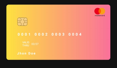
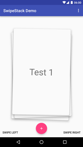
CircularCardsStackView
Overview
Features
- Android 11 support
- Easy setup
- Endless card stack
- Swipe horizontally with animation
- Fully customized
- Support to all resolutions with portrait orientation
Usage
Dependencies
- Step 1: Add the JitPack repository in your project build.gradle file
allprojects {
	    repositories {
		    ...
		    maven { url 'https://jitpack.io' }
	    }
    }
- Step 2: Add the dependency in your app module build.gradle file
dependencies {
		    ...
	        implementation 'com.github.Mindinventory:CircularCardsStackView:0.0.2'
	}
Implementation
- Step 1: Add CardCircularStackView in your xml and customize attributes
<com.mindinventory.circularcardsstackview.ui.CircularCardsStackView
       android:id="@+id/cardStack"
       android:layout_width="0dp"
       android:layout_height="wrap_content"
       app:actionOptionsVisibility="true"
       app:childViewHeight="@dimen/_250sdp"
       app:primaryTextColor="@android:color/white"
       app:primaryTextFontFamily="@font/roboto_bold"
       app:primaryTextSize="@dimen/_16ssp"
       app:profileViewBackgroundColor="#80000000"
       app:secondaryTextColor="@android:color/white"
       app:secondaryTextFontFamily="@font/roboto_medium"
       app:secondaryTextSize="@dimen/_14ssp"
       app:stackCardBackgroundColor="@color/white"
       app:stackCardChildPadding="@dimen/_15sdp"
       app:stackCardCornerRadius="@dimen/_20sdp"
       app:stackCardStrokeColor="@color/white"
       app:stackCardStrokeWidth="@dimen/_2sdp"  />
Step 2: Provide card list and implement pageChangeListener
cardStack.setUpCardStack(ArrayList
Step 3: Customize card action option's icon and implement action listener
cardStack.setActionOptions(
            firstButtonResourceId = R.drawable.ic_message,
            secondButtonResourceId = R.drawable.ic_heart,
            object : CardActionListener {
                override fun onFirstButtonOptionClick(position: Int) {

                }

                override fun onSecondButtonOptionClick(position: Int) {

                }

            }
        )
Appearance
| Attribute | Description | Default |
|---|---|---|
| stackCardBackgroundColor | The background color of the card | white |
| stackCardChildPadding | The padding of the card's child view | _15sdp |
| stackCardCornerRadius | The corner radius of the card | _30sdp |
| stackCardStrokeColor | The stroke color of the card | white |
| stackCardStrokeWidth | The stroke width of the card | _2sdp |
| profileViewBackgroundColor | The background color of profile view | #80000000 |
| childViewHeight | The height of the child view of the card | _250sdp |
| actionOptionsVisibility | Manage the visibility of the actions of the card | true |
| primaryTextColor | The text color of the primary text of the profile view | white |
| secondaryTextColor | The text color of the secondary text of the profile view | white |
| primaryTextFontFamily | The FontFamily of the primary text of the profile view | roboto_bold |
| secondaryTextFontFamily | The FontFamily of the secondary text of the profile view | roboto_medium |
| primaryTextSize | The text size of the primary text of the profile view | _16ssp |
| secondaryTextSize | The text size of the secondary text of the profile view | _14ssp |
Guideline for contributors
Contribution towards our repository is always welcome, we request contributors to create a pull request to the develop branch only.
Guideline to report an issue/feature request
It would be great for us if the reporter can share the below things to understand the root cause of the issue.
- Library version
- Code snippet
- Logs if applicable
- Device specification like (Manufacturer, OS version, etc)
- Screenshot/video with steps to reproduce the issue
Requirements
- minSdkVersion >= 21
- Androidx
Library used
LICENSE!
CircularCardsStackView is MIT-licensed.
Let us know!
If you use our open-source libraries in your project, please make sure to credit us and Give a star to www.mindinventory.com


