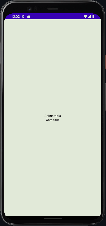
AnimatableCompose 

Add Animatable Material Components in Android Jetpack Compose.
Create jetpack compose animation painless.
What you can create from Material 3 components right now;
- Spacer Animation
- Text Animation
- Box Animation
- Card Animation
- Icon Animation
- LazyRow Animation
- and combinations
How it looks
| Phone Number | Card Dealer |
|---|---|
 |
 |
Phone Number
States
//Create components state
val animatableCardState = rememberAnimatableCardState(
    initialSize = DpSize(80.dp, 80.dp),
    targetSize = DpSize(Dp.Infinity, 120.dp),
    toTargetSizeAnimationSpec = tween(500, 500), //  specify delay(500) for target
    initialShape = RoundedCornerShape(32.dp),
    targetShape = RoundedCornerShape(0.dp),
    toTargetShapeAnimationSpec = tween(500, 500),
    initialOffset = DpOffset(0.dp, 0.dp),
    targetOffset = DpOffset(0.dp, - Dp.Infinity),
    toInitialOffsetAnimationSpec = tween(500, 500),
)
val animatableIconState = rememberAnimatableIconState(
    initialSize = DpSize(40.dp, 40.dp),
    targetSize = DpSize(80.dp, 80.dp),
    toTargetSizeAnimationSpec = tween(500,500),
    initialOffset = DpOffset(0.dp, 0.dp),
    targetOffset = DpOffset((-50).dp, 0.dp),
    toTargetOffsetAnimationSpec = tween(500, 500)
)
val animatableTextState = rememberAnimatableTextState(
    initialFontSize = 0.sp,
    targetFontSize = 26.sp,
    toTargetFontSizeAnimationSpec = tween(500, 500),
    initialOffset = DpOffset(0.dp, 0.dp),
    targetOffset = DpOffset((-25).dp, 0.dp),
    toTargetOffsetAnimationSpec = tween(500, 500)
)

// Create shared state
val sharedAnimatableState = rememberSharedAnimatableState(
    listOf(
        animatableCardState,
        animatableIconState, // default index = 0
        animatableIconState.copy( // create state with copy func. for same params
            index = 1, // specify index for same components
            initialSize = DpSize(0.dp, 0.dp),
            targetSize = DpSize(36.dp, 36.dp),
            targetOffset = DpOffset(40.dp, 0.dp),
        ),
        animatableTextState, // default index = 0
        animatableTextState.copy(
            index = 1, // specify index for same components
            targetFontSize = 12.sp
        )
    )
)
Components
AnimatableCard(
    onClick = {
        sharedAnimatableState.animate()
    },
    state = sharedAnimatableState // pass shared state
) {
    Row(
        modifier = Modifier.fillMaxSize(),
        verticalAlignment = Alignment.CenterVertically,
        horizontalArrangement = Arrangement.Center
    ) {
        AnimatableIcon(
            imageVector = Icons.Default.Person,
            contentDescription = null,
            state = sharedAnimatableState // pass shared state
        )
        Column {
            AnimatableText(
                text = "Emir Demirli",
                state = sharedAnimatableState // pass shared state
            )
            AnimatableText(
                text = "+90 0535 508 55 52",
                state = sharedAnimatableState, // pass shared state
                stateIndex = 1 // specify index for same components
            )
        }
        AnimatableIcon(
            imageVector = Icons.Default.Phone,
            contentDescription = null,
            state = sharedAnimatableState, // pass shared state
            stateIndex = 1 // specify index for same components
        )
    }
}
Card Dealer
States
val cards by remember  {
    mutableStateOf(listOf("A","K","Q","J","10","9","8","7","6","5","4","3","2"))
}
var deck by remember {
    mutableStateOf(cards + cards + cards + cards)
}

val animatableCardState = rememberAnimatableCardState(
    initialSize = DpSize(64.dp, 64.dp),
    targetSize = DpSize(64.dp, 64.dp),
    initialOffset = DpOffset(0.dp, 120.dp),
    targetOffset = DpOffset(-Dp.Infinity, -Dp.Infinity)
)
val animatableTextState = rememberAnimatableTextState(
    initialFontSize = 0.sp,
    targetFontSize = 24.sp
)

val cardStates = mutableListOf<AnimatableState>()
val textStates = mutableListOf<AnimatableState>()

deck.indices.forEach {
    cardStates.add(
        animatableCardState.copy(
            index = it,
            toTargetOffsetAnimationSpec = tween(400, (it * 400)),
            targetOffset = DpOffset(if(it % 2 == 0) (-100).dp else 100.dp, (-150).dp)
        )
    )
    textStates.add(
        animatableTextState.copy(
            index = it,
            toTargetFontSizeAnimationSpec = tween(400, (it * 400))
        )
    )

}

val sharedAnimatableState = rememberSharedAnimatableState(cardStates + textStates)
Components
Box(
    modifier = Modifier
        .fillMaxSize()
        .clickable {
            deck = deck.shuffled()
            sharedAnimatableState.animate()
        },
    contentAlignment = Alignment.Center
) {
    deck.indices.forEach {
        AnimatableCard(
            onClick = {},
            state = sharedAnimatableState,
            stateIndex = it,
            fixedShape = RoundedCornerShape(16.dp)
        ) {
            Box(Modifier.fillMaxSize(), Alignment.Center) {
                AnimatableText(
                    text = deck[it],
                    state = sharedAnimatableState,
                    stateIndex = it
                )
            }
        }
    }
}
| Insta Story | Info Card |
|---|---|
 |
 |
Insta Story
States
val lazyListState = rememberLazyListState()
val scope = rememberCoroutineScope()
var selectedIndex by remember { mutableStateOf(0) }

val stories by remember { mutableStateOf(Story.stories) }

val animatableCardState = rememberAnimatableCardState(
    initialSize = DpSize(width = 70.dp, height = 70.dp),
    targetSize = DpSize(width = Dp.Infinity, height = Dp.Infinity),
    initialShape = CircleShape,
    targetShape = RoundedCornerShape(0.dp),
    initialPadding = PaddingValues(4.dp, 8.dp),
    targetPadding = PaddingValues(0.dp),
    initialBorder = BorderStroke(2.dp, Brush.verticalGradient(listOf(Color.Red, Color.Yellow))),
    targetBorder = BorderStroke(0.dp, Color.Unspecified)
)

val cardStates = mutableListOf<AnimatableState>()

stories.indices.forEach { index ->
    cardStates.add(
        animatableCardState.copy(
            index = index,
            onAnimation = {
                when(it) {
                    AnimationState.INITIAL -> {}
                    AnimationState.INITIAL_TO_TARGET -> {
                        scope.launch {
                            delay(150)
                            lazyListState.animateScrollToItem(selectedIndex)
                        }
                    }
                    AnimationState.TARGET -> {}
                    AnimationState.TARGET_TO_INITIAL -> {}
                }
            },
            toTargetAnimationSpec = tween(250)
        )
    )
}

val sharedAnimatableState = rememberSharedAnimatableState(cardStates)
Components
Box(
    modifier = Modifier.fillMaxSize(),
) {
    LazyRow(
        state = lazyListState
    ) {
        items(stories.size) { index ->
            AnimatableCard(
                modifier = Modifier
                    .size(100.dp),
                onClick = {
                    selectedIndex = index
                    cardStates[index].animate()
                },
                state = sharedAnimatableState,
                stateIndex = index
            ) {
                AsyncImage(
                    model = stories[index].url,
                    contentDescription = null,
                    contentScale = ContentScale.Crop,
                    modifier = Modifier.fillMaxSize()
                )
            }
        }
    }
}
Data
data class Story(
    val url: String
) {
    companion object {
        val stories = listOf(
            //
        )
    }
}
Info Card
States
val lazyListState = rememberLazyListState()
val snapperFlingBehavior = rememberSnapperFlingBehavior(
    lazyListState = lazyListState,
    snapOffsetForItem = SnapOffsets.Start,
)
val scope = rememberCoroutineScope()
var selectedIndex by remember { mutableStateOf(0) }

val animatableCardState = rememberAnimatableCardState(
    initialSize = DpSize(width = 340.dp, height = 180.dp),
    targetSize = DpSize(width = Dp.Infinity, height = 340.dp),
    initialShape = RoundedCornerShape(32.dp),
    targetShape = RoundedCornerShape(0.dp, 0.dp, 32.dp, 32.dp),
    toTargetShapeAnimationSpec = tween(750),
    initialPadding = PaddingValues(horizontal = 8.dp),
    targetPadding = PaddingValues(0.dp),
    onAnimation = {
        when(it) {
            AnimationState.INITIAL -> {}
            AnimationState.INITIAL_TO_TARGET -> {
                scope.launch {
                    delay(500)
                    lazyListState.animateScrollToItem(selectedIndex)
                }
            }
            AnimationState.TARGET -> {}
            AnimationState.TARGET_TO_INITIAL -> {}
        }
    }
)
val animatableBoxState = rememberAnimatableBoxState(
    initialAlignment = Alignment.Center,
    targetAlignment = Alignment.TopCenter
)
val animatableTextState = rememberAnimatableTextState(
    initialFontSize = 0.sp,
    targetFontSize = 12.sp,
    initialOffset = DpOffset(x = 0.dp, y = 300.dp),
    targetOffset = DpOffset(x = 0.dp, y = 0.dp),
    toTargetAnimationSpec = tween(250)
)
val animatableSpacerState = rememberAnimatableSpacerState(
    initialSize = DpSize(width = 0.dp, height = 0.dp),
    targetSize = DpSize(width = 0.dp, height = 16.dp)
)

val infoCards by remember { mutableStateOf(InfoCard.infoCards) }

val cardStates = mutableListOf<AnimatableState>()
val boxStates = mutableListOf<AnimatableState>()
val textStates = mutableListOf<AnimatableState>()
val spacerStates = mutableListOf<AnimatableState>()

infoCards.indices.forEach { index ->
    cardStates.add(
        animatableCardState.copy(
            index = index
        )
    )
    boxStates.add(
        animatableBoxState.copy(
            index = index
        )
    )
    textStates.add(
        animatableTextState.copy(
            index = index
        )
    )
    if(index == 0) {
        spacerStates.add(
            animatableSpacerState.copy(
                index = index,
                initialSize = DpSize(width = 0.dp, height = 300.dp),
                targetSize = DpSize(width = 0.dp, height = 0.dp)
            )
        )
    }
    spacerStates.add(
        animatableSpacerState.copy(
            index = index + 1,
        )
    )
}

val sharedAnimatableState = rememberSharedAnimatableState(
    animatableStates = cardStates + boxStates + textStates + spacerStates
)
Components
Column(
    modifier = Modifier.fillMaxSize(),
) {
    AnimatableSpacer(
        state = sharedAnimatableState
    )
    LazyRow(
        verticalAlignment = Alignment.CenterVertically,
        state = lazyListState,
        flingBehavior = snapperFlingBehavior
    ) {
        items(infoCards.size) { index ->
            AnimatableCard(
                onClick = {
                    selectedIndex = index
                    sharedAnimatableState.animate()
                },
                state = sharedAnimatableState,
                stateIndex = index,
                colors = CardDefaults.cardColors(
                    containerColor = Color(0xFFE9E7FE)
                )
            ) {
                Row(
                    modifier = Modifier.fillMaxSize(),
                    verticalAlignment = Alignment.CenterVertically,
                    horizontalArrangement = Arrangement.SpaceBetween
                ) {
                    AnimatableBox(
                        modifier = Modifier
                            .weight(1f)
                            .fillMaxHeight()
                            .padding(16.dp),
                        stateIndex = index,
                        state = sharedAnimatableState
                    ) {
                        LazyColumn(horizontalAlignment = Alignment.CenterHorizontally) {
                            item {
                                Text(
                                    text = infoCards[index].title,
                                    fontSize = 22.sp,
                                    fontWeight = FontWeight.Bold
                                )
                                Text(
                                    modifier = Modifier.align(Alignment.CenterStart),
                                    text = "MGS 1",
                                    fontSize = 12.sp,
                                    color = Color.Gray
                                )
                                AnimatableSpacer(
                                    stateIndex = index + 1,
                                    state = sharedAnimatableState
                                )
                                AnimatableText(
                                    text = infoCards[index].info,
                                    stateIndex = index,
                                    state = sharedAnimatableState,
                                    fontWeight = FontWeight.Bold
                                )
                            }
                        }
                    }
                    AsyncImage(
                        modifier = Modifier
                            .weight(1f)
                            .padding(8.dp)
                            .clip(RoundedCornerShape(32.dp)),
                        model = infoCards[index].imageUrl,
                        contentDescription = null,
                        contentScale = ContentScale.Crop
                    )
                }
            }
        }
    }
}
Data
data class InfoCard(
    val imageUrl: String,
    val title: String,
    val info: String
){
    companion object {
        val infoCards = listOf(
            //
        )
    }
}
How to use
You can learn to use it step by step, you need to use state and components together.
AnimatableText
State
// Simply create state and pass it to AnimatableText
val state = rememberAnimatableTextState(
    initialFontSize = 12.sp,
    targetFontSize = 60.sp
)
Component
Column(
    modifier = Modifier
        .fillMaxSize()
        .clickable {
            state.animate() // animate
        },
    verticalArrangement = Arrangement.Center,
    horizontalAlignment = Alignment.CenterHorizontally
) {
    AnimatableText(
        text = "Animatable",
        state = state // pass state
    )
    AnimatableText(
        text = "Compose",
        state = state // pass state
    )
}
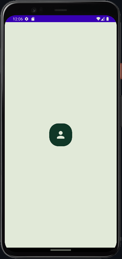
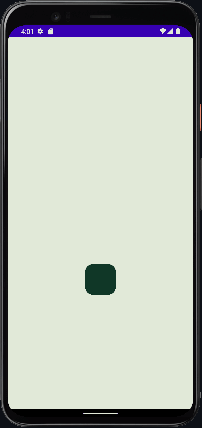
AnimatableBox

State
// Simply create box state and pass it to AnimatableBox
val state = rememberAnimatableBoxState(
    initialSize = DpSize(60.dp, 60.dp), // set initial size
    targetSize = DpSize(Dp.Infinity, 120.dp), // set target size
    initialOffset = DpOffset(x = 0.dp, y = 0.dp), // set initial offset
    targetOffset = DpOffset(x = 0.dp, y = - Dp.Infinity) // set target offset
    // Dp.Infinity will take the maximum value according to the screen size,
    // ps: Dp.Infinity for offset needs centered component and sizes, however you may not use it if you want
    initialAlignment = Alignment.Center,  // set initial alignment
    targetAlignment = Alignment.TopStart // set target alignment
)
Component
AnimatableBox(
    modifier = Modifier
        .border(1.dp, Color.Red)
        .clickable {
            state.animate()
        },
    state = state
) {
    Icon(
        modifier = Modifier.padding(8.dp),
        imageVector = Icons.Default.Add,
        contentDescription = null
    )
}
AnimatableCard

State
// Simply create card state and pass it to AnimatableCard
val animatableCardState = rememberAnimatableCardState(
    initialSize = DpSize(width = 70.dp, height = 70.dp),
    targetSize = DpSize(width = 200.dp, height = 70.dp),
    initialShape = CircleShape,
    targetShape = RoundedCornerShape(0.dp, 0.dp, 24.dp, 0.dp),
    initialOffset = DpOffset(x = 0.dp, y = 0.dp),
    targetOffset = DpOffset(x = - Dp.Infinity, y = - Dp.Infinity)
)
Component
Box(
    modifier = Modifier
        .fillMaxSize()
        .clickable {
            animatableCardState.animateToInitial() // animate to initial
        },
    contentAlignment = Alignment.Center
) {
    AnimatableCard(
        modifier = Modifier.size(100.dp),
        onClick = {
            animatableCardState.animateToTarget() // animate to target
        },
        state = animatableCardState
    ) {}
}
AnimatableCardWithText

States
// Simply create card state and text state
val animatableCardState = rememberAnimatableCardState(
    initialSize = DpSize(width = 50.dp, height = 25.dp),
    targetSize = DpSize(width = 300.dp, height = 150.dp),
    initialShape = CircleShape,
    targetShape = RoundedCornerShape(16.dp)
)
val animatableTextState = rememberAnimatableTextState(
    initialFontSize = 4.sp,
    targetFontSize = 36.sp
)
// Merge the states you created into sharedState and pass it to AnimatableCard and AnimatableText
val sharedAnimatableState = rememberSharedAnimatableState(
    animatableStates = listOf(
        animatableCardState,
        animatableTextState
    ),
    toTargetAnimationSpec = infiniteRepeatable(tween(1000), RepeatMode.Reverse) //specify shared animation spec
)
Components
Box(
    modifier = Modifier
        .fillMaxSize()
        .clickable { sharedAnimatableState.animate() },
    contentAlignment = Alignment.Center
) {
    AnimatableCard(
        modifier = Modifier.size(100.dp),
        state = sharedAnimatableState // pass shared state
    ) {
        Box(Modifier.fillMaxSize(), Alignment.Center) {
            AnimatableText(
                text = "Animatable",
                state = sharedAnimatableState // pass shared state
            )
        }
    }
}
Setup
- Open the file
settings.gradle(it looks like that)
dependencyResolutionManagement {
    repositoriesMode.set(RepositoriesMode.FAIL_ON_PROJECT_REPOS)
    repositories {
        google()
        mavenCentral()
        // add jitpack here 👇🏽
        maven { url 'https://jitpack.io' }
       ...
    }
}
...
- Sync the project
- Add dependencies
dependencies {
    implementation 'com.github.commandiron:AnimatableCompose:1.0.5'
}
Todo
✔️
- SharedAnimationSpec
✔️

 504 Jan 2, 2023
 769 Jan 7, 2023

 66 Dec 14, 2022

 3.6k Jan 5, 2023

 866 Dec 29, 2022
 137 Nov 29, 2022
 33.5k Jan 4, 2023
 13.6k Dec 28, 2022

 3.1k Dec 16, 2022

 5.6k Dec 30, 2022
 405 Nov 11, 2022
 77 Dec 9, 2022
 2.7k Dec 30, 2022
 34 Sep 8, 2022
 36 May 12, 2022
 7 Oct 22, 2022
 503 Dec 30, 2022
 218 Dec 29, 2022
 39 Dec 10, 2022