Material Dialogs
View Releases and Changelogs
Modules
The core module is the fundamental module that you need in order to use this library. The others are extensions to core.
Please note that since Material Dialogs 2.x.x, this library only supports Kotlin. The latest Java version is 0.9.6.0 and can be found here. Note that 0.9.6.0 is unsupported, bugs & improvements will not be made to that version.
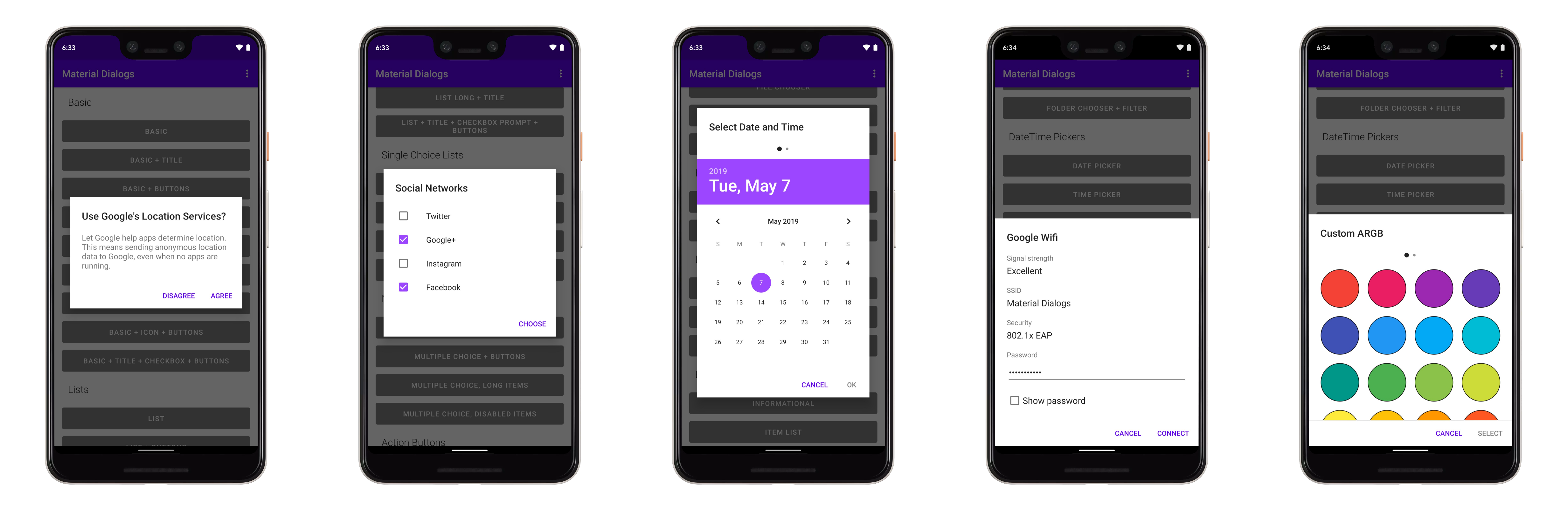
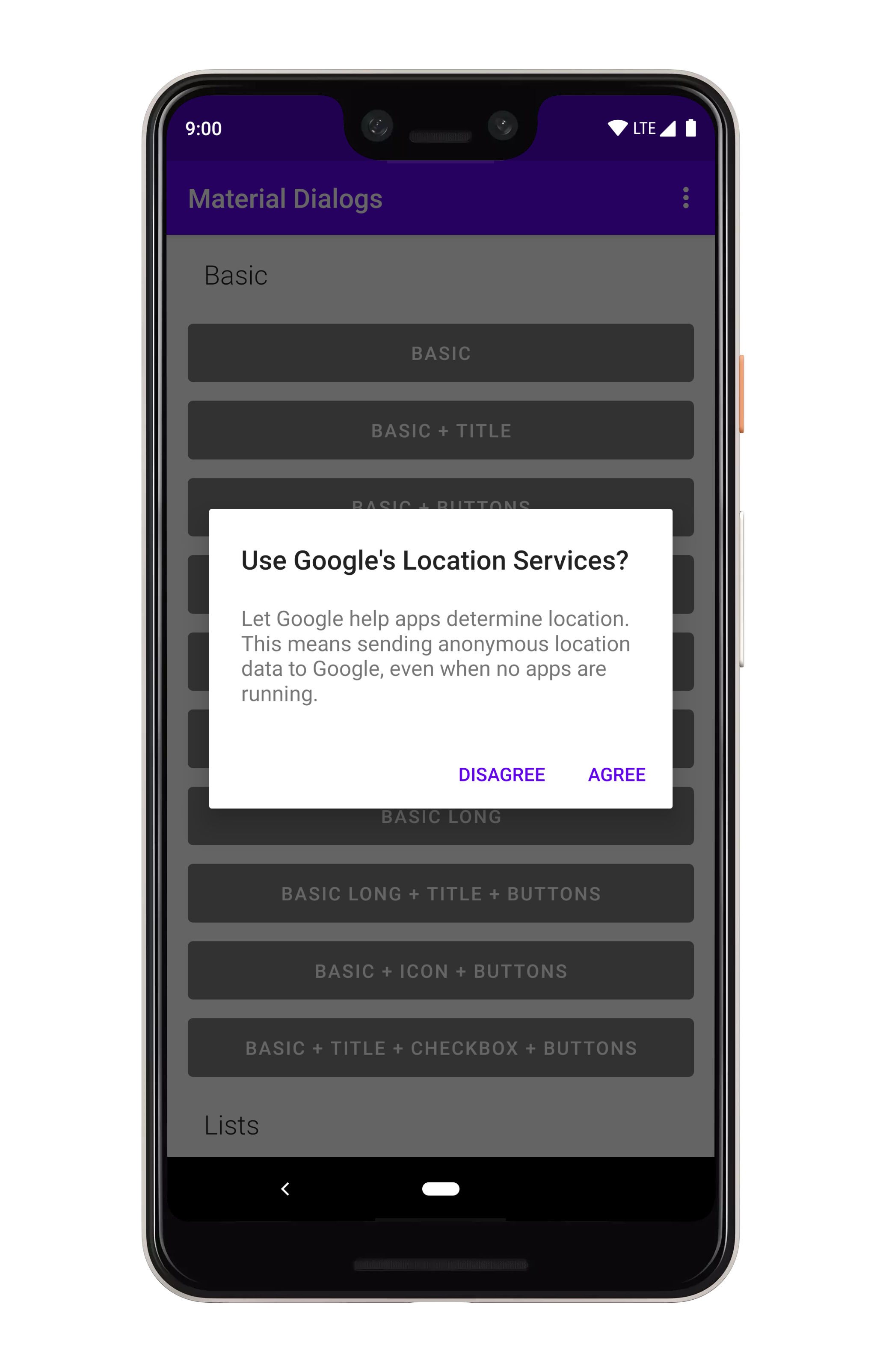
Core
Core Tutorial and Samples
The core module contains everything you need to get started with the library. It contains all core and normal-use functionality.
dependencies {
  ...
  implementation 'com.afollestad.material-dialogs:core:3.3.0'
}
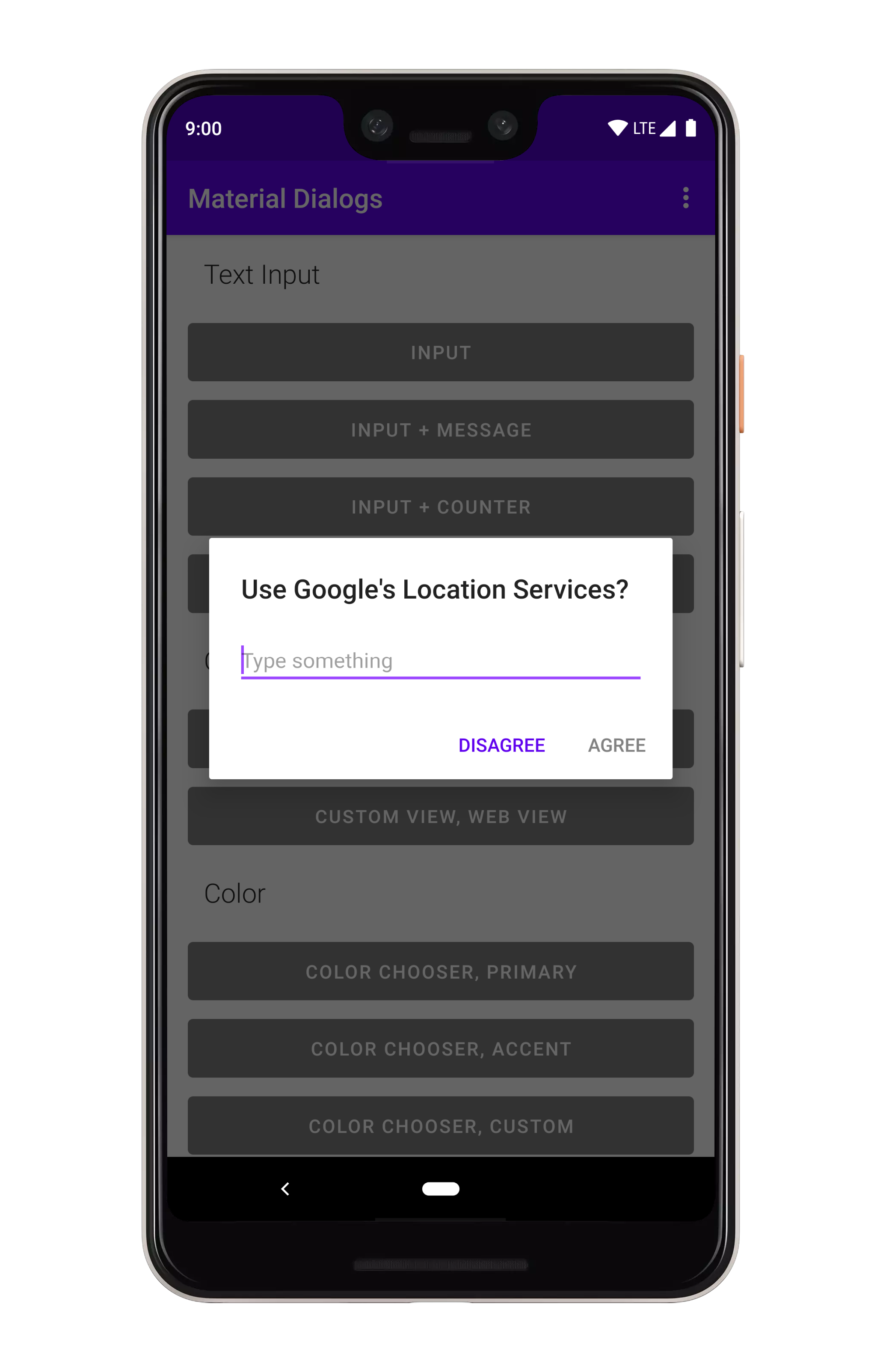
Input
Input Tutorial and Samples
The input module contains extensions to the core module, such as a text input dialog.
dependencies {
  ...
  implementation 'com.afollestad.material-dialogs:input:3.3.0'
}
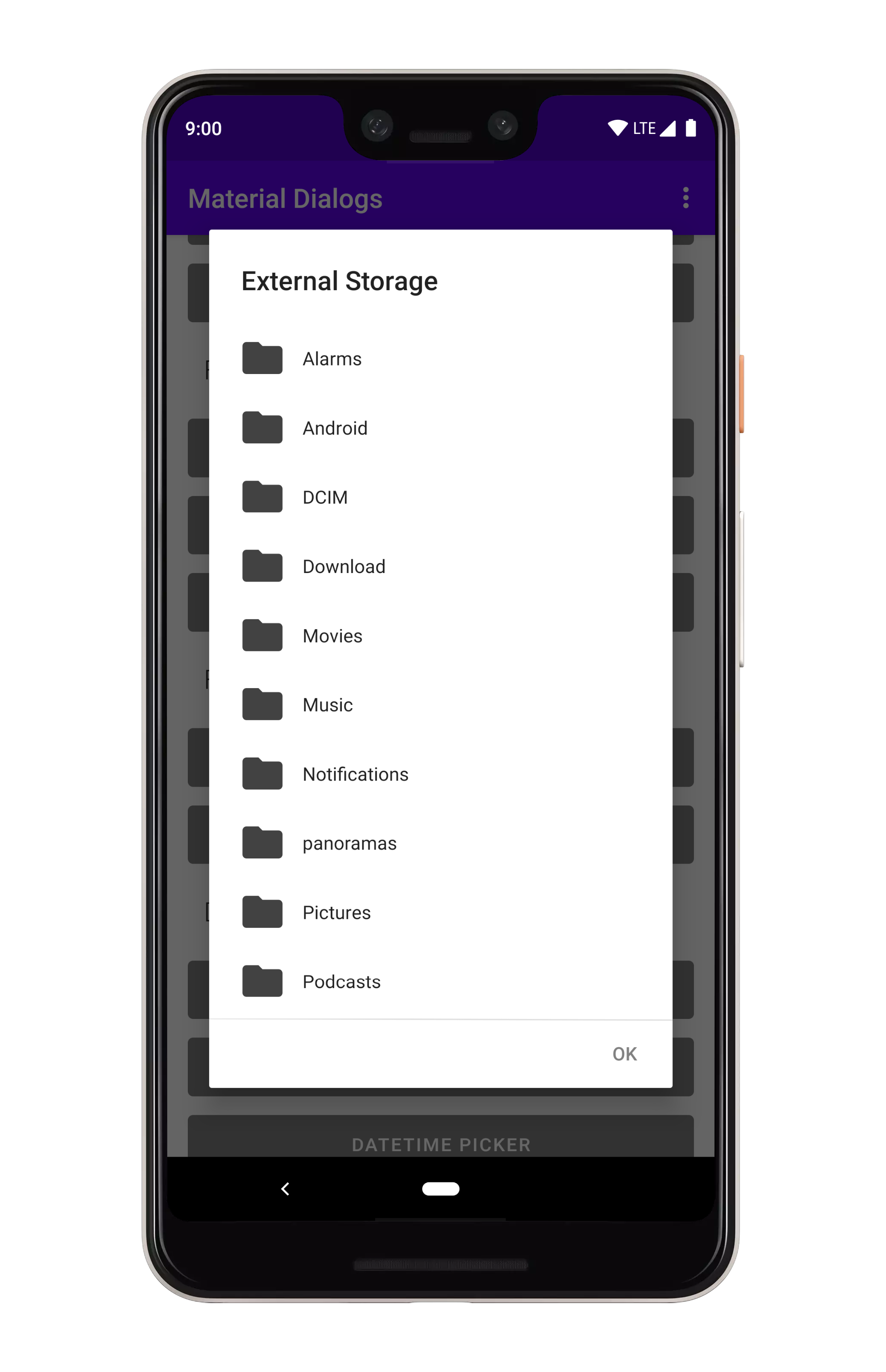
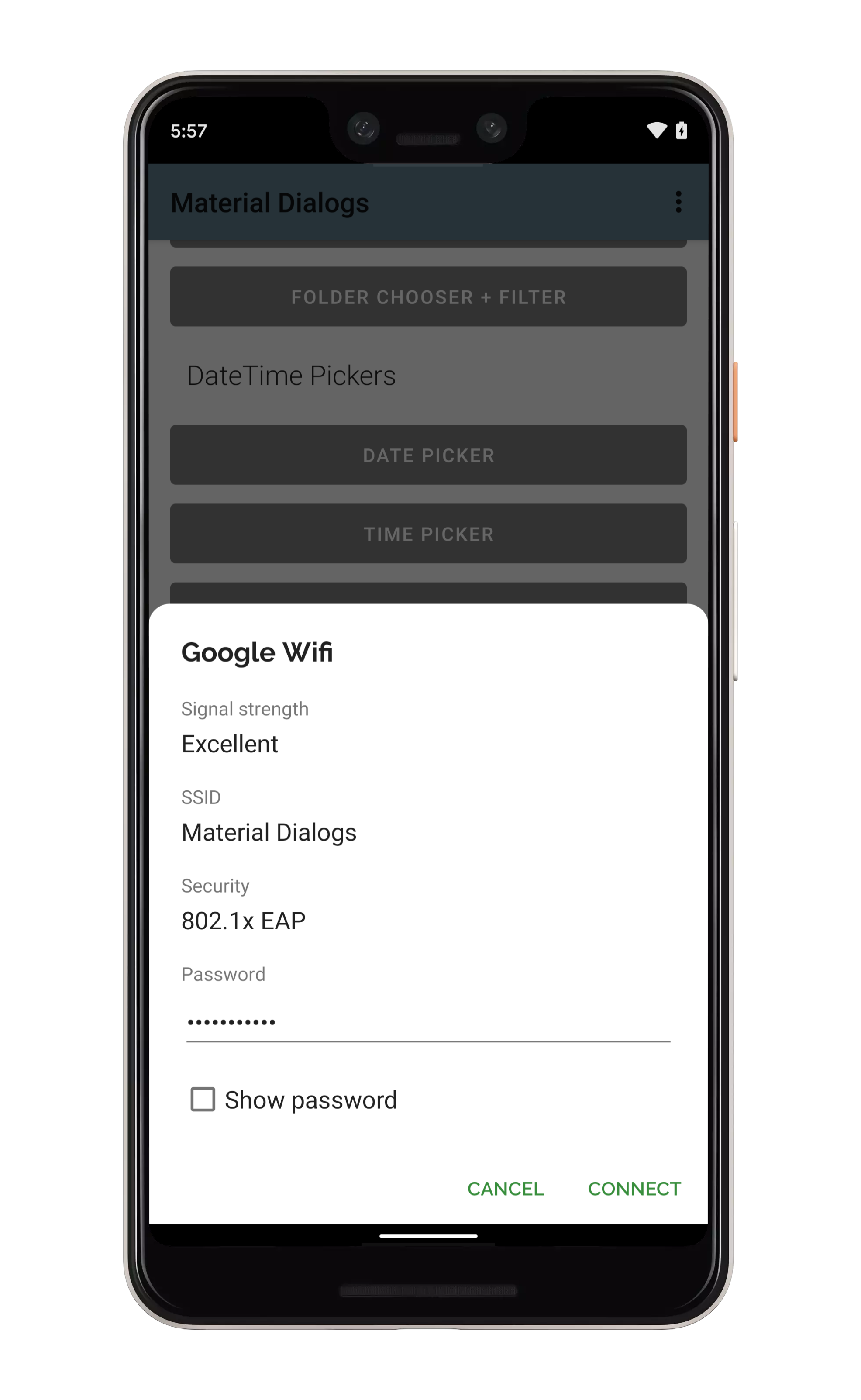
Files
Files Tutorial and Samples
The files module contains extensions to the core module, such as a file and folder chooser.
dependencies {
  ...
  implementation 'com.afollestad.material-dialogs:files:3.3.0'
}
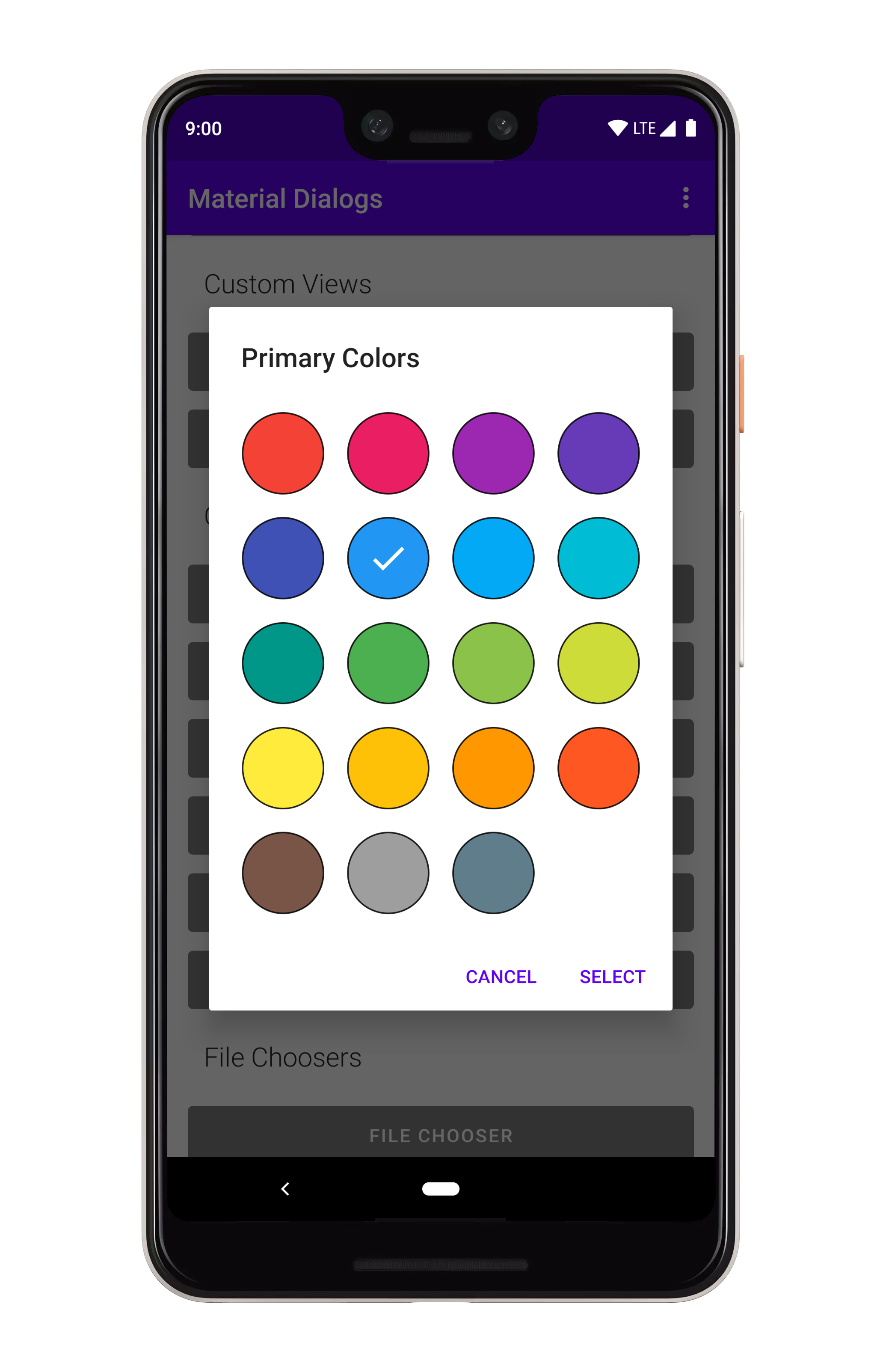
Color
Color Tutorial and Samples
The color module contains extensions to the core module, such as a color chooser.
dependencies {
  ...
  implementation 'com.afollestad.material-dialogs:color:3.3.0'
}
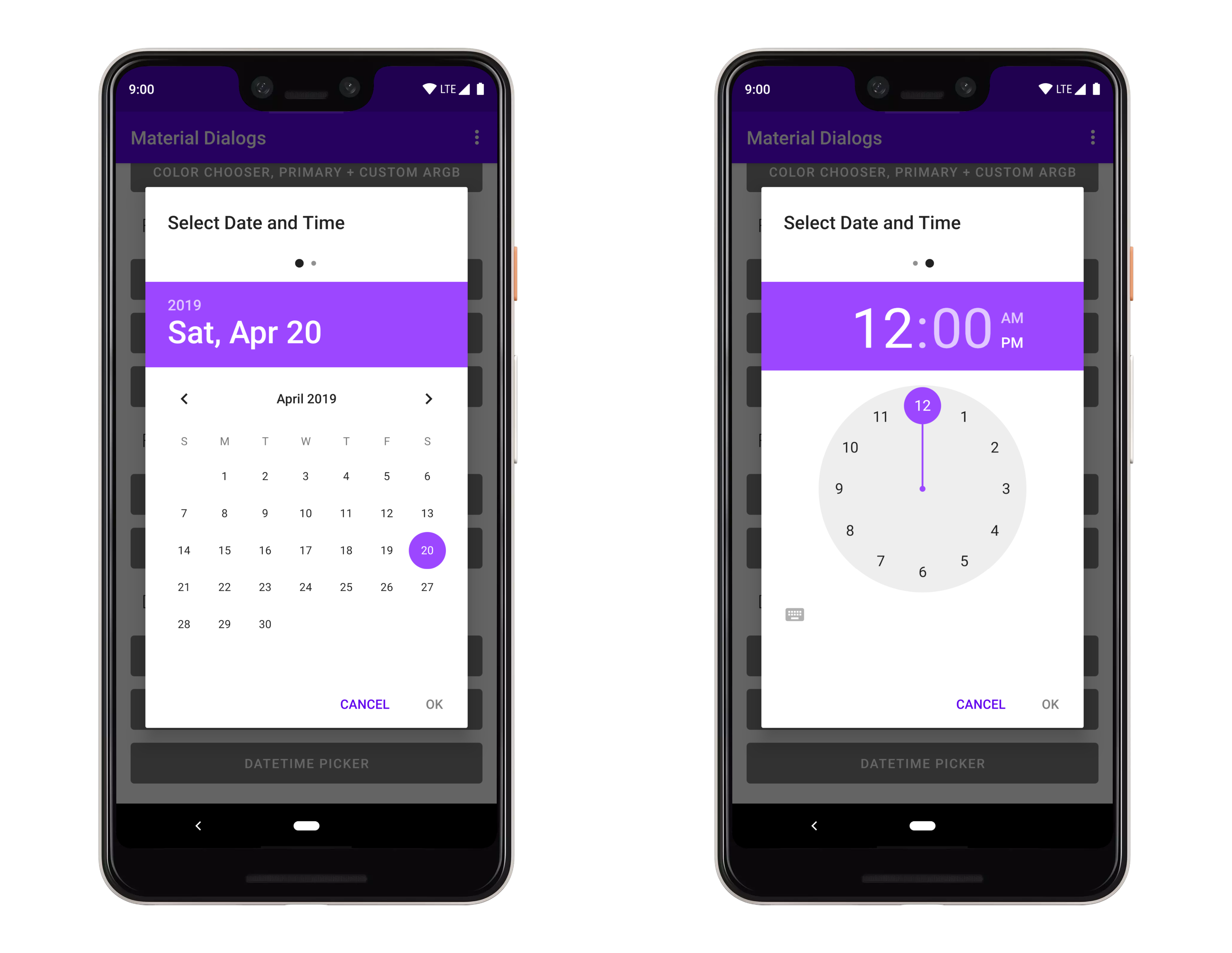
DateTime
DateTime Tutorial and Samples
The datetime module contains extensions to make date, time, and date-time picker dialogs.
dependencies {
  ...
  implementation 'com.afollestad.material-dialogs:datetime:3.3.0'
}
Bottom Sheets
Bottom Sheets Tutorial and Samples
The bottomsheets module contains extensions to turn modal dialogs into bottom sheets, among other functionality like showing a grid of items. Be sure to checkout the sample project for this, too!
dependencies {
  ...
  implementation 'com.afollestad.material-dialogs:bottomsheets:3.3.0'
}
Lifecycle
Lifecycle Tutorial and Samples
The lifecycle module contains extensions to make dialogs work with AndroidX lifecycles.
dependencies {
  ...
  implementation 'com.afollestad.material-dialogs:lifecycle:3.3.0'
}


 838 Dec 30, 2022
 2.2k Dec 29, 2022
 144 Nov 29, 2022
 572 Nov 11, 2022
 124 Dec 28, 2022
 7.3k Dec 30, 2022
 22 Nov 8, 2022
 2 Dec 25, 2021
 522 Jan 2, 2023
 468 Nov 10, 2022
 152 Nov 30, 2022
 73 Nov 29, 2022
 192 Jan 2, 2023
 228 Nov 25, 2022
 253 Dec 29, 2022
 5k Dec 29, 2022
 2.3k Dec 8, 2022