Expandable Panel Android Library


Check ExpandablePanel Demo application on GooglePlay:

Details
This Android library implements the expand by sliding logic for a top or a bottom view in a two children view composition. That's the default behaviour, but it allows you to set a different View as the expandable one, making this component support multiple views inside it. It supports Android SDK 2.1 (Eclair) as minimum.
ExpandablePanel library brings a custom view class called ExpandablePanelView to the final user. It implements the needed logic for integrating the expandable logic into your own Android application.
Custom Attributes
ExpandablePanel lib allows you to customize the following properties. Feel free to combine them to create cool user interfaces:
expandablepanel:completionPercent: % of the parent's height where you want the autocomplete animation to begin working.expandablepanel:completeExpandAnimationSpeed: Speed for the autocomplete animation.expandablepanel:completeShrinkAnimationSpeed: Speed for the autoshrink animation.expandablepanel:beginExpanded: Use it if you need the topView to begin expanded. If that's your case, the view will play a bounce animation at start to inform the user about the hidden bottom view.expandablepanel:bounceCount: Use it to set the number of times topView is going to play bounce animation when it begins expanded.expandablepanel:invertBehavior: Use it to invert the panel's behaviour and make bottomView become the expandable one. You can combine it with any other custom attributes. Bounce animation will get inverted too when using this attr.expandablepanel:animableViewId: Use it to assign an animable view using the view identifier if yourExpandablePanelViewcontains more than 2 child. This attribute is not mandatory, if you don't use it, first or second child (based on theexpandablepanel:invertBehaviorattribute) is going to be used as the animable view.expandablepanel:autoAnimateOnClick: Use this one to enable automatic expanding or shrinking when user clicks on animable view.
Usage
In order to make it work, you will need to use ExpandablePanelView class into your Android XML Layout.
-
- Add
ExpandablePanelViewto the layout.
- Add
-
- Add two children views to the ExpandablePanelView XML element.
-
ExpandablePanelViewextendsRelativeLayout, so you will need to give an android id to the top view and setup theandroid:belowattribute in the bottom one.
-
- Set the
xmlns:draggable_view="http://schemas.android.com/apk/res-auto"if you are going to use any of the cusom attributes.
- Set the
Use ExpandableListener if you want your class to be able to get expandable callbacks. Following methods are offered to the user:
onExpandingStarted: Dispatched when the user starts expanding the view.onExpandingFinished: Dispatched when autocomplete expanding animation is finished.onShrinkStarted: Dispatched when the user starts shrinking the view.onShrinkFinished: Dispatched when autocomplete shrinking animation is finished.onExpandingTouchEvent: Dispatched meanwhile the user is dragging to expand or shrink the view. This one is very useful if you want to map touch coordinates to your class and be able to use them for creating cool combined animations.
Basic Usage
<RelativeLayout xmlns:android="http://schemas.android.com/apk/res/android"
    xmlns:tools="http://schemas.android.com/tools"
    xmlns:expandablepanel="http://schemas.android.com/apk/res-auto"
    android:layout_width="match_parent"
    android:layout_height="match_parent"
    tools:context=".MainActivity">

    <com.jorgecastilloprz.expandablepanel.ExpandablePanelView
        android:layout_width="match_parent"
        android:layout_height="match_parent"
        android:background="@android:color/darker_gray"
        expandablepanel:completionPercent="0.8"
        expandablepanel:completeExpandAnimationSpeed="150"
        expandablepanel:completeShrinkAnimationSpeed="200">

        <ImageView
            android:id="@+id/topLayout"
            android:layout_width="match_parent"
            android:layout_height="250dp"
            android:src="@drawable/nightbackground"
            android:scaleType="centerCrop"/>

        <ImageView
            android:background="@color/material_pink"
            android:layout_width="match_parent"
            android:layout_height="match_parent"
            android:layout_below="@+id/topLayout"/>

    </com.jorgecastilloprz.expandablepanel.ExpandablePanelView>

</RelativeLayout>
Begin Expanded Usage:
<com.jorgecastilloprz.expandablepanel.ExpandablePanelView
        android:id="@+id/expandablePanelView"
        android:layout_width="match_parent"
        android:layout_height="match_parent"
        android:background="@android:color/darker_gray"
        expandablepanel:completionPercent="0.8"
        expandablepanel:completeExpandAnimationSpeed="150"
        expandablepanel:completeShrinkAnimationSpeed="200"
        expandablepanel:beginExpanded="true"
        expandablepanel:bounceCount="2">

    <ImageView
        android:id="@+id/topLayout"
        android:layout_width="match_parent"
        android:layout_height="250dp"
        android:src="@drawable/nightbackground"
        android:scaleType="centerCrop"/>

    <ImageView
        android:background="@color/material_pink"
        android:layout_width="match_parent"
        android:layout_height="match_parent"
        android:layout_below="@+id/topLayout"/>

</com.jorgecastilloprz.expandablepanel.ExpandablePanelView>
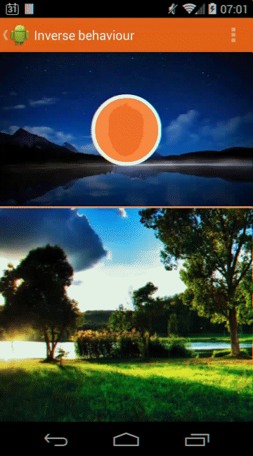
Invert Behaviour Usage:
- You will need to remove
android:layout_belowfrom bottomView and addandroid:layout_aboveto the top one, in order to make Android capable of settingfixed bottomView heightbefore topViewmatch_parentheight. - You must set
android:layout_alignParentBottom="true"in bottom view too.
<RelativeLayout xmlns:android="http://schemas.android.com/apk/res/android"
    xmlns:tools="http://schemas.android.com/tools"
    xmlns:expandablepanel="http://schemas.android.com/apk/res-auto"
    android:layout_width="match_parent"
    android:layout_height="match_parent"
    tools:context=".MainActivity">

    <com.jorgecastilloprz.expandablepanel.ExpandablePanelView
        android:id="@+id/expandablePanelView"
        android:layout_width="match_parent"
        android:layout_height="match_parent"
        android:background="@android:color/darker_gray"
        expandablepanel:completionPercent="0.8"
        expandablepanel:completeExpandAnimationSpeed="150"
        expandablepanel:completeShrinkAnimationSpeed="200"
        expandablepanel:invertBehavior="true">

        <RelativeLayout
            android:id="@+id/topLayout"
            android:layout_width="match_parent"
            android:layout_height="match_parent"
            android:layout_above="@+id/bottomLayout">

            <LinearLayout
                android:layout_width="match_parent"
                android:layout_height="match_parent"
                android:orientation="vertical"
                android:weightSum="100">

                <ImageView
                    android:layout_width="match_parent"
                    android:layout_height="0dp"
                    android:layout_weight="99"
                    android:src="@drawable/nightbackground"
                    android:scaleType="centerCrop"/>

                <View
                    android:layout_width="match_parent"
                    android:layout_height="0dp"
                    android:layout_weight="1"
                    android:background="@color/flat_orange_bright" />

            </LinearLayout>

            <expandablepanel.jorgecastilloprz.com.expandablepanel.ui.components.CircledImageView
                android:id="@+id/avatar"
                android:layout_width="100dp"
                android:layout_height="100dp"
                android:src="@drawable/avatar"
                android:layout_centerInParent="true"/>


        </RelativeLayout>

        <ImageView
            android:id="@+id/bottomLayout"
            android:layout_width="match_parent"
            android:layout_height="300dp"
            android:src="@drawable/daybackground"
            android:scaleType="centerCrop"
            android:layout_alignParentBottom="true"/>

    </com.jorgecastilloprz.expandablepanel.ExpandablePanelView>

</RelativeLayout>
Import ExpandablePanel dependency
Add the next code to your build.gradle project dependencies:
dependencies {
    compile 'com.github.jorgecastilloprz:expandablepanel:1.0.4@aar'
}
Set the mavenCentral repo into the external build.gradle:
buildscript {
    repositories {
        mavenCentral()
    }
    dependencies {
        classpath 'com.android.tools.build:gradle:0.12.+'
    }
}

allprojects {
    repositories {
        mavenCentral()
    }
}
If you are using Maven, use the following code:
<dependency>
  <groupId>com.github.jorgecastilloprz</groupId>
  <artifactId>expandablepanel</artifactId>
  <version>1.0.4</version>
  <type>aar</type>
</dependency>
Developer
- Jorge Castillo Pérez jorge.castillo.prz@gmail.com
- Twitter acc - @JorgeCastilloPr (https://twitter.com/jorgecastillopr)
License
Copyright 2014 Jorge Castillo Pérez

Licensed under the Apache License, Version 2.0 (the "License");
you may not use this file except in compliance with the License.
You may obtain a copy of the License at

   http://www.apache.org/licenses/LICENSE-2.0

Unless required by applicable law or agreed to in writing, software
distributed under the License is distributed on an "AS IS" BASIS,
WITHOUT WARRANTIES OR CONDITIONS OF ANY KIND, either express or implied.
See the License for the specific language governing permissions and
limitations under the License.

 29 Dec 12, 2022

 178 Dec 9, 2022

 24 Nov 29, 2022

 287 Nov 18, 2022

 1.8k Dec 27, 2022

 1.1k Oct 28, 2022
 2.6k Jan 5, 2023

 1.8k Dec 29, 2022
 561 Nov 20, 2022


 65 Dec 9, 2022
 699 Nov 19, 2022
 354 Nov 10, 2022
 4 Jan 14, 2022
 944 Dec 27, 2022
 867 Nov 19, 2022
 355 Nov 11, 2022
 150 Dec 16, 2022
 320 Dec 30, 2022
 61 Dec 16, 2022