ios UISegmentedControl for android

Overview

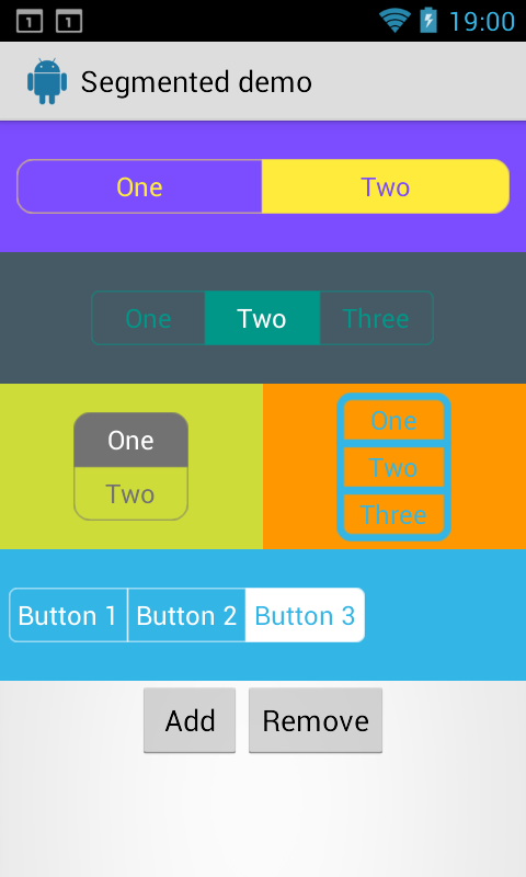
android-segmented-control

Android-Segmented is a custom view for Android which is based on RadioGroup and RadioButton widget. This implementation is inspired by Segmented Controls for iOS.

Sample Image

Including in your project:

Download source code and import as module

The latest code has bug fixes, iOS 7's (and up) style segment control (which has nice fade animation and tint) and support for Font Awesome. (These features has not been pushed to Maven yet)

Using maven

Android-Segmented Library is pushed to Maven Central, so you just need to add the following dependency to your build.gradle.

dependencies {
    compile 'info.hoang8f:android-segmented:1.0.6'
}

Manually

Copy(or merge) below files into corresponding file/folder:

  • SegmentedGroup.java
  • res/drawable/*
  • res/drawable-v14/*
  • res/values/colors.xml
  • res/values/dimens.xml
  • res/values/styles.xml (only RadioButton style)

Usage

Define in xml like this and make sure that the RadioButton's style is: @style/RadioButton

<attr name="sc_corner_radius" format="dimension" />
<attr name="sc_border_width" format="dimension" />
<attr name="sc_tint_color" format="color" />
<attr name="sc_checked_text_color" format="color" />

Sample code:

<info.hoang8f.android.segmented.SegmentedGroup
    xmlns:segmentedgroup="http://schemas.android.com/apk/res-auto"
    android:id="@+id/segmented2"
    android:layout_width="wrap_content"
    android:layout_height="wrap_content"
    android:layout_margin="10dp"
    android:orientation="horizontal"
    segmentedgroup:sc_border_width="2dp"
    segmentedgroup:sc_corner_radius="10dp">

    <RadioButton
        android:id="@+id/button21"
        android:layout_width="wrap_content"
        android:layout_height="wrap_content"
        android:text="One"
        style="@style/RadioButton" />

    <RadioButton
        android:id="@+id/button22"
        android:layout_width="wrap_content"
        android:layout_height="wrap_content"
        android:text="Two"
        style="@style/RadioButton" />
</info.hoang8f.android.segmented.SegmentedGroup>

You also can be change the tint color and title color when button is checked by setTintColor method. Here is sample code:

SegmentedGroup segmented2 = (SegmentedGroup) rootView.findViewById(R.id.segmented2);
segmented2.setTintColor(Color.DKGRAY);

SegmentedGroup segmented3 = (SegmentedGroup) rootView.findViewById(R.id.segmented3);
segmented3.setTintColor(Color.parseColor("#FFD0FF3C"), Color.parseColor("#FF7B07B2"));

SegmentedGroup segmented4 = (SegmentedGroup) rootView.findViewById(R.id.segmented4);
segmented4.setTintColor(getResources().getColor(R.color.radio_button_selected_color));

If you dont specify border_width and/or corner_radius the default values will be used (1dp for border_width and 5 dp for corner_radius)

Credits

Author:

  • Le Van Hoang (@hoang8f)
  • Added support for vertical RadioGroup by tchar.

License

The MIT License (MIT)

Copyright (c) 2014 Le Van Hoang

Permission is hereby granted, free of charge, to any person obtaining a copy
of this software and associated documentation files (the "Software"), to deal
in the Software without restriction, including without limitation the rights
to use, copy, modify, merge, publish, distribute, sublicense, and/or sell
copies of the Software, and to permit persons to whom the Software is
furnished to do so, subject to the following conditions:

The above copyright notice and this permission notice shall be included in all
copies or substantial portions of the Software.

THE SOFTWARE IS PROVIDED "AS IS", WITHOUT WARRANTY OF ANY KIND, EXPRESS OR
IMPLIED, INCLUDING BUT NOT LIMITED TO THE WARRANTIES OF MERCHANTABILITY,
FITNESS FOR A PARTICULAR PURPOSE AND NONINFRINGEMENT. IN NO EVENT SHALL THE
AUTHORS OR COPYRIGHT HOLDERS BE LIABLE FOR ANY CLAIM, DAMAGES OR OTHER
LIABILITY, WHETHER IN AN ACTION OF CONTRACT, TORT OR OTHERWISE, ARISING FROM,
OUT OF OR IN CONNECTION WITH THE SOFTWARE OR THE USE OR OTHER DEALINGS IN THE
SOFTWARE.
Comments
  • How do I know which one is selected, and how do I set which one is selected on default?

    How do I know which one is selected, and how do I set which one is selected on default?

    Hi, basically the question is already in the title. But here again: How do I tell my app that the first or second one is selected, and how do I set which one is selected when you enter the activity?

    Cheers, Yannick E.

    question 
    opened by yannickErp 5
  • ActionBarSherlock in conflict With Appcompatv7

    ActionBarSherlock in conflict With Appcompatv7

    Hi, I tried your library and this is nicely done! Unfortunately, in your library, you import in your depedencies the appcompat-v7 and when I import it in my project, it is in conflict with the ActionBarSherlock.

    So, I decided to download the source and remove the appcompat or at least see why the appcompat is in the project.

    From my opinion, the appcompat is useless in the library. The only reason why it's there, it's because the theme(defined in the style.xml) in the Manifest come from the appcompat.

    I would suggest to simply remove the the appcompat to avoid conflict in project that contain ActionBarSherlock.

    Thanks!

    Hugo

    opened by hugocroch 3
  • Attributes support etc.

    Attributes support etc.

    Ok I changed a lot of stuff. What did I do. According to #21 and #20 I:

    • Added support for custom border_width (stroke_margin) via the dimension's file. This changes the appearance of all the radiogroups in the project.
    • Polished the code: Basically added a LayoutSelector inner class to provide everything related about the layouts and made the public void updateBackground() cleaner and shorter.
    • And finally added support to individually change the appearance of each radiogroup by adding a styleable, so users can now declare their border_width and corner_radius from the layout files. The SegmentedGroup parses those attributes and changes the radius via Gradient.setCornerRadii() method. Because of that there is no need to keep so many xml files for each radiobutton. We only need 2. One for checked and one for unchecked. The rest are done via the LayoutSelector and the radii tables.

    Have a look at the screenshots under my attributes-support branch. Any comments are gratefully accepted. Tell me what you like, what you don't so I can change it.

    tchar.

    opened by tchar 2
  • Add Button Padding Attribute

    Add Button Padding Attribute

    Added support for custom padding value that applies to each button of the segmented group. The attributes exist in the dimensions file alongside other attributes like border_width and complies with the current attribute system.

    Please let me know what you think. Was just using this library for a project I'm working on and found that this would be a useful feature.

    Regards, J-Mo

    opened by J-Mo63 1
  • can't change colors

    can't change colors

    Hi, I'm trying to use this component but I'm actually unable to change any of the colors.

    my code: xml:

    <info.hoang8f.android.segmented.SegmentedGroup
                            xmlns:segmentedgroup="http://schemas.android.com/apk/res-auto"
                            android:id="@+id/segmented"
                            android:layout_width="wrap_content"
                            android:layout_height="wrap_content"
                            android:layout_margin="10dp"
                            android:orientation="horizontal"
                            segmentedgroup:sc_border_width="2dp"
                            segmentedgroup:sc_corner_radius="10dp"
                            segmentedgroup:sc_tint_color="#CC0000"
                            segmentedgroup:sc_checked_text_color="#00CC00">
    
                            <RadioButton
                                android:id="@+id/button21"
                                android:layout_width="wrap_content"
                                android:layout_height="wrap_content"
                                android:text="One"
                                style="@style/RadioButton" />
    
                            <RadioButton
                                android:id="@+id/button22"
                                android:layout_width="wrap_content"
                                android:layout_height="wrap_content"
                                android:text="Two"
                                style="@style/RadioButton" />
                        </info.hoang8f.android.segmented.SegmentedGroup>
    

    java:

    SegmentedGroup segmented = (SegmentedGroup) view.findViewById(R.id.segmented);
    segmented.setTintColor(Color.parseColor("#CC0000"));
    

    the component remains blue and white Am I doing something wrong?

    opened by jackthebeast 1
  • Attribute

    Attribute "border_width" has already been defined

    Error:(2) Attribute "border_width" has already been defined exampleapp/app/build/intermediates/exploded-aar/com.android.support/appcompat-v7/22.2.0/res/values/values.xml

    opened by LOG-TAG 1
  • file attr.xml in Maven Central

    file attr.xml in Maven Central

    When I use "compile 'info.hoang8f:android-segmented:1.0.4@aar'" to compile the library, the file attr.xml is not downloaded then when I compile it cannot find custom xml attributes.

    opened by Brumanuel 1
  • adding segments programaticly with weights doesn't work

    adding segments programaticly with weights doesn't work

    I have a template layout with a radiobutton with width 0 and weight 1, and i try to add 4 buttons programaticly to an already created empty Segment group, but it ignores the weight, and just makes them the size they would be if it were set to wrap content

    opened by eclair4151 1
  • Not Support in RTL

    Not Support in RTL

    I have implemented SegmentedGroupTab in my app which is support Arabic language, were i found that rtl not support by this library

    @johnjohndoe @hoang8f @croemmich @myanimal @bitdeli-chef

    opened by pinal-27 0
  • not very customizable

    not very customizable

    You can only set border and text color together (cannot set them separately) and there is no way to set the unselected text color. You cannot set rounded corner of selected rectangle for all four sides. Also no animations.

    You cannot customize a lot of things to match the specs. Such limited specs that it is better to just create your own rather than use this library. :(

    opened by truthhonestmessaging 0
  • Added attribute for text color change

    Added attribute for text color change

    Kindly merge this attribute in your library because on changing tint color and text color also getting change and i have added new attribute for it "sc_text_color"

    opened by MuhammadTouseeq 0
  • How to check which segmented control is selected?

    How to check which segmented control is selected?

    If I create a segmented control with 3 radiobuttons?. How can I check what box is selected?

    if android:id="@+id/button1" is selected = do this if android:id="@+id/button2" is selected = do that

    Tips?

    opened by pinloop 1
Owner
Kaopiz Software Co., Ltd.
ios风格的分段控件,类似 UISegmentedControl

segmentedview ios 风格的分段控件,类似 UISegmentedControl Gradle repositories { maven { url "https://jitpack.io" } } dependencies { compile 'com.github

ezy 58 Nov 11, 2022
An Android library supports badge notification like iOS in Samsung, LG, Sony and HTC launchers.

ShortcutBadger: The ShortcutBadger makes your Android App show the count of unread messages as a badge on your App shortcut! Supported launchers: Sony

Leo Lin 7.2k Dec 30, 2022
iOS UIActionSheet for Android

ActionSheet This is like iOS UIActionSheet component, has iOS6 and iOS7 style, support custom style, background, button image, text color and spacing

星一 810 Nov 10, 2022
A Popover Controller for Android Tablets. It's an easy solution to simulate an iOS UIPopoverController

PopoverView A Popover Controller for Android Tablets. It's an easy solution to simulate an iOS UIPopoverController Base example 9patch image comes fro

Daniel Lupiañez Casares 203 Nov 29, 2022
A realtime blurring overlay for Android (like iOS UIVisualEffectView)

RealtimeBlurView It's just a realtime blurring overlay like iOS UIVisualEffectView. Just put the view in the layout xml, no Java code is required. //

Tu Yimin 3k Jan 9, 2023
Simple and powerful library to emulate iOS's "3D Touch" preview functionality on Android.

Android 3D Touch - PeekView iOS uses 3D Touch as a way to "peek" into full content, such as emails, pictures, web searches, etc. While they have dedic

Luke Klinker 502 Dec 29, 2022
Multiplatform UI DSL with screen management in common code for mobile (android & ios) Kotlin Multiplatform development

Mobile Kotlin widgets This is a Kotlin MultiPlatform library that provides declarative UI and application screens management in common code. You can i

IceRock Development 320 Dec 30, 2022
A Jetpack Compose library with blur, pixelate, and other effects to keep your designer happy. Inspired by iOS UIVisualEffectView.

A Jetpack Compose library with blur, pixelate, and other effects to keep your designer happy. Inspired by iOS UIVisualEffectView.

清茶 67 Dec 30, 2022
Android library used to create an awesome Android UI based on a draggable element similar to the last YouTube graphic component.

Draggable Panel DEPRECATED. This project is not maintained anymore. Draggable Panel is an Android library created to build a draggable user interface

Pedro Vicente Gómez Sánchez 3k Dec 6, 2022
TourGuide is an Android library that aims to provide an easy way to add pointers with animations over a desired Android View

TourGuide TourGuide is an Android library. It lets you add pointer, overlay and tooltip easily, guiding users on how to use your app. Refer to the exa

Tan Jun Rong 2.6k Jan 5, 2023
Bubbles for Android is an Android library to provide chat heads capabilities on your apps. With a fast way to integrate with your development.

Bubbles for Android Bubbles for Android is an Android library to provide chat heads capabilities on your apps. With a fast way to integrate with your

Txus Ballesteros 1.5k Jan 2, 2023
View that imitates Ripple Effect on click which was introduced in Android L (for Android 2.3+)

RippleView View that imitates Ripple Effect on click which was introduced in Android L. Usage For a working implementation, Have a look at the Sample

Muthuramakrishnan Viswanathan 1.2k Dec 30, 2022
A new canvas drawing library for Android. Aims to be the Fabric.js for Android. Supports text, images, and hand/stylus drawing input. The library has a website and API docs, check it out

FabricView - A new canvas drawing library for Android. The library was born as part of a project in SD Hacks (www.sdhacks.io) on October 3rd. It is cu

Antwan Gaggi 1k Dec 13, 2022
MarkdownView is an Android webview with the capablity of loading Markdown text or file and display it as HTML, it uses MarkdownJ and extends Android webview.

About MarkdownView (Markdown For Android) is an Android library that helps you display Markdown text or files (local/remote) as formatted HTML, and st

Feras Alnatsheh 1k Dec 20, 2022
SwipeBack for Android Activities to do pretty the same as the android "back-button" will do, but in a really intuitive way by using a swipe gesture

SwipeBack SwipeBack is for Android Activities to do pretty the same as the android "back-button" will do, but in a really intuitive way by using a swi

Hannes Dorfmann 697 Dec 14, 2022
A backport of the SwitchPreference component that was introduced on Android 4 (ICS / level 14). This port works on Android 2.1+ (Eclair MR1 / level 7).

Android Switch Preference Backport A backport of the SwitchPreference component that was introduced on Android 4 (ICS / level 14). This port works on

Benoit Lubek 498 Dec 29, 2022
Wizard Pager is a library that provides an example implementation of a Wizard UI on Android, it's based of Roman Nurik's wizard pager (https://github.com/romannurik/android-wizardpager)

Wizard Pager Wizard Pager is a library that provides an example implementation of a Wizard UI on Android, it's based of Roman Nurik's wizard pager (ht

Julián Suárez 520 Nov 11, 2022
Make your native android Toasts Fancy. A library that takes the standard Android toast to the next level with a variety of styling options. Style your toast from code.

FancyToast-Android Prerequisites Add this in your root build.gradle file (not your module build.gradle file): allprojects { repositories { ... ma

Shashank Singhal 1.2k Dec 26, 2022