Badge
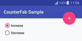
Preview
Integration
- Add the JitPack repository to your root build.gradle:
repositories {
    maven { url "https://jitpack.io" }
}
- Add the dependency to your sub build.gradle:
dependencies {
    implementation "com.github.nekocode:Badge:${last-version}"
}
Badge Types
This library provides four types of badges with cliche customizations.
| Type | Badge | Type | Badge |
|---|---|---|---|
TYPE_NUMBER |
 |
TYPE_ONLY_ONE_TEXT |
 |
TYPE_TWO_TEXT |
 |
TYPE_TWO_TEXT_COMPLEMENTARY |
 |
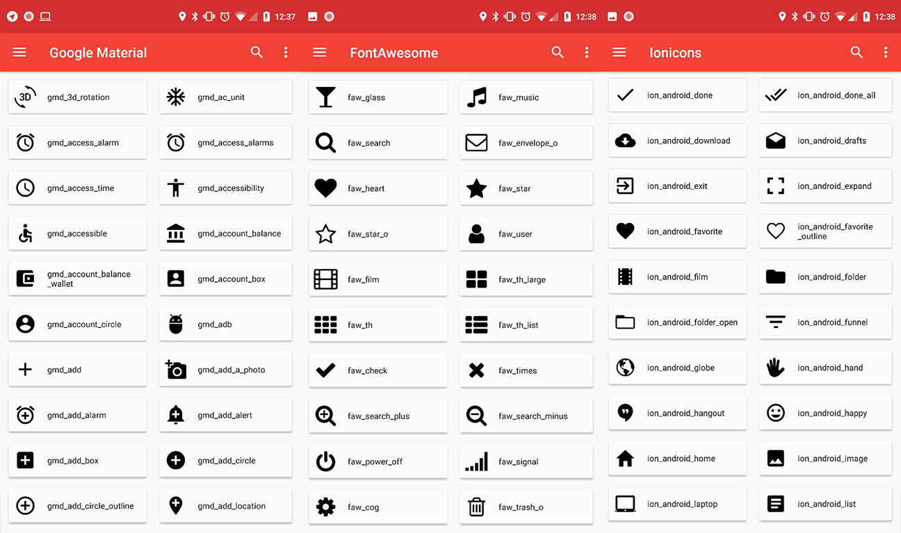
Attributes
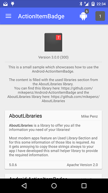
Usage
The above screenshot's example:
final BadgeDrawable drawable =
        new BadgeDrawable.Builder()
                .type(BadgeDrawable.TYPE_NUMBER)
                .number(9)
                .build();

final BadgeDrawable drawable2 =
        new BadgeDrawable.Builder()
                .type(BadgeDrawable.TYPE_ONLY_ONE_TEXT)
                .badgeColor(0xff336699)
                .text1("VIP")
                .build();

final BadgeDrawable drawable3 =
        new BadgeDrawable.Builder()
                .type(BadgeDrawable.TYPE_WITH_TWO_TEXT_COMPLEMENTARY)
                .badgeColor(0xffCC9933)
                .text1("LEVEL")
                .text2("10")
                .padding(dp2px(2), dp2px(2), dp2px(2), dp2px(2), dp2px(2))
                .strokeWidth(dp2px(1))
                .build();

final BadgeDrawable drawable4 =
        new BadgeDrawable.Builder()
                .type(BadgeDrawable.TYPE_WITH_TWO_TEXT)
                .badgeColor(0xffCC9999)
                .text1("TEST")
                .text2("Pass")
                .build();

final BadgeDrawable drawable5 =
        new BadgeDrawable.Builder()
                .type(BadgeDrawable.TYPE_NUMBER)
                .number(999)
                .badgeColor(0xff336699)
                .build();
The above drawable4 BadgeDrawable has set a number that too large to show, in this case, it will be replaced with "..." for showing. And then you can use toSpannable() for converting the drawable to SpannableString without setting its drawing bounds. It has already took internal measure.
SpannableString spannableString =
        new SpannableString(TextUtils.concat(
                "TextView ",
                drawable.toSpannable(),
                " ",
                drawable2.toSpannable(),
                " ",
                drawable3.toSpannable(),
                " ",
                drawable4.toSpannable(),
                " ",
                drawable5.toSpannable()
        ));

textView.setText(spannableString);
If the drawable's bounds was setted by manual or content view. It will auto cut the text to adjust the bounds' width. Look like:
You can also use the badge drawable for ImageView and other more view.
 733 Dec 2, 2022

 435 Apr 4, 2022

 7.2k Dec 30, 2022
 3k Nov 28, 2022
 1.3k Jan 1, 2023

 5 Jun 28, 2022
 4 Jul 27, 2022
 827 Nov 25, 2022

 3.2k Jan 8, 2023

 1.4k Dec 5, 2022
 2.3k Dec 16, 2022
 344 Nov 29, 2022
 164 Dec 16, 2022

 48 May 26, 2022

 213 Oct 11, 2022

 1.6k Dec 29, 2022


 3k Nov 28, 2022
 1.3k Jan 1, 2023
 387 Nov 20, 2022
 1.1k Jan 4, 2023
 4.1k Dec 27, 2022
 536 Nov 22, 2022
 288 Dec 25, 2022