A simple implementation of collapsing toolbar for Jetpack Compose

Overview

compose-collapsing-toolbar

A simple implementation of CollapsingToolbarLayout for Jetpack Compose

Installation

You should add mavenCentral() repository before installation. Then add the following line to the dependencies block in your app level build.gradle:

implementation "me.onebone:toolbar-compose:2.0.1"

or build.gradle.kts:

implementation("me.onebone:toolbar-compose:2.0.1")

Example

An example can be found here.

Usage

Connecting AppBarContainer and CollapsingToolbar

The first step you should do to use collapsing toolbar is to connect AppBarContainer and CollapsingToolbar. This can be accomplished by passing the same CollapsingToolbarState instance to AppBarContainer and CollapsingToolbar. A most common way to get the state is by using rememberCollapsingToolbarState():

val state = rememberCollapsingToolbarState()

AppBarContainer(
    collapsingToolbarState = state,
    /* ... */
) {
    CollapsingToolbar(
        // Be sure to pass the same CollapsingToolbarState instance you passed to AppBarContainer
        collapsingToolbarState = state,
        /* ... */
    ) {
        /* ... */
    }
}

Adding child to CollapsingToolbar

Similar to CollapsingToolbarLayout, you may add children to the CollapsingToolbar. The toolbar will collapse until it gets as small as the smallest child, and will expand as large as the largest child.

Adding child to AppBarContainer

The AppBarContainer may consist of at most one CollapsingToolbar and unlimited number of body composable. Each body composable should be marked with appBarBody() modifier:

AppBarContainer(/* ... */) {
    CollapsingToolbar(/* ... */) {
        /* ... */
    }

    LazyColumn(
        modifier = Modifier
            .appBarBody() // <<--- body composable should be marked with `appBarBody()` modifier 
    ) {
        /* ... */
    }
}

Note that the CollapsingToolbar only if the body composable is scrollable. You don't need to care about anything when using LazyColumn because it is scrollable by default, however, if you hope to use non-scrollable such as Column or Row as body you should use verticalScroll() modifier for CollapsingToolbar to inspect nested scroll.

AppBarContainer(/* ... */) {
    CollapsingToolbar(/* ... */) {
        /* ... */
    }

    Column(
        modifier = Modifier
            .verticalScroll(rememberScrollState())
            // ^^ body composable should be scrollable for collapsing toolbar to play with nested scroll
            .appBarBody()
    ) {
        /* ... */
    }
}

parallax, pin, road

You can tell children of CollapsingToolbar how to deal with a collapse/expansion. This works almost the same way to the collapseMode in the CollapsingToolbarLayout except for the road modifier.

CollapsingToolbar(/* ... */) {
    Image(
        modifier = Modifier.parallax(ratio = 0.2f) // parallax, pin, road are available
    )
}

road modifier

The road() modifier allows you to place a child relatively to the toolbar. It receives two arguments: whenCollapsed and whenExpanded. As the name suggests, these describe how to place a child when the toolbar is collapsed or expanded, respectively. This can be used to display a title text on the toolbar which is moving as the scroll is fed.

CollapsingToolbar(/* ... */) {
    Text(
        text = "Title",
        modifier = Modifier
            .road(
                whenCollapsed = Alignment.CenterStart,
                whenExpanded = Alignment.BottomEnd
            )
    )
}

The above code orders the title Text to be placed at the CenterStart position when the toolbar is collapsed and BottomEnd position when it is expanded.

Scroll Strategy

ScrollStrategy defines how CollapsingToolbar consumes scroll. You can set your desired behavior by providing scrollStrategy at AppBarContainer:

AppBarContainer(
    /* ... */
    scrollStrategy = ScrollStrategy.EnterAlways // EnterAlways, EnterAlwaysCollapsed, ExitUntilCollapsed are available
) {
    /* ... */
}

ScrollStrategy.EnterAlways

EnterAlways

ScrollStrategy.EnterAlwaysCollapsed

EnterAlwaysCollapsed

ScrollStrategy.ExitUntilCollapsed

ExitUntilCollapsed

Comments
  • Significant performance drop in case of rich toolbar layout

    Significant performance drop in case of rich toolbar layout

    My toolbar contains pretty large numbers of elements so its performance is especially important for me. Here is my toolbar: Screenshot of my toolbar

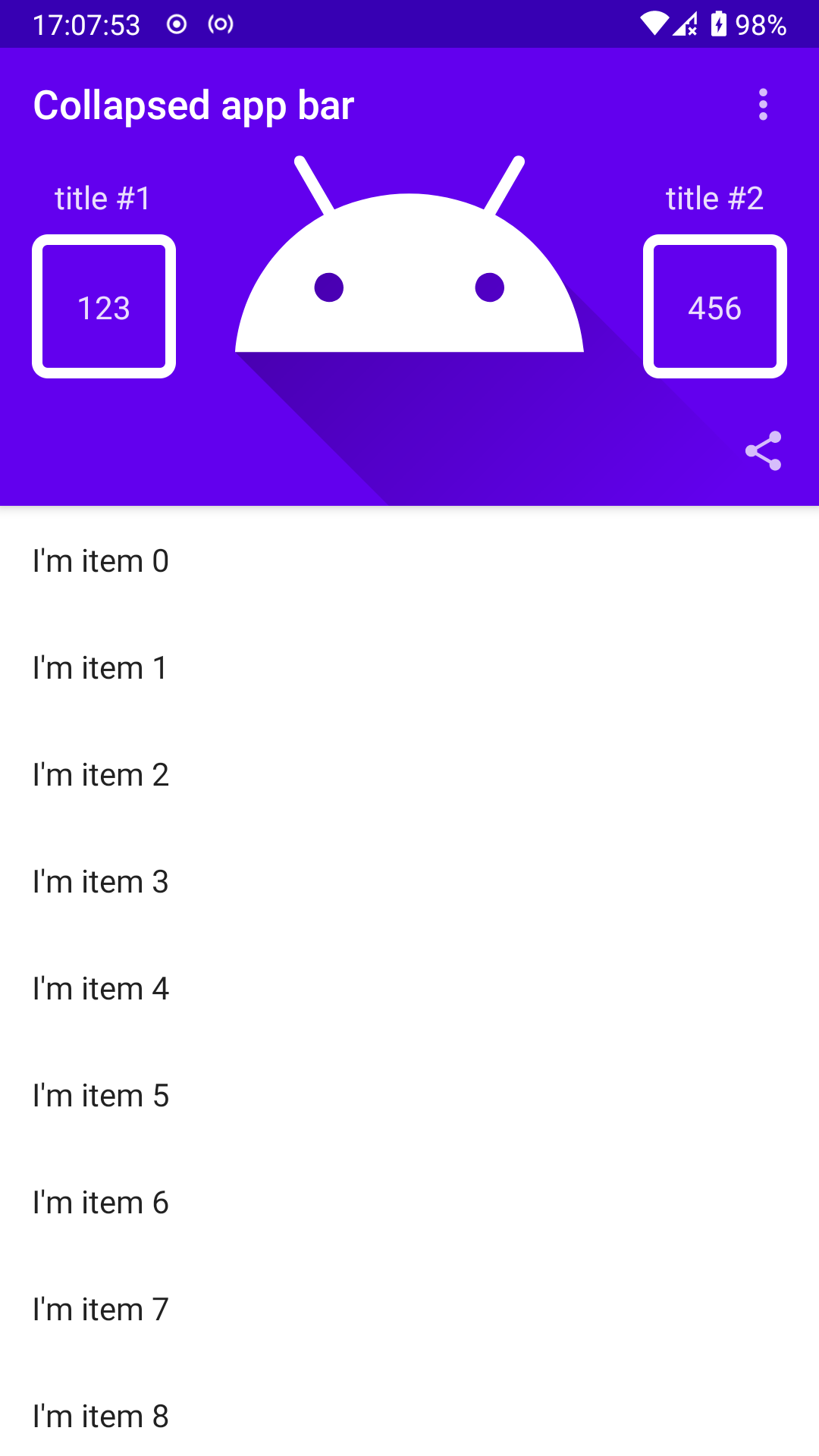
    In action it looks like this: GIF of my toolbar

    On the GIF you can see performance drop when scroll occur. It's important to node that the GIF is not compressed.

    Here is the code of my toolbar layout:

    import android.os.Bundle
    import android.util.Log
    import androidx.activity.ComponentActivity
    import androidx.activity.compose.setContent
    import androidx.annotation.FloatRange
    import androidx.compose.foundation.Image
    import androidx.compose.foundation.border
    import androidx.compose.foundation.clickable
    import androidx.compose.foundation.layout.Arrangement
    import androidx.compose.foundation.layout.Box
    import androidx.compose.foundation.layout.Column
    import androidx.compose.foundation.layout.IntrinsicSize
    import androidx.compose.foundation.layout.Row
    import androidx.compose.foundation.layout.RowScope
    import androidx.compose.foundation.layout.aspectRatio
    import androidx.compose.foundation.layout.fillMaxSize
    import androidx.compose.foundation.layout.fillMaxWidth
    import androidx.compose.foundation.layout.height
    import androidx.compose.foundation.layout.padding
    import androidx.compose.foundation.lazy.LazyColumn
    import androidx.compose.foundation.shape.RoundedCornerShape
    import androidx.compose.material.AppBarDefaults
    import androidx.compose.material.Icon
    import androidx.compose.material.IconButton
    import androidx.compose.material.MaterialTheme
    import androidx.compose.material.Surface
    import androidx.compose.material.Text
    import androidx.compose.material.TopAppBar
    import androidx.compose.material.contentColorFor
    import androidx.compose.material.icons.Icons
    import androidx.compose.material.icons.filled.MoreVert
    import androidx.compose.material.icons.filled.Share
    import androidx.compose.material.primarySurface
    import androidx.compose.runtime.Composable
    import androidx.compose.runtime.mutableStateOf
    import androidx.compose.runtime.remember
    import androidx.compose.ui.Alignment
    import androidx.compose.ui.Modifier
    import androidx.compose.ui.draw.alpha
    import androidx.compose.ui.draw.shadow
    import androidx.compose.ui.graphics.Color
    import androidx.compose.ui.layout.ContentScale
    import androidx.compose.ui.platform.LocalContext
    import androidx.compose.ui.res.painterResource
    import androidx.compose.ui.res.stringResource
    import androidx.compose.ui.text.style.TextAlign
    import androidx.compose.ui.unit.dp
    import me.onebone.toolbar.ui.theme.CollapsingToolbarTheme
    
    class PerformanceTestActivity: ComponentActivity() {
      override fun onCreate(savedInstanceState: Bundle?) {
        super.onCreate(savedInstanceState)
        setContent {
          CollapsingToolbarTheme {
            Surface(color = MaterialTheme.colors.background) {
              MyScaffold(
                modifier = Modifier.fillMaxSize(),
              )
            }
          }
        }
      }
    }
    
    @Composable
    private fun MyScaffold(
      modifier: Modifier = Modifier,
    ) {
      MyAppBarScaffold(
        modifier = modifier.fillMaxSize(),
      ) {
        val timestamp = System.currentTimeMillis()
        LazyColumn {
          items(100) {
            val timestamp2 = System.currentTimeMillis()
            Text(
              modifier = Modifier
                .fillMaxWidth()
                .padding(16.dp),
              text = "I'm item $it"
            )
            Log.d("perf list item", "list item draw speed = ${System.currentTimeMillis() - timestamp2}")
          }
        }
        Log.d("perf list", "list draw speed = ${System.currentTimeMillis() - timestamp}")
      }
    }
    
    @Composable
    private fun MyAppBarScaffold(
      modifier: Modifier = Modifier,
      content: @Composable () -> Unit,
    ) {
      val collapsingToolbarScaffoldState = rememberCollapsingToolbarScaffoldState()
    
      CollapsingToolbarScaffold(
        modifier = modifier,
        state = collapsingToolbarScaffoldState,
        scrollStrategy = ScrollStrategy.ExitUntilCollapsed,
        toolbarModifier = Modifier.shadow(AppBarDefaults.TopAppBarElevation),
        toolbar = {
          val timestamp = System.currentTimeMillis()
    
          val progress = collapsingToolbarScaffoldState.toolbarState.progress
    //      val progress = 1f
    
          Surface(
            modifier = Modifier
              .height(IntrinsicSize.Min)
    //          .height(300.dp)
              .parallax(0.5f), // TODO: Affects performance
            color = MaterialTheme.colors.primarySurface,
            elevation = AppBarDefaults.TopAppBarElevation,
          ) {
            MyAppBarContent(
              progress = progress,
            )
          }
    
    
          MyExpandedAppBar(
            modifier = Modifier
              .road(Alignment.BottomStart, Alignment.BottomStart), // TODO: Affects performance
            progress = progress, // TODO: Affects performance
    //        progress = 1f,
          )
          // Collapsing toolbar collapses its size as small as the that of a smallest child (this)
          MyCollapsedAppBar(
            modifier = Modifier.clickable(onClick = { }), // TODO: Affects performance
            progress = progress, // TODO: Affects performance
    //        progress = 1f,
          )
    
          Log.d("perf", "toolbar draw speed = ${System.currentTimeMillis() - timestamp}, progress = $progress")
    
        },
        body = content
      )
    }
    
    @Composable
    private fun MyExpandedAppBar(
      modifier: Modifier = Modifier,
      @FloatRange(from = 0.0, to = 1.0) progress: Float,
    ) {
      Log.d("redraw", "expanded bar redrawing")
      MyAppBar(
        modifier = modifier,
        title = {
          Log.d("redraw", "expanded bar title redrawing")
          val progressReversed = 1f - progress
          Text(
            modifier = Modifier.alpha(progressReversed.configureProgress(0.5f)),
            text = stringResource(R.string.app_name),
            color = MaterialTheme.colors.onPrimary
          )
        },
        actions = {
          Log.d("redraw", "expanded bar actions redrawing")
          IconButton(
            modifier = Modifier.alpha(progress.configureProgress(0.5f)),
            onClick = { }
          ) {
            Icon(imageVector = Icons.Filled.Share, contentDescription = null)
          }
        }
      )
    }
    
    @Composable
    private fun MyCollapsedAppBar(
      modifier: Modifier = Modifier,
      @FloatRange(from = 0.0, to = 1.0) progress: Float,
    ) {
      Log.d("redraw", "collapsed bar redrawing")
      val popupExpanded = remember { mutableStateOf(false) }
    
      val popupOptions = arrayOf("option #1", "option #2")
    
      MyAppBar(
        modifier = modifier,
        title = {
          Log.d("redraw", "collapsed bar title redrawing")
          Text(
            modifier = Modifier.alpha(progress),
            text = "Collapsed app bar",
            color = MaterialTheme.colors.onPrimary
          )
        },
        actions = {
          Log.d("redraw", "collapsed actions redrawing")
          IconButton(onClick = { popupExpanded.value = true }) {
            Icon(
              imageVector = Icons.Filled.MoreVert,
              contentDescription = null
            )
          }
        }
      )
    }
    
    @Composable
    private fun MyAppBarContent(
      modifier: Modifier = Modifier,
      @FloatRange(from = 0.0, to = 1.0) progress: Float,
    ) {
      Log.d("redraw", "content redrawing")
      Box(
        modifier = modifier
          .fillMaxWidth()
          .alpha(progress.configureProgress(0.5f)),
        contentAlignment = Alignment.Center
      ) {
        Log.d("redraw", "image redrawing")
        Image(
          modifier = Modifier.fillMaxSize(),
          painter = painterResource(R.drawable.ic_launcher_foreground),
          contentDescription = null,
          contentScale = ContentScale.Crop
        )
        Row(
          modifier = Modifier
            .padding(horizontal = 16.dp, vertical = MaterialAppBarHeight)
            .fillMaxSize(),
          horizontalArrangement = Arrangement.SpaceBetween,
          verticalAlignment = Alignment.CenterVertically
        ) {
          Log.d("redraw", "tile row redrawing")
          MyTile(
            title = "title #1",
            value = "123"
          )
          MyTile(
            title = "title #2",
            value = "456"
          )
        }
      }
    }
    
    @Composable
    private fun MyTile(
      modifier: Modifier = Modifier,
      title: String,
      value: String,
    ) {
      Log.d("redraw", "tile redrawing")
      val fontScale = LocalContext.current.resources.configuration.fontScale
    
      Column(
        modifier = modifier.height(MyStatisticsTileHeight.times(fontScale)),
        horizontalAlignment = Alignment.CenterHorizontally,
      ) {
        Text(
          modifier = Modifier.padding(vertical = 8.dp),
          text = title
        )
        Box(
          modifier = Modifier
            .padding(bottom = 8.dp)
            .aspectRatio(1f)
            .border(
              width = MyStatisticsTileBorderWidth,
              color = MaterialTheme.colors.onPrimary,
              shape = RoundedCornerShape(8.dp)
            )
            .fillMaxSize(),
          contentAlignment = Alignment.Center,
        ) {
          Text(
            modifier = Modifier
              .padding(horizontal = MyStatisticsTileBorderWidth.times(2)),
            text = value,
            textAlign = TextAlign.Center
          )
        }
      }
    }
    
    @Composable
    private fun MyAppBar(
      modifier: Modifier = Modifier,
      title: @Composable () -> Unit,
      actions: @Composable RowScope.() -> Unit = {},
    ) {
      TopAppBar(
        modifier = modifier.height(MaterialAppBarHeight),
        title = title,
        actions = actions,
        backgroundColor = Color.Transparent,
        contentColor = contentColorFor(MaterialTheme.colors.primarySurface),
        elevation = 0.dp
      )
    }
    
    private val MyStatisticsTileHeight = 118.dp
    private val MyStatisticsTileBorderWidth = 5.dp
    private val MaterialAppBarHeight = 56.dp
    
    /**
     * Applies configurations on value that represent a progress (e.g. animation)
     *
     * @param startAt Sets the starting point for the value. The resulting progress will begin
     * to increase only when the original progress value reaches passed value.
     */
    fun Float.configureProgress(@FloatRange(from = 0.0, to = 1.0) startAt: Float): Float {
      val start = (1f - startAt).coerceAtLeast(0f)
      val multiplier = 1f / start
      return (this - start) * multiplier
    }
    

    I added some logs to figure out what parts of UI affected by recomposition. It turned out that they all were affected after any change in the toolbar state. Even if I remove alpha modifier the recomposition process still affect all toolbar composables. I think this behaviour directly contradicts the basic principle of Compose - doing recomposition only if state of composable has changed

    In my case there is no need to recompose toolbars (only they titles). So there must a way not to trigger recomposition of all tolbar content

    I'm still in research of this problem. But it's important to discuss this problem.

    performance 
    opened by RareScrap 6
  • Initial content height is incorrect

    Initial content height is incorrect

    Hello. I'm trying to make a window with button that is always at the bottom. I have column with some items and button at the end. I have added spacer between items and button to fill the remaining space making button pined to bottom. The issue is that this doesn't work with CollapsingToolbar and I have to scroll to reveal the button. I think the issue is that content height is calculated incorrectly when toolbar is initially expanded.

    Here is code snippet to reproduce this issue:

    CollapsingToolbarScaffold(
    		modifier = Modifier
    			.fillMaxSize(),
    		state = state,
    		scrollStrategy = ScrollStrategy.ExitUntilCollapsed,
    		toolbar = {
    			val textSize = (18 + (30 - 18) * state.toolbarState.progress).sp
    
    			Box(
    				modifier = Modifier
    					.background(MaterialTheme.colors.primary)
    					.fillMaxWidth()
    					.height(150.dp)
    					.pin()
    			)
    
    			Text(
    				text = "Title",
    				modifier = Modifier
    					.road(Alignment.CenterStart, Alignment.BottomEnd)
    					.padding(60.dp, 16.dp, 16.dp, 16.dp),
    				color = Color.White,
    				fontSize = textSize
    			)
    
    			Icon(
    				Icons.Default.ArrowBack,
    				modifier = Modifier
    					.pin()
    					.padding(16.dp),
    				contentDescription = null
    			)
    		}
    	) {
    		Column(
    			modifier = Modifier
    				.fillMaxSize()
    				.verticalScroll(rememberScrollState())
    		) {
    			Row(
    				modifier = Modifier
    					.fillMaxWidth()
    					.padding(16.dp)
    					.background(Color.DarkGray)
    					.height(64.dp)
    			) {}
    
    			Row(
    				modifier = Modifier
    					.fillMaxWidth()
    					.padding(16.dp)
    					.background(Color.DarkGray)
    					.height(64.dp)
    			) {}
    
    			Row(
    				modifier = Modifier
    					.fillMaxWidth()
    					.padding(16.dp)
    					.background(Color.DarkGray)
    					.height(64.dp)
    			) {}
    
    			Row(
    				modifier = Modifier
    					.fillMaxWidth()
    					.padding(16.dp)
    					.background(Color.DarkGray)
    					.height(64.dp)
    			) {}
    
    			Spacer(modifier = Modifier
    				.fillMaxHeight()
    				.weight(1f))
    
    			Button(
    				onClick = { /*TODO*/ },
    				modifier = Modifier
    					.padding(16.dp)
    					.fillMaxWidth()
    			) {
    				Text(text = "Button")
    			}
    		}
    	}
    bug 
    opened by aurimas-zarskis 6
  • Expand when needed

    Expand when needed

    Hello. This works great for collapsing toolbars, but is there a way to expand/collapse the toolbar when needed?

    My use case is that I have a search input on the toolbar and I want to expand the toolbar when keyboard is visible (via LocalWindowInsets.current.ime.isVisible)

    feature 
    opened by alashow 6
  • AbstractMethodError When Trying to Scroll

    AbstractMethodError When Trying to Scroll

    Description The program force closed and get AbstractMethodError when trying to scroll the screen.

    To Reproduce Use this code, i paste it here: pastebin.

    Screenshot image image

    bug 
    opened by wiryadev 5
  • Support placing child at fixed position regardless of scroll state

    Support placing child at fixed position regardless of scroll state

    It is a common use case of collapsing toolbar to place its child at a fixed position, floating buttons, for example.

    Previously, the library did not directly let users do it and should have needed to offset components manually with the scrollY state. With this change, it is now possible to place it with the new modifier Modifier.align in the CollapsingToolbarScaffold body. This is somewhat similar to layout_gravity property in the Jetpack's CollapsingToolbarLayout.

    Usage example can be found at ParallaxActivity.kt in the app module.

    Backwards compatibility

    body parameter at CollapsingToolbarScaffold changes its signature from () -> Unit to CollapsingToolbarScaffoldScope.() -> Unit. Although it is a non-breaking change in general, there might be some use cases where body lambda is initialized somewhere before then passing the lambda to the function which causes type incompatible error.

    feature api 
    opened by onebone 4
  • Cannot access 'CollapsingToolbarScopeInstance': it is internal in 'me.onebone.toolbar'

    Cannot access 'CollapsingToolbarScopeInstance': it is internal in 'me.onebone.toolbar'

    IntelliJ IDEA imports me.onebone.toolbar.CollapsingToolbarScopeInstance.road and complains that it's internal when trying to use Modifier.road() or others

    IntelliJ IDEA 2021.3 RC (Ultimate Edition) Build #IU-213.5744.125, built on November 17, 2021 Runtime version: 11.0.13+7-b1751.19 amd64 VM: OpenJDK 64-Bit Server VM by JetBrains s.r.o. Linux 5.15.4-arch1-1 GC: G1 Young Generation, G1 Old Generation Memory: 4096M Cores: 16 Kotlin: 213-1.5.10-release-949-IJ5744.125 Current Desktop: KDE

    CollapsingToolbar v. 2.3.0

    support 
    opened by Nek-12 4
  • Added Floating Action Button to scaffold layout

    Added Floating Action Button to scaffold layout

    Added Fab to scaffold layout so you don't have to wrap scaffold layout inside a box and put fab there.

    How to add fab:

    CollapsingToolbarScaffold(
        state = rememberCollapsingToolbarScaffoldState(), // provide the state of the scaffold
        toolbar = {
            // contents of toolbar go here...
        },
       floatingActionButton = {
           // contents of fab go here..
       },
       floatingActionButtonPosition = FabPosition.END, // position of fab
    ) {
        // main contents go here...
    }
    
    opened by AnkitSuda 4
  • CollapsingToolbar does not consume fling

    CollapsingToolbar does not consume fling

    Summary

    Although the user flings the content all the way to the top and there is a left velocity that CollapsingToolbar can consume, it does not consume fling.

    Partial Solution

    I can implement fling behavior by overriding onPreScroll() and onPostScroll() callbacks in NestedScrollConnection. However, the problem is that as of Jetpack Compose 1.0.0-rc01 it calculates fling velocity by relative position of the content (For the actual source code calculating the velocity, refer to here and here). As an offset of content moves as the toolbar is expanded/collapsed, the velocity that is calculated inside a child(moving) layout does not provide a valid velocity as a whole resulting in buggy fling behavior because the change in relative position hardly matches the global position change in screen surface.

    Further Observations

    Jetpack Compose basically utilizes event bubble(where event is passed from child through its parents) while we can capture an event before the child processes it using Initial PointerEventPass. However using PointerEventPass.Initial type will pay high implementation cost as there is an only small set of high level API with Initial passing type.

    Traditional Android UI System

    The traditional Android UI components which support nested scrolling such as RecyclerView and NestedScrollView calculate velocity using relative position, but they adjust their offset when its relative position to the screen has changed as we can see at here and here.

    Conclusion

    At the moment, I could not find a method to implement flinging behavior correctly, I will leave this as an issue until a valid way is found.

    bug help wanted 
    opened by onebone 4
  • ExitUntilCollapsed causing wierd padding on bottom

    ExitUntilCollapsed causing wierd padding on bottom

    I have 2 composable screens with CollapsingToolbarScaffold. When you enter 1st screen the padding on the bottom is like it should be 0.dp, but when you go from 1st to 2nd screen, it seems that the ScrollStrategy.ExitUntilCollapsed on the second screen adds some padding around 56.dp on the bottom. If I use any other scroll strategy the problem is gone. Both screens use ScrollStrategy.ExitUntilCollapsed.

    Update 1 (Workaround):

    If you add

        Box(modifier = Modifier.fillMaxSize()) {
        }
    

    Outside of CollapsingToolbarScaffold, the padding is now gone and it is drawn through the whole screen.

    Update 2: Real solution

    Don't forget to add a modifier = Modifier.fillMaxSize(), else the scaffold isn't expanded to fill the screen, even though you have enough items.

    opened by pesjak 3
  • How to show a composable on a fixed position inside CollapsingToolbarScaffold regardless of toolbar state?

    How to show a composable on a fixed position inside CollapsingToolbarScaffold regardless of toolbar state?

    Hey,

    The library is amazing, but I have an issue that I don't know how to solve.

    I want to put the Button inside CollapsingToolbarScaffold, but I want it to be always shown, no matter the state of CollapsingToolbarScaffold. Currently if you put it inside it won't show until the state of the toolbar collapses.

    1 solution I tried is to put the Button outside of CollapsingToolbarScaffold, but then you have a button that is not part of the content that you want to show.

    For example if you have an AnimatedNavHost inside the content of CollapsingToolbarScaffold to manage the screens, the button inside those screens is different, but won't be shown at the bottom of the screen (over the content), but it will be shown at the bottom of the content.

    To summarize, is there any way to "flag" a composable, so that it is not influenced by the scrolling state, but is independent and still part of the CollapsingToolbarScaffold content?

    feature api 
    opened by pesjak 3
  • Unwanted space while scrolling

    Unwanted space while scrolling

    Expected:

    expected

    Currently:

    https://user-images.githubusercontent.com/79169838/162226079-4b543a54-99cb-4cad-afc7-e8c44d738e20.mp4

    Implementation

    @OptIn(ExperimentalPagerApi::class)
    @Composable
    internal fun MainScreen() {
        val state = rememberCollapsingToolbarScaffoldState()
    
        val tabData = listOf(
            "MUSIC" to Icons.Filled.Home,
            "MARKET" to Icons.Filled.ShoppingCart
        )
        val pagerState = rememberPagerState(
            pageCount = tabData.size,
            initialOffscreenLimit = 1,
            infiniteLoop = false,
            initialPage = 0,
        )
    
        val tabIndex = pagerState.currentPage
        val coroutineScope = rememberCoroutineScope()
        CollapsingToolbarScaffold(
            modifier = Modifier
                .fillMaxSize(),
            state = state,
            scrollStrategy = ScrollStrategy.ExitUntilCollapsed,
            toolbar = {
                Box(
                    modifier = Modifier
                        .height(400.dp)
                        .fillMaxWidth()
                        .background(Color.Blue)
                )
    
                TabRow(
                    selectedTabIndex = tabIndex,
                    indicator = { tabPositions ->
                        TabRowDefaults.Indicator(
                            Modifier.tabIndicatorOffset(tabPositions[tabIndex])
                        )
                    },
                    modifier = Modifier.road(
                        whenCollapsed = Alignment.CenterStart,
                        whenExpanded = Alignment.BottomEnd
                    )
                ) {
                    tabData.forEachIndexed { index, pair ->
                        Tab(selected = tabIndex == index, onClick = {
                            coroutineScope.launch {
                                pagerState.animateScrollToPage(index)
                            }
                        }, text = {
                            Text(text = pair.first)
                        }, icon = {
                            Icon(imageVector = pair.second, contentDescription = null)
                        })
                    }
                }
    
            }
        ) {
    
            LazyColumn(
                modifier = Modifier
                    .fillMaxWidth()
            ) {
                items(100) {
                    Text(
                        text = "Item $it",
                        modifier = Modifier.padding(8.dp)
                    )
                }
            }
        }
    
    
    }
    

    `

    wontfix 
    opened by anil-agridroid 2
  • How to use the pin modifier with ScrollStrategy.EnterAlways?

    How to use the pin modifier with ScrollStrategy.EnterAlways?

    If I use EnterAlways + pin() on my toolbar, I would expect that my toolbar stays at the top always but instead it's getting scrolled up off the screen after the toolbar is collapsed.

    I guess I'm looking for a combination of EnterAlways and ExitUntilCollapsed.

    feature 
    opened by cj1098 0
  • Toolbar height remember issue

    Toolbar height remember issue

    I came across the following issue. I use compose navigation. When I navigate back and the remembered toolbar height value is restored, maxHeight is set to initial Int.MAX_VALUE which results in really small progress value and causes components that are using progress value to flicker when you navigate back (video included). height

    https://user-images.githubusercontent.com/108057654/196040063-cf463b37-88f9-45e8-a26c-05b092292a6a.mp4

    bug 
    opened by 4Gabriela4 0
  • SwipeRefresh as a child doesn't expand

    SwipeRefresh as a child doesn't expand

    Not sure if it's an issue related to #18 but having SwipeRefresh as a child of the body blocks the toolbar from expanding. You can only expand the toolbar on a fling or when the SwipeRefresh is refreshing. View system components first expand the toolbar then activates Swiperefreshlayout pull gesture.

    bug 
    opened by TepesLucian 0
  • Always visible toolbar navigation icon?

    Always visible toolbar navigation icon?

    Hi, I am using the ExitUntilCollapsed scroll strategy for my project, and it works well. My toolbar has a navigation icon.

    Currently, the entire toolbar (including its navigation icon) gets its visibility changed when scrolling. I want the toolbar's navigation icon to always be displayed, and then have the remaining toolbar elements (background, title, etc.) animate its visibility when scrolling, which is the case already.

    Is this possible to do?

    opened by gosr 0
  • Vertical scrolling using an AndroidView ViewPager

    Vertical scrolling using an AndroidView ViewPager

    Hello all.

    Here's my situation:

    I need to implement a (not compose, so I can't use HorizontalPager) ViewPager on my screen. Each ViewPager page is a list with an infinite scroll feature implemented. I'm using the ScrollableTabRow composable for tabs.

    The screen is all implemented, but I'm facing issues with the scrolling.

    CollapsingToolbarScaffold lib recommends to set verticalScroll(rememberScrollState()) to the parent Column of my content. This works fine, but the ViewPager height doesn't seem to be calculated, making the scroll not happen. After some research, I found that we need to set the height explicitly if I want to use verticalScroll, but I couldn't make it work.

    Here's what I've already tried:

    1. Wrap the content in BoxWithConstraints and set the maxHeight;
    2. Implement onGloballyPositioned modifier;
    3. Set scrollable(rememberScrollState(), Orientation.Vertical)
    4. Set ViewCompat.setNestedScrollingEnabled(this, true) to the ViewPager (this works, but the scroll gets no smooth at all so, certainly not an option).

    Any ideas? Here's my code:

    val selectedPage = remember {
            mutableStateOf(0)
        }
    
        val pagerState = rememberPagerState(initialPage = selectedPage.value)
    
        Surface(modifier = Modifier.fillMaxSize(), color = Color(0xFFF1F3F5)) {
    
            Column {
                ScrollableTabRow(
                    edgePadding = 0.dp,
                    selectedTabIndex = selectedPage.value,
                    backgroundColor = Color.Transparent,
                    modifier = Modifier
                        .padding(16.dp)
                        .height(36.dp),
                    indicator = { },
                    divider = { }
                ) {
                    NativeTab("Tab 1", 0, pagerState, selectedPage)
                    NativeTab("Tab 2", 1, pagerState, selectedPage)
                    NativeTab("Tab 3", 2, pagerState, selectedPage)
                }
    
                AndroidView(
                    factory = { context ->
                        ViewPager(context).also {
                            it.adapter = CustomPagerAdapter(context)
                            it.currentItem = selectedPage.value
                            it.addOnPageChangeListener(object :
                                ViewPager.OnPageChangeListener {
                                override fun onPageScrolled(
                                    position: Int,
                                    positionOffset: Float,
                                    positionOffsetPixels: Int
                                ) {
                                }
    
                                override fun onPageSelected(position: Int) {
                                    selectedPage.value = position
                                }
    
                                override fun onPageScrollStateChanged(state: Int) {
                                }
                            })
                            ViewCompat.setNestedScrollingEnabled(it, true)
                        }
                    },
                    update = {
                        it.currentItem = selectedPage.value
                    },
                    modifier = Modifier.weight(1f)
                )
            }
        }
    

    Any help would be much appreciated.

    Thanks

    opened by leonardo-ndo 0
  • IME goes over the focused TextField

    IME goes over the focused TextField

    I've played around with the sample app and there's an issue if you enable edge to edge with the keyboard. It scrolls the Column but not enough to keep it in view. Sample code:

    class MainActivity: ComponentActivity() {
    	override fun onCreate(savedInstanceState: Bundle?) {
    		super.onCreate(savedInstanceState)
    		WindowCompat.setDecorFitsSystemWindows(window, false)
    		setContent {
    			CollapsingToolbarTheme { MainScreen() }
    		}
    	}
    }
    
    @Composable
    fun MainScreen() {
    	CollapsingToolbarScaffold(
    		modifier = Modifier
    			.statusBarsPadding()
    			.imePadding()
    			.fillMaxSize(),
    		state = rememberCollapsingToolbarScaffoldState(),
    		scrollStrategy = ScrollStrategy.EnterAlwaysCollapsed,
    		toolbar = {
    			TopAppBar(
    				title = { Text(text = "Title") },
    				modifier = Modifier.height(56.dp),
    			)
    		}
    	) {
    		Column(
    			modifier = Modifier
    				.fillMaxWidth()
    				.verticalScroll(rememberScrollState())
    				.navigationBarsPadding(),
    		) {
    			repeat(100) {
    				TextField(
    					value = "Item $it",
    					onValueChange = {},
    					modifier = Modifier.padding(8.dp)
    				)
    			}
    		}
    	}
    }
    

    I'm sure it has to do with the body offset when toolbar is expanded. LazyColumn is worse, losing the focus when keyboard is showing (that's for sure a compose issue). Any thoughts on this?

    opened by TepesLucian 0
Owner
onebone
onebone
Luis David Orellana 3 Jun 20, 2022
Compose-Ratingbar-library - A simple implementation for rating bar in Jetpack Compose

Compose-Ratingbar-library - A simple implementation for rating bar in Jetpack Compose

Mahmoud Hussein 14 Dec 21, 2022
Luis David Orellana 11 Jan 1, 2023
A simple authentication application using Jetpack compose to illustrate signin and sign up using Mvvm, Kotlin and jetpack compose

Authentication A simple authentication application using Jetpack compose to illustrate signin and sign up using Mvvm, Kotlin and jetpack compose Scree

Felix Kariuki 5 Dec 29, 2022
An implementation of the Bloc pattern for Kotlin and Jetpack Compose

Kotlin Bloc An implementation of the Bloc pattern for Kotlin and Jetpack Compose. Documentation Documentation is available here: https://ptrbrynt.gith

Peter Bryant 21 Dec 7, 2022
Jetpack Compose implementation of Discord's Overlapping Panels

OverlappingPanelsCompose Jetpack Compose implementation of Discord's Overlapping Panels Installation Groovy Add JitPack repository to root build.gradl

Xinto 9 Jul 11, 2022
A jetpack compose form builder implementation.

Jetpack Compose FormBuilder A highly android library used to provide an abstraction layer over form elements as well as provide a DRY code implementat

DSC-JKUAT 116 Dec 22, 2022
ComposeImageBlurhash is a Jetpack Compose component with the necessary implementation to display a blurred image while the real image is loaded from the internet. Use blurhash and coil to ensure good performance.

compose-image-blurhash ComposeImageBlurhash is a Jetpack Compose component with the necessary implementation to display a blurred image while the real

Orlando Novas Rodriguez 24 Nov 18, 2022
A Jetpack Compose implementation of Owl, a Material Design study

Owl sample This sample is a Jetpack Compose implementation of Owl, a Material De

Alexander 1 Feb 26, 2022
Android Jetpack Compose implementation of SpinKit with additionals

ComposeLoading Android Jetpack Compose implementation of SpinKit with additionals. How it looks Preview Setup Open the file settings.gradle (it looks

Emir Demirli 8 Dec 18, 2022
Jetpack Compose Boids | Flocking Insect 🐜. bird or Fish simulation using Jetpack Compose Desktop 🚀, using Canvas API 🎨

?? ?? ?? Compose flocking Ants(boids) ?? ?? ?? Jetpack compose Boids | Flocking Insect. bird or Fish simulation using Jetpack Compose Desktop ?? , usi

Chetan Gupta 38 Sep 25, 2022
A collection of animations, compositions, UIs using Jetpack Compose. You can say Jetpack Compose cookbook or play-ground if you want!

Why Not Compose! A collection of animations, compositions, UIs using Jetpack Compose. You can say Jetpack Compose cookbook or play-ground if you want!

Md. Mahmudul Hasan Shohag 186 Jan 1, 2023
Learn Jetpack Compose for Android by Examples. Learn how to use Jetpack Compose for Android App Development. Android’s modern toolkit for building native UI.

Learn Jetpack Compose for Android by Examples. Learn how to use Jetpack Compose for Android App Development. Android’s modern toolkit for building native UI.

MindOrks 382 Jan 5, 2023
This is a sample app(For beginners - App #2) built using Jetpack Compose. It demonstrates the concept of State Hoisting in Jetpack Compose.

JetBMICalculator This is a sample app(For beginners - App #2) built using Jetpack Compose. It demonstrates the concept of State Hoisting in Jetpack Co

BHAVNA THACKER 3 Dec 31, 2022
Jetpack-Compose-Demo - Instagram Profile UI using Jetpack Compose

Jetpack-Compose-Demo Instagram Profile UI using Jetpack Compose

omar 1 Aug 11, 2022
Jetpack-compose-animations-examples - Cool animations implemented with Jetpack compose

Jetpack-compose-animations-examples This repository consists of 4 animations: St

Canopas Software 180 Jan 2, 2023
Compose-navigation - Set of utils to help with integrating Jetpack Compose and Jetpack's Navigation

Jetpack Compose Navigation Set of utils to help with integrating Jetpack Compose

Adam Kobus 5 Apr 5, 2022
Jetpack-compose-uis - A collection of some UIs using Jetpack Compose. built using Katalog

Jetpack Compose UIs This is a collection of some UIs using Jetpack Compose. It i

Mori Atsushi 3 Dec 15, 2022
It's a simple app written in Kotlin that shows a simple solution for how to save an image into Firebase Storage, save the URL in Firestore, and read it back using Jetpack Compose.

It's a simple app written in Kotlin that shows a simple solution for how to save an image into Firebase Storage, save the URL in Firestore, and read it back using Jetpack Compose.

Alex 10 Dec 29, 2022