
InfoBar Compose
An Android Jetpack Compose library for displaying on-screen messages. Unlike the built-in Snackbar from the Compose Material library, the InfoBar can be properly displayed without additional requirements, like Scaffold, SnackbarHost / SnackbarHostState, or manually starting new coroutines to show the on-screen message.
Although the InfoBar composable is inspired by the Snackbar, it does not aim to entirely copy its design or behavior.
Test drive this library, demo app available on Google Play!


Usage
Include the library in your module-level build.gradle file:
repositories {
    mavenCentral()
}

dependencies {
    implementation 'com.radusalagean:info-bar-compose:1.0.0'
}
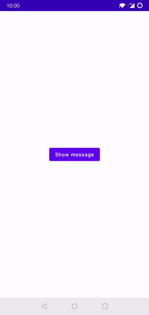
The simplest configuration of an InfoBar is showcased below:
var message: InfoBarMessage? by remember { mutableStateOf(null) }

// Assign the message on an event callback (button click, download complete, message received, etc.):
// message = InfoBarMessage(text = "Example message")

InfoBar(offeredMessage = message) {
    // ⚠️ Important step: We are nulling out the message in the trailing lambda (onDismiss function)
    message = null
}
A complete working example:
setContent {
    YourAppTheme {
        Box(Modifier.fillMaxSize().padding(16.dp)) {
            var message: InfoBarMessage? by remember { mutableStateOf(null) }
            Button(
                modifier = Modifier.align(Alignment.Center),
                onClick = { message = InfoBarMessage(text = "Example message") }
            ) {
                Text("Show message")
            }
            InfoBar(offeredMessage = message) {
                message = null
            }
        }
    }
}
InfoBar types
The InfoBar composable has 2 signatures:
- One for a standard version, which already has a layout defined, inspired by the Material design
Snackbar. This composable has multiple parameters exposed, allowing for increased customizability of the predefined standard layout. - One for a generic version, allowing to pass a composable layout defined in the client app.
Configuration parameters
InfoBar composable:
| S | G |
|---|---|
Available in the Standard InfoBar |
Available in the Generic InfoBar |
| Parameter | Description | Type | S | G |
|---|---|---|---|---|
modifier |
Modifier to be applied to the InfoBar surface |
Modifier |
|
|
offeredMessage |
InfoBarMessage or BaseInfoBarMessage subclass instance, describing the message that should be displayed |
InfoBarMessage? |
|
|
elevation |
Elevation to be applied to the InfoBar surface |
Dp |
|
|
shape |
Shape to be applied to the InfoBar surface |
Shape |
|
|
backgroundColor |
Background color to be applied to the InfoBar surface |
Color? |
|
|
content |
The content composable to use in the InfoBar surface |
@Composable (T) -> Unit |
|
|
textVerticalPadding |
Vertical padding for the message text | Dp |
|
|
textColor |
Color for the message text | Color? |
|
|
textFontSize |
Font size for the message text | TextUnit |
|
|
textFontStyle |
Font style for the message text | FontStyle? |
|
|
textFontWeight |
Font weight for the message text | FontWeight? |
|
|
textFontFamily |
Font family for the message text | FontFamily? |
|
|
textLetterSpacing |
Letter spacing for the message text | TextUnit |
|
|
textDecoration |
Decoration for the message text | TextDecoration? |
|
|
textAlign |
Alignment for the message text | TextAlign? |
|
|
textLineHeight |
Line height for the message text | TextUnit |
|
|
textMaxLines |
Maximum number of lines for the message text | Int |
|
|
textStyle |
Style for the message text | TextStyle |
|
|
actionColor |
Color for the action button text | Color? |
|
|
fadeEffect |
Use fading effect when the message appears and disappears? (controls the alpha property) |
Boolean |
|
|
fadeEffectEasing |
Easing style of the fade effect | InfoBarEasing |
|
|
scaleEffect |
Use scaling effect when the message appears and disappears? (controls the scaleX / scaleY properties) |
Boolean |
|
|
scaleEffectEasing |
Easing style of the scale effect | InfoBarEasing |
|
|
slideEffect |
Which sliding effect to use when the message appears and disappears? (controls the translationY property) |
InfoBarSlideEffect |
|
|
slideEffectEasing |
Easing style of the slide effect | InfoBarEasing |
|
|
enterTransitionMillis |
Enter animation duration in milliseconds | Int |
|
|
exitTransitionMillis |
Exit animation duration in milliseconds | Int |
|
|
wrapInsideExpandedBox |
Maintain the shadow of the InfoBar even when animating the alpha property, by wrapping the InfoBar content inside a Box layout that fills the maximum available space. The alpha property is then animated on the outer Box instead of the InfoBar surface, thus not clipping the shadow when alpha is less than 1f. Note: Any modifier you pass from the outside is applied to the InfoBar surface, not the outer Box layout! |
Boolean |
|
|
onDismiss |
Function which is called when the InfoBar is either timed out or dismissed by the user. Don't forget to always null out the InfoBarMessage / BaseInfoBarMessage subclass instance here! (see usage example from above) |
() -> Unit |
|
|
InfoBarMessage class:
| Parameter | Description | Type |
|---|---|---|
text |
Message as string | String? |
textStringResId |
Message as string resource id | Int? |
textStringResArgs |
Arguments for textStringResId |
Array
|
textColor |
Color for the message text (overrides textColor set in the InfoBar composable) |
Color? |
action |
Action as string | String? |
actionStringResId |
Action as string resource id | Int? |
actionStringResArgs |
Arguments for actionStringResId |
Array
|
actionColor |
Color for the action button text (overrides actionColor set in the InfoBar composable) |
Color? |
backgroundColor |
Background color to be applied to the InfoBar surface (overrides backgroundColor set in the InfoBar composable) |
Color? |
displayTimeSeconds |
The number of seconds to display the message (excluding animation time). Pass -1 if you don't want the message to time out. |
Int? |
onAction |
Function which is called when the user presses the action button | (() -> Unit)? |
Using the generic composable
If the standard InfoBar signature does not entirely meet your requirements in terms of layout, you can use the generic InfoBar signature, which allows you to pass a custom layout composable:
-
Extend the
BaseInfoBarMessageabstract class and define your custom message data structure:class CustomMessage( val textString: String, val icon: ImageVector, val iconColor: Color, val textColor: Color = Color.Unspecified, override val backgroundColor: Color? = null, override val displayTimeSeconds: Int? = 4, ) : BaseInfoBarMessage() { override val containsControls: Boolean = false }
-
Declare the
contentcomposable that defines your layout:val content: @Composable (CustomMessage) -> Unit = { message -> Row { Icon( modifier = Modifier.padding(8.dp).align(Alignment.CenterVertically), imageVector = message.icon, contentDescription = null, tint = message.iconColor ) Text( modifier = Modifier.align(Alignment.CenterVertically), text = message.textString, color = message.textColor ) } }
-
Display the message:
setContent {
    YourAppTheme {
        Box(Modifier.fillMaxSize().padding(16.dp)) {
            var message: CustomMessage? by remember { mutableStateOf(null) }
            Button(
                modifier = Modifier.align(Alignment.Center),
                onClick = {
                    message = CustomMessage(
                        textString = "This is a custom message",
                        textColor = Color(0xFF414141),
                        icon = Icons.Rounded.Info,
                        iconColor = Color(0xFF27C54D),
                        backgroundColor = Color(0xFFE3F1E6)
                    )
                }
            ) {
                Text("Show message")
            }
            InfoBar(offeredMessage = message, content = content) {
                message = null
            }
        }
    }
}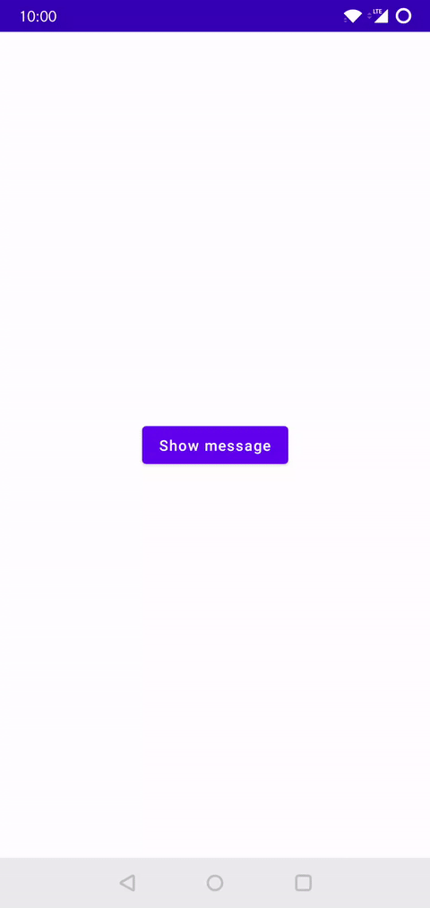
Sample App
More complex usage examples are available in the sample app. Download from Google Play.
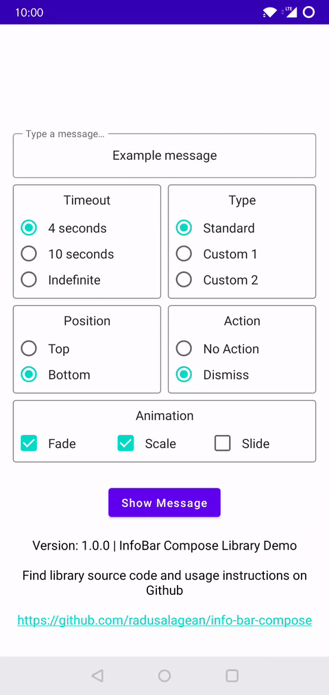
Photo credits: The sample app contains 2 photos, used under Pexels license. The authors of these photos are Kittichai Chumanee and Karolina Grabowska.
Contributions
Found a bug or have a suggestion? Please open an issue.
Support
If you use this library and enjoy it, please support it by starring it on GitHub.
Further reading
There is an article available that showcases this library in a bit more detail.
License
Apache License 2.0, see the LICENSE file for details.

 13 Aug 14, 2022

 382 Jan 5, 2023
 38 Sep 25, 2022

 186 Jan 1, 2023

 3 Dec 31, 2022

 1 Aug 11, 2022

 180 Jan 2, 2023
 5 Apr 5, 2022
 3 Dec 15, 2022

 4 Jul 27, 2022
 4 Dec 15, 2022
 1 Mar 8, 2022
 10 Mar 6, 2022
 19 Dec 5, 2022
 1 Feb 25, 2022
 3 Sep 2, 2022
 0 Jan 15, 2022
 2 Feb 19, 2022