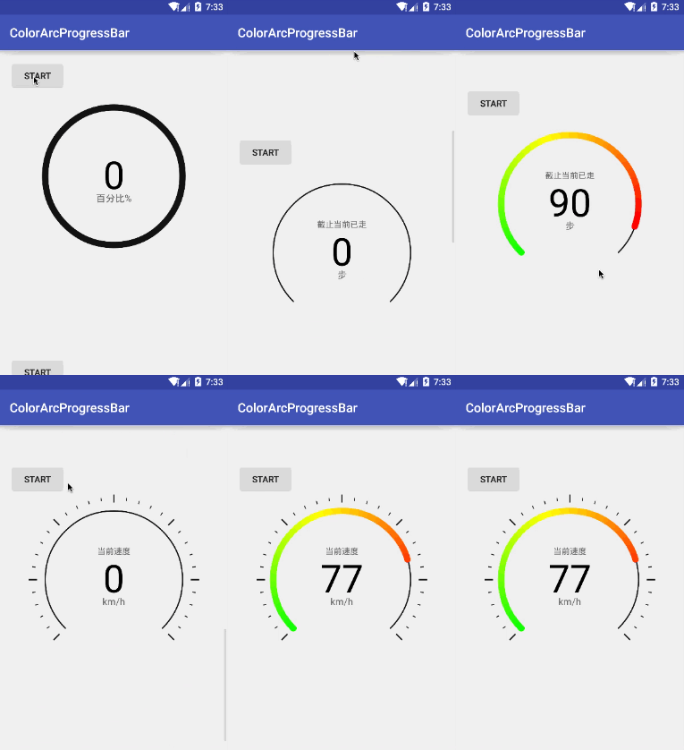
CircularProgressBar for Jetpack Compose
An android library to easily add circular progress bar into your Jetpack Compose apps.
Have a Look
Usage
CircularProgressBar(
    modifier = Modifier.size(120.dp),
    progress = 30f,
    progressMax = 100f,
    progressBarColor = Color.Blue,
    progressBarWidth = 20.dp,
    backgroundProgressBarColor = Color.Gray,
    backgroundProgressBarWidth = 10.dp,
    roundBorder = true,
    startAngle = 90f
)
For animations, you can use any animation API provided by Compose depending on your animation scenario.
val progress by animateFloatAsState(/* progress value */)

CircularProgressBar(
    modifier = Modifier.size(120.dp),
    progress = progress,
    progressMax = 100f,
    progressBarColor = Color.Blue,
    progressBarWidth = 20.dp,
    backgroundProgressBarColor = Color.Gray,
    backgroundProgressBarWidth = 10.dp,
    roundBorder = true,
    startAngle = 90f
)
Supported Properties
| Property | Type | Default |
|---|---|---|
progress |
Float | 0f |
progressMax |
Float | 100f |
progressBarColor |
Color | Color.Black |
progressBarWidth |
Dp | 7.dp |
backgroundProgressBarColor |
Color | Color.Gray |
backgroundProgressBarWidth |
Dp | 3.dp |
roundBorder |
Boolean | false |
startAngle |
Float | 0f |
Download
Add JitPack repository to your root build.gradle file
allprojects {
    repositories {
        maven { url 'https://jitpack.io' }
    }
}
Add the dependency to your app build.gradle file
dependencies {
    implementation 'com.github.hitanshu-dhawan:CircularProgressBar-Compose:1.0.0-rc01'
}
Licence
Copyright (c) 2021 Hitanshu Dhawan

Licensed under the Apache License, Version 2.0 (the "License");
you may not use this file except in compliance with the License.
You may obtain a copy of the License at

http://www.apache.org/licenses/LICENSE-2.0

Unless required by applicable law or agreed to in writing, software
distributed under the License is distributed on an "AS IS" BASIS,
WITHOUT WARRANTIES OR CONDITIONS OF ANY KIND, either express or implied.
See the License for the specific language governing permissions and
limitations under the License.


