SlidingUpMenu
A library that allows you to present menu items (from menu resource and/or other sources) to users as a bottom sheet.


Gradle Dependency
Add the dependency to your app's build.gradle:
implementation 'com.r4sh33d:SlidingUpMenu:0.0.2'
Usage
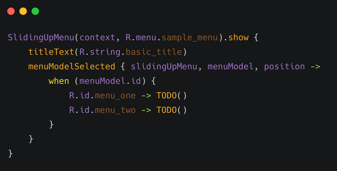
It is very easy to get started with SlidingUpMenu. Just specify a Context and a menu resource file:
SlidingUpMenu(context, R.menu.sample_menu).show()
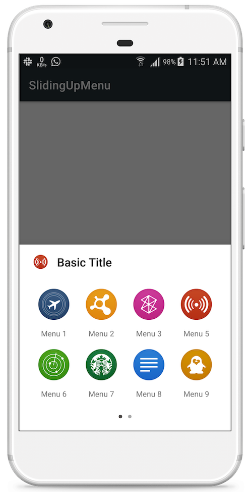
Title
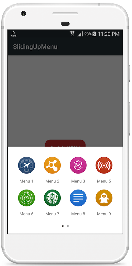
You can specify the title for the menu dialog by supplying a String id to the titleText method.
SlidingUpMenu(context, R.menu.sample_menu).show {
   titleText(R.string.basic_title)
}
You can also specify a String for the title:
titleText(titleText = "Basic Title")
Menu Items
You specify the menu items by supplying a Menu resource id and/or list of MenuModel items. If both menu resource id and list of MenuModel is specified, SlidingUpMenu will merge the sources together and present the menu items to users at once:
SlidingUpMenu(context, R.menu.sample_menu).show() // Menu resource id only
//or
SlidingUpMenu(context, menuModelItems = menuItems).show() // List of MenuModel only
//or
SlidingUpMenu(context, R.menu.sample_menu, menuItems).show() // Menu resource + List of MenuModel
Callback
To receive item selected events, You specify a MenuModelSelectedListener to the menuModelSelected method. The menuModelSelected method takes in a lambda that will be called with the selected MenuModel, the position of the MenuModel and the SlidingUpMenu instance.
SlidingUpMenu(context, R.menu.sample_menu).show {
   titleText(R.string.basic_title)
   menuModelSelected { slidingUpMenu, menuModel, position ->
       //
   }
}
You can identify the selected menu item by querying the menuModel.id or using position. For menu resource files inflated from xml, the id is the android:id specified in the menu item tag:
SlidingUpMenu(context, R.menu.sample_menu).show {
   titleText(titleText = "Basic Title")
   menuModelSelected { slidingUpMenu, menuModel, position ->
   when (menuModel.id) {
       R.id.menu_one -> TODO()
       R.id.menu_two -> TODO()
       R.id.menu_three -> TODO()
       //...
       }
   }
}
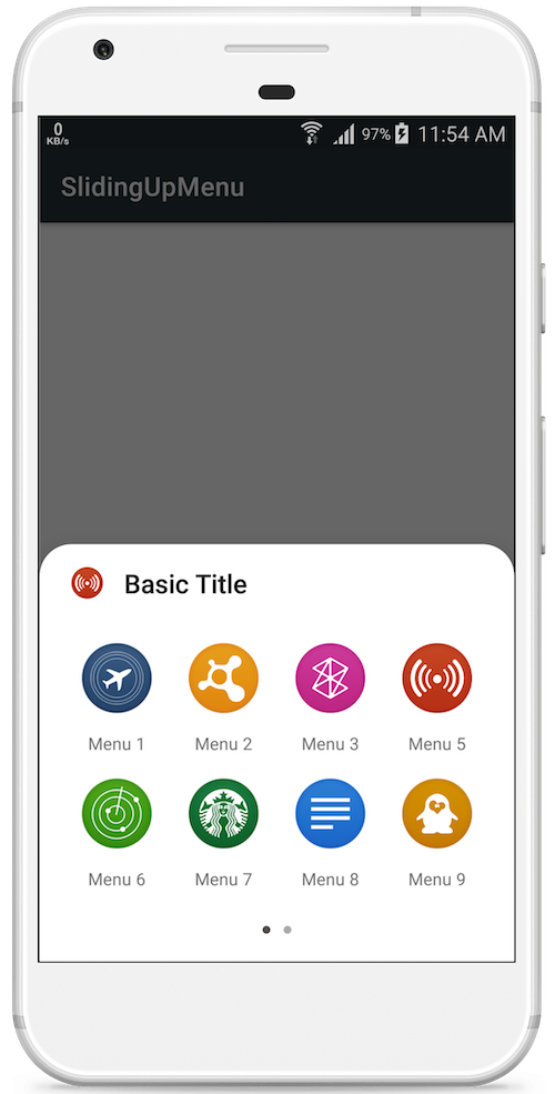
Showing and Dismissing Menu
Showing Menu
You can create and immediately show the dialog, as seen the sample code snippets above. Just call the show() method variant that takes in a configuration block. You can add configurations in the block. SlidingUpMenu will apply the configuration and show the dialog immediately:
SlidingUpMenu(context, R.menu.sample_menu).show {
   // Configuration block
   titleText(R.string.basic_title)
   icon(R.drawable.icon)
   menuType(GRID)
   // ...
}
Alternatively, you can create and configure the SlidingUpMenu instance, and show at a later time:
val slidingUpMenu = SlidingUpMenu(context, R.menu.sample_menu)
// perform some operations
slidingUpMenu.titleText(R.string.basic_title)
   .icon(R.drawable.icon)
   .menuType(GRID)
   //...
// Then after some time.
slidingUpMenu.show()
Dismissing Menu
By default, SlidingMenu will automatically be dismissed anytime a menu item is selected. You can control this behaviour:
SlidingUpMenu(context, R.menu.sample_menu).show {
   dismissOnMenuItemSelected(false)
}
If you disable auto-dismiss, you need to manually dismiss the menu dialog.
slidingUpMenu.dismiss()
Like other Dialogs you can also configure the behaviour when users' touch outside the dialog content:
slidingUpMenu.setCanceledOnTouchOutside(true)
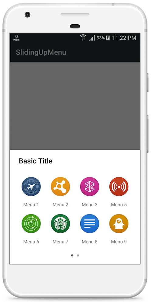
Menu Type
You can pass a MenuType to the menuType method to specify if you want the menu items to be arranged in a list or grid manner.
GRID
SlidingUpMenu(context, R.menu.sample_menu).show {
   menuType(MenuType.GRID)
}
LIST
SlidingUpMenu(context, R.menu.sample_menu).show {
   menuType(MenuType.LIST)
}
Scroll Direction
To control the scrolling direction for the menu items, You specify a ScrollDirection to the scrollDirection method:
SlidingUpMenu(context, R.menu.sample_menu).show {
   scrollDirection(ScrollDirection.HORIZONTAL)
   //or
   scrollDirection(ScrollDirection.VERTICAL)
}
Icon
To set an icon for the menu dialog, use the icon method to supply a Drawable or a drawable resource id. The icon will be displayed at the top left corner of the menu dialog.
SlidingUpMenu(context, R.menu.sample_menu).show {
    icon(R.drawable.icon)
    // or
    val drawable = {...}
    icon(drawable)
}
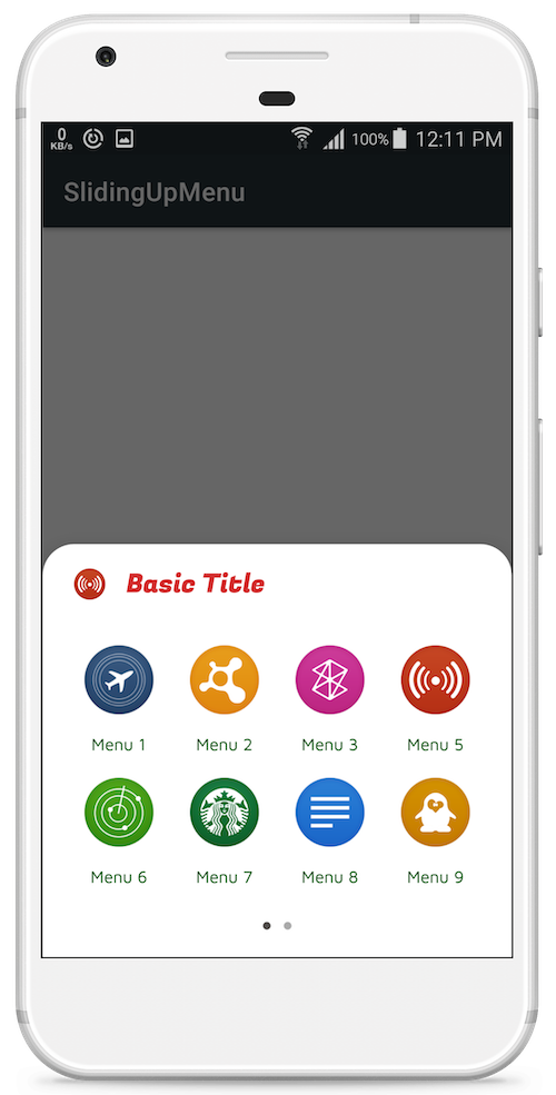
Theming
Corner Radius
You can get rounded edges by specifying a corner radius to the menu dialog:
SlidingUpMenu(context, R.menu.sample_menu).show {
   cornerRadius(16f) // 16dp
   // or
   cornerRadius(R.dimen.cornerRadius) // from dimens resource
}
You can also specify the corner radius as an attribute in your theme style definition.
<style name="AppThemeLight" parent="Theme.MaterialComponents.Light.DarkActionBar">
   ...
   <item name="sm_corner_radius">24dp</item>
   ...
</style>
Corner Radius
Text Color and Font
You can specify colors and fonts for dialog title and body with theme attributes:
<style name="AppThemeLight" parent="Theme.MaterialComponents.Light.DarkActionBar">
   ...
   <item name="sm_title_text_font">@font/fugaz_one</item>
   <item name="sm_title_text_color">@color/colorAccent</item>
   <item name="sm_body_text_font">@font/maven_pro</item>
   <item name="sm_body_text_color">@android:color/holo_orange_light</item>
   ...
</style>
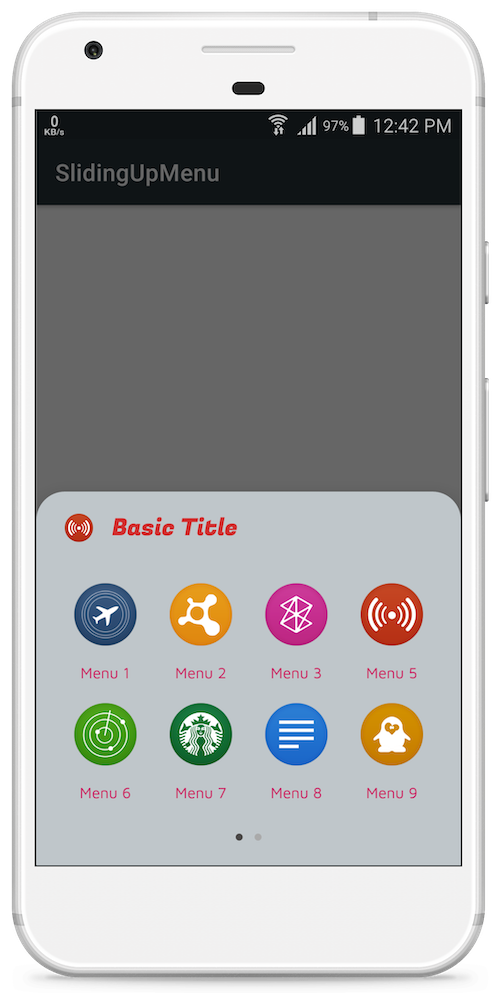
Background color
You can set background color for menu dialog:
<style name="AppThemeLight" parent="Theme.MaterialComponents.Light.DarkActionBar">
   ...
   <item name="sm_background_color">@color/menuBackground</item>
   ...
</style>
Ripple color
You can set the color for to use as background when menu items are selected:
<style name="AppThemeLight" parent="Theme.MaterialComponents.Light.DarkActionBar">
   ...
   <item name="sm_ripple_color">@color/rippleColor</item>
   ...
</style>
SlidingUpMenu uses Dialog under the hood, so most standard Dialog operations should also be available. You can also check out MaterialDialogs for more customizable set of Dialogs. The icons used in the screenshots are from here.
License
Copyright (c) 2019 Rasheed Sulayman.

Licensed under the Apache License, Version 2.0 (the "License");
you may not use this file except in compliance with the License.
You may obtain a copy of the License at

   http://www.apache.org/licenses/LICENSE-2.0

Unless required by applicable law or agreed to in writing, software
distributed under the License is distributed on an "AS IS" BASIS,
WITHOUT WARRANTIES OR CONDITIONS OF ANY KIND, either express or implied.
See the License for the specific language governing permissions and
limitations under the License.

 192 Jan 4, 2023

 5 Nov 8, 2022
 242 Nov 10, 2022
 385 Dec 31, 2022

 73 Dec 10, 2022
 10 Nov 15, 2021
 3.8k Dec 28, 2022
 142 Dec 24, 2022

 2k Dec 23, 2022

 19 Nov 1, 2022
 12 Sep 21, 2022
 23 Oct 19, 2022
 1.4k Dec 18, 2022
 181 Nov 29, 2022
 2.6k Dec 8, 2022
 296 Nov 10, 2022
 11.1k Dec 21, 2022
 1.6k Dec 13, 2022
 441 Nov 25, 2022