65 Repositories
Android pager-indicator Libraries

Add Expandable Horizontal Pager in Android Jetpack Compose.
ExpandableHorizontalPagerCompose Add Expandable Horizontal Pager in Android Jetpack Compose. How it looks Usage BoxWithConstraints( modifier = Mod
🚀📱💖Animated LazyColumn/Row changes scale/color with animation and have a current selected item like a Pager. An elegant alternative for selecting from a list
Compose AnimatedList Animated infinite and finite LazyRow and LazyColumn with scale and color animations on scroll change based on how far they are to
🚀📒📍 Indicators for Horizontal or Vertical Pager with different orientation, color, size options and optional touch feature.
Compose Pager Indicator Indicators for Horizontal or Vertical pager with different orientation, color, size options and optional touch feature. indica
Onboarding sample project with view pager & shared preferences
Onboarding Sample Project When the application is first downloaded, we go to onboarding from the splash screen. We keep the information that onboardin
Slider-Gallery-Zoom: image slider for android supporting indicator and auto scroll with clicking on image
image slider supporting indicator and auto scroll with clicking on image to open full screen image slider swipe and pinch zoom gestures like gallery,just pass your images and the position of the current image.

An app showing how to make an Instagram/YouTube Shorts/TikTok style video pager
It's pretty straightforward to get started using ExoPlayer by following the library's Hello world! documentation. Once you throw Android's lifecycles
JCSectionedProgressIndicator - A Sectioned Progress Indicator built in Jetpack Compose. Easily specify number of sections with corresponding section colors
JCSectionedProgressIndicator A Sectioned Progress Indicator built in Jetpack Com
WaxedNotWaxed - Adds a simple indicator to know if a copper block is waxed or not
Waxed Not Waxed Adds a simple indicator to know if a copper block is waxed or no

IndicatorView Library For Android
IndicatorView A simple library to add indicators for your Carousel or ViewPagers. Download Step 1. Add the JitPack repository to your build file Gradl

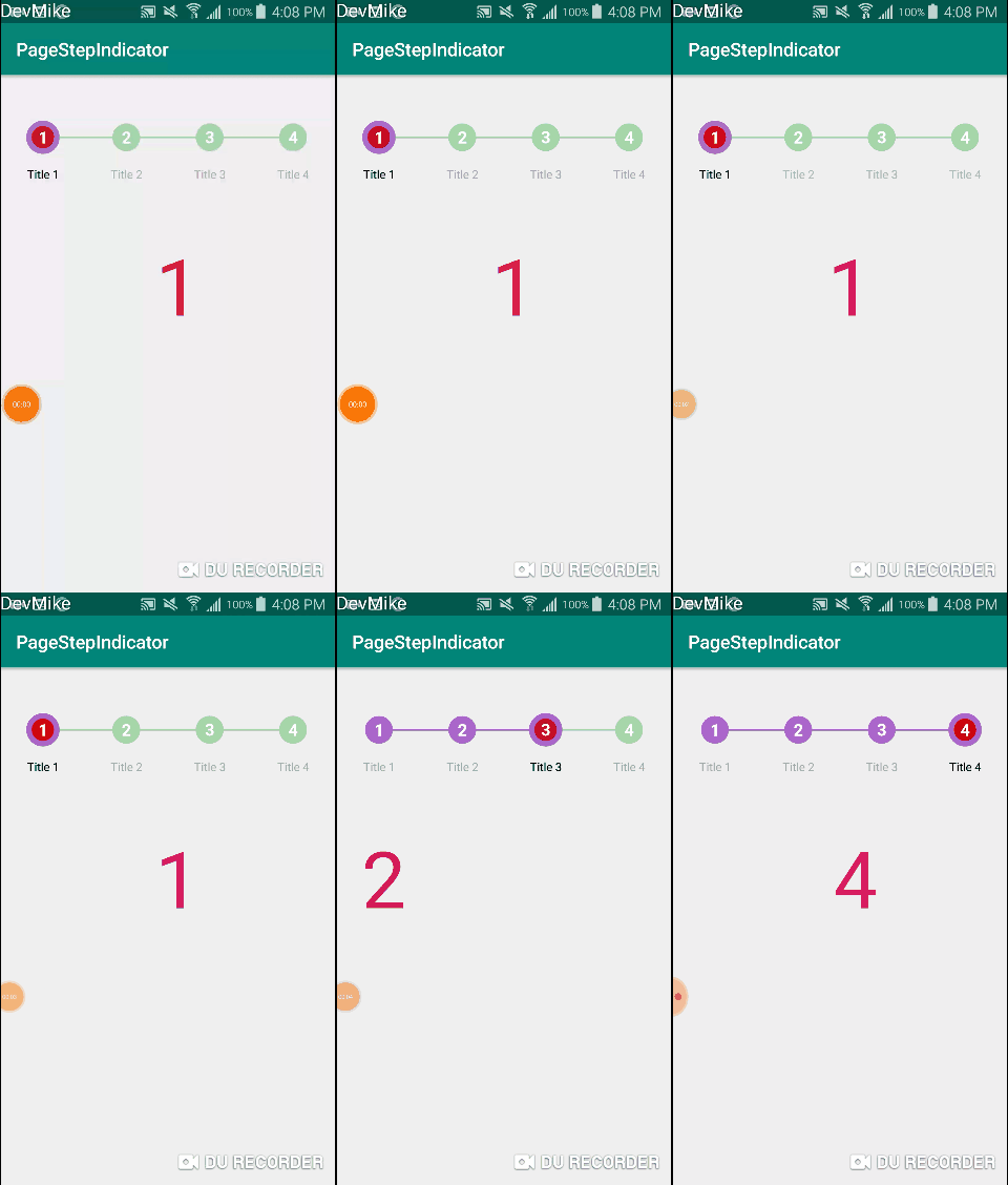
Step indicator with titles/labels and tons of customizations.
PageStepIndicator was built from existing StepIndicator library developed by Layerlre . I needed a page indicator that can display title and at the sa
Android App of Pager
Pager Pager allows you to communicate with people without any infrastructure based services like cellular network or Wifi. We make this possible by tr

Ranger is custom view which able to act like android seekbar.
Ranger is custom view which able to act like android seekbar.

Pulseq is a service for monitoring activity from all your devices.
Pulseq is inspired by technically-functional/heartbeat, which is licensed under the ISC license. The main idea of pulseq is to provide statistics on y

Scrollbar Indicator usign compose
Carousel Carousel is a scroll indicator for ScrollableState composes. Carousel can be vertial or horizontal indicator based on the size provided using

Indicator like tachometer View Library for Android
Tachometer Android Indicator like tachometer View Library for Android GIF Sample Preview Setup Step 1. Add Jitpack repository to your project build.gr

帮助您迅速构建顶部Tab,比如今日头条效果,热搜、搜索记录、与ViewPager/ViewPager2搭配的工具类;
FlowHelper FlowHelper 可以帮助您迅速构建Tab,比如热搜、搜索记录、与ViewPager搭配的工具类; 注意注意注意!!! 提问题的时候,请遵循以下标准 现象: 操作步骤,应用场景 对应代码: 贴图或者贴代码 机型或版本: 可选 后面对描述不清的问题,不予理会,精力有限,感谢理
Added support to modify text size and indicator width based on the original TabLayout.
XTabLayout——可修改选中项字体大小和指示器长度的TabLayout XTabLayout是基于design包中的TabLayout进行了功能的扩展,在保留原有功能的基础上,增加了修改选中项字体大小、修改指示器长度以及限制屏幕显示范围内显示的Tab个数。 集成步骤: 1.添加XTabLayo

A lightweight circular indicator view library for Android
A lightweight circular indicator view library for Android

CircularCardsStackView is an Android library for dealing with swipeable card views.
CircularCardsStackView Overview Features Android 11 support Easy setup Endless card stack Swipe horizontally with animation Fully customized Support t
Circular motion is a ViewPager library that can be used to make Awesome Onboarding designs.
CircularMotion Android Circular Motion Onboarding library Circular motion is a ViewPager library that can be used to make Awesome Onboarding designs.
A simple app showing how to make a YouTube Shorts/TikTok style video pager
It's pretty straightforward to get started using ExoPlayer by following the library's Hello world! documentation. Once you throw Android's lifecycles

This library provides easy ways to add onboarding or pager screens with different animation and indicators.
WalkThroughAndroid Make amazing OnBoarding Screens easily for your app with different colorful animations, fonts, styles, and many more. Customize you

Step by step,just use HorizontalStepView,VerticalStepView. step indicator,flow indicator,timeline,order process,express status
StepView Step by step. Step indicator. Flow indicator。 snapshot like this:HorizontalStepView like this also like this:VerticalStepView Yeah,I am not w
Wizard Pager is a library that provides an example implementation of a Wizard UI on Android
Wizard Pager is a library that provides an example implementation of a Wizard UI on Android, it's based of Roman Nurik's wizard pager.

Pager (especially for ViewPager) indicator in two styles: circle & fraction.
PagerIndicator Pager (especially for ViewPager) indicator in two styles: circle & fraction. Demo circle fraction Dependency implementation 'me.liangfe
Paging indicator widgets compatible with the ViewPager from the Android Support Library and ActionBarSherlock.
Android ViewPagerIndicator Paging indicator widgets that are compatible with the ViewPager from the Android Support Library to improve discoverability
Android AlertDialog with moving dots progress indicator
Spots progress dialog Android AlertDialog with moving spots progress indicator packed as android library. =========== Usage The library available in m
A rubber indicator
RubberIndicator A rubber indicator for ViewPager Designed by Valentyn Khenkin Here is the CSS version Usage The attributes for RubberIndicator are not

Pager (especially for ViewPager) indicator in two styles: circle & fraction.
PagerIndicator Pager (especially for ViewPager) indicator in two styles: circle & fraction. Demo circle fraction Dependency implementation 'me.liangfe
Android - A ViewPager page indicator that displays the current page number and (optionally) the page count
NumericPageIndicator A ViewPager page indicator that displays the current page number and (optionally) the page count. It can also display buttons to

A Page Indicator Lib is realized in a different way.
#FlycoPageIndicator A Page Indicator Lib is realized in a different way. Support for Android 2.2 and up. ##Demo ####Here is a DemoApk download ##Gradl
Android auto scroll viewpager or viewpager in viewpager
Android Auto Scroll ViewPager ViewPager which can auto scrolling, cycling, decelerating. ViewPager which can be slided normal in parent ViewPager. Att

Step indicator with titles/labels and tons of customizations.
PageStepIndicator was built from existing StepIndicator library developed by Layerlre . I needed a page indicator that can display title and at the sa

A simple and flexible Fillable Progress Layout written in Kotlin
FillProgressLayout 🔥 A simple and flexible Fill Progress Layout written in Kotlin 🔥 Netflix button animation using FillProgressLayout Support Librar
![:barber: [Android Library] Stacked dual progress indicator progress-bar](https://github.com/nisrulz/stackedhorizontalprogressbar/raw/develop/img/walkthrough-cropped.gif)
:barber: [Android Library] Stacked dual progress indicator progress-bar
StackedHorizontalProgressBar Specs Featured in Show some ❤️ Android library with ability to show two progress indicators in one horizontal progress ba

A 'Google Fit' like activity indicator for Android
WheelIndicatorView A 'Google Fit' like activity indicator for Android Screenshots Usage How to use: Add a "WheelIndicatorView" in the layout editor li

This lib can be used for viewpager infinite loop with indicator easily.
InfiniteIndicator This project is inspired by the android-auto-scroll-view-pager of Trinea. Use the salvage lib implement view recycle adapter.It cont
Android - An action bar item which acts both as a refresh button and as a progress indicator
RefreshActionItem An action bar item that implements this common pattern: Initially it shows a refresh button. If the button is clicked, a background

MaterialLoadingProgressBar provide a styled ProgressBar which looks like SwipeRefreshLayout's loading indicator(support-v4 v21+)
MaterialLoadingProgressBar MaterialLoadingProgressBar provide a styled ProgressBar which looks like SwipeRefreshLayout's loading indicator(support-v4
A rubber indicator
RubberIndicator A rubber indicator for ViewPager Designed by Valentyn Khenkin Here is the CSS version Usage The attributes for RubberIndicator are not
Wizard Pager is a library that provides an example implementation of a Wizard UI on Android, it's based of Roman Nurik's wizard pager (https://github.com/romannurik/android-wizardpager)
Wizard Pager Wizard Pager is a library that provides an example implementation of a Wizard UI on Android, it's based of Roman Nurik's wizard pager (ht

Android-ScrollBarPanel allows to attach a View to a scroll indicator like it's done in Path 2.0
Path 2.0 like ScrollBarPanel for Android Android-ScrollBarPanel allows to attach a View to a scroll indicator like it's done in Path 2.0. Features Sup
Implementation of the fragment with the ability to display indeterminate progress indicator when you are waiting for the initial data.
Android-ProgressFragment Implementation of the fragment with the ability to display indeterminate progress indicator when you are waiting for the init

Dots indicator that shows the current position on a View Pager. It does all the work for you with a few customisations.
Dots What is Dots? Dots is a library that helps in implementing a simple yet effective dots indicator for the View Pagers used in your android code. I

Auto Scrolling Image Pager with Pager Indicator and Text
AutoImageFlipper Auto Scrolling Image Pager with Pager Indicator and Text Note: It works only on Apps which are using AndroidX dependencies, if you're
Android AlertDialog with moving dots progress indicator
Spots progress dialog Android AlertDialog with moving spots progress indicator packed as android library. =========== Usage The library available in m

Android Floating ActionButton with a progress indicator ring
FabProgress Android Circular floating action button with intergrated progress indicator ring As per material design docs Demo: Demo apk HOW TO ADD TO

A view pager indicator view to deal with a large amount of pages.
Attention I'm not going to support this anymore. Just use a better solution, e.g. this one Indefinite-Pager-Indicator BubblePagerIndicator A view page

Android LiquidSwipe Library
LiquidSwipe Android LiquidSwipe Library Default Touch Interactive LiquidSwipe is a viewpager library that can be used to make awesome onboarding desig
A pager for Android with parallax effect
ParallaxPagerTransformer A pager transformer for Android with parallax effect Installation in your build.gradle file dependencies { // ... com

A lightweight indicator like in nexus 5 launcher
CircleIndicator A lightweight indicator like in nexus 5 launcher Gradle AndroidX dependencies { implementation 'me.relex:circleindicator:2.1.6' }

🦚 An expandable layout that shows a two-level layout with an indicator.
ExpandableLayout 🦚 An expandable layout that shows a two-level layout with an indicator. Including in your project Gradle Add below codes to your roo

PLEASE NOTE, THIS PROJECT IS NO LONGER BEING MAINTAINED AVLoadingIndicatorView Now AVLoadingIndicatorView was updated version to 2.X , If you have any
Android AlertDialog with moving dots progress indicator
Spots progress dialog Android AlertDialog with moving spots progress indicator packed as android library. =========== Usage The library available in m

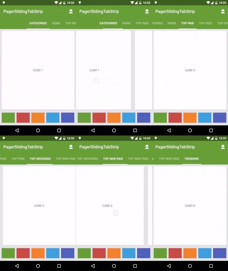
An interactive indicator to navigate between the different pages of a ViewPager
Android PagerSlidingTabStrip (default Material Design) This library is not maintained anymore and there will be no further releases. For most of the c
A rubber indicator
RubberIndicator A rubber indicator for ViewPager Designed by Valentyn Khenkin Here is the CSS version Usage The attributes for RubberIndicator are not

A spring indicator like Morning Routine guide.
SpringIndicator An indicator like Morning Routine guide.It was originally based on BezierDemo. The sample app: click me #Usage Add the dependency to y
Paging indicator widgets compatible with the ViewPager from the Android Support Library and ActionBarSherlock.
Android ViewPagerIndicator Paging indicator widgets that are compatible with the ViewPager from the Android Support Library to improve discoverability

A lightweight indicator like in nexus 5 launcher
CircleIndicator A lightweight indicator like in nexus 5 launcher Gradle AndroidX dependencies { implementation 'me.relex:circleindicator:2.1.6' }
A pager for Android with parallax effect
ParallaxPagerTransformer A pager transformer for Android with parallax effect Installation in your build.gradle file dependencies { // ... com

Three material Dots Indicators for view pagers in Android !
Material View Pager Dots Indicator This library makes it possible to represent View Pager Dots Indicator with 3 different awesome styles ! It supports
Paging indicator widgets compatible with the ViewPager from the Android Support Library and ActionBarSherlock.
Android ViewPagerIndicator Paging indicator widgets that are compatible with the ViewPager from the Android Support Library to improve discoverability
An interactive indicator to navigate between the different pages of a ViewPager
Android PagerSlidingTabStrip Interactive paging indicator widget, compatible with the ViewPager from the Android Support Library. Try out the sample a