Progress Button █▒▒▒▒▒▒▒


Need easy way to refelect all the button states?
Progress Button is a android library for hanling different types state like active, finished, enabled, disabled and reset with a single line of code.
🚀
Demo
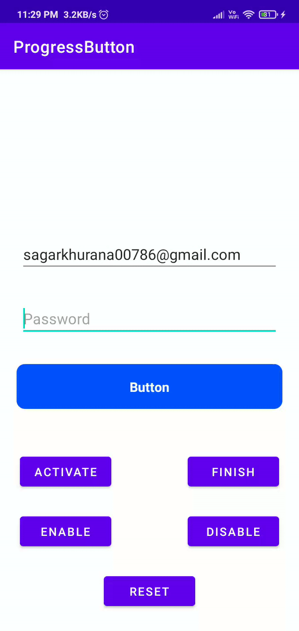
🧐
Features
- One line of code to change state
- Easy configurable
- Customizable
- Set vibration on click
- Disable views in active state
🛠️
Installation Steps
repositories {
 maven { url 'https://jitpack.io' }
}

dependencies {
 implementation 'com.github.hellosagar:ProgressButton:0.1'
}
💻
Usage
In XMl you need to define the button with your parameters to acheive the desired the design
Notes -
- To use vibration on click please add the following permission in android manifest
">
<uses-permission android:name="android.permission.VIBRATE"/>
Here is the sample code
">
<dev.sagar.progress_button.ProgressButton
        android:id="@+id/button"
        android:layout_width="0dp"
        android:layout_height="54dp"
        android:layout_marginStart="20dp"
        android:layout_marginEnd="20dp"
        app:btn_elevation="12dp"
        app:corner_radius="12dp"
        app:default_text="YOOYOOYOYOYO"
        app:disabled_color="@android:color/holo_purple"
        app:finish_text="Im done"
        app:is_vibrate="false"
        app:finished_color="@color/gray_700"
        app:layout_constraintBottom_toBottomOf="parent"
        app:layout_constraintEnd_toEndOf="parent"
        app:layout_constraintStart_toStartOf="parent"
        app:layout_constraintTop_toBottomOf="@+id/user_id_input_layout_login"
        app:pressed_color="@color/black_500"
        app:stroke_color="@android:color/holo_orange_dark"
        app:stroke_width="3dp" />
Color Parameters
| Explanation | Parameter Name | Type | Default Value |
|---|---|---|---|
| Set Default Color | default_color | color | #0052FE |
| Set Disabled Color | disabled_color | color | #537CD3 |
| Set Pressed Color | pressed_color | color | #0845D1 |
| Set Finished Color | finished_color | color | #27AE60 |
| Set Ripple Color | ripple_color | color | @android:color/transparent |
| Set Text Color | btn_text_color | color | #FFFFFF |
| Set Stroke Color | stroke_color | color | @android:color/transparent |
Text Parameters
| Explanation | Parameter Name | Type | Default Value |
|---|---|---|---|
| Set Default Text | default_color | text | Button |
| Set Finished Text | finish_text | text | Finish |
| Set Text Size | btn_text_size | dimension | 14sp |
Vibration Parameters
| Explanation | Parameter Name | Type | Default Value |
|---|---|---|---|
| Is Vibration enabled | is_vibrate | boolean | false |
| Set Vibration time in (ms) | finish_text | integer | 30 |
Misc Button Parameters
| Explanation | Parameter Name | Type | Default Value |
|---|---|---|---|
| Set Stroke Width | stroke_width | dimension | 0dp |
| Set Corner Radius | corner_radius | dimension | 10dp |
| Set Button Elevation | btn_elevation | dimension | 0dp |
Here is the code sample to understand on how to change the button state
class MainActivity : AppCompatActivity() {
    private lateinit var binding: ActivityMainBinding

    override fun onCreate(savedInstanceState: Bundle?) {
        super.onCreate(savedInstanceState)
        binding = ActivityMainBinding.inflate(layoutInflater)
        setContentView(binding.root)

        initViews()
        initClickListeners()
    }

    private fun initViews() = binding.apply {
        // Passing list of view that we want them to be disabled during the active state
        progressButton.setDisableViews(listOf(
            editTextTextPersonName,
            editTextTextPersonName2,
        ))

    }

    private fun initClickListeners() = binding.apply {

        progressButton.setOnClickListener {
            Toast.makeText(this@MainActivity, "On click!", Toast.LENGTH_SHORT).show()
        }

        btnActivate.setOnClickListener {
            // Activate state
            progressButton.activate()
        }

        btnFinish.setOnClickListener {
            // Finish state
            progressButton.finished()
        }

        btnEnable.setOnClickListener {
            // Enable state
            progressButton.enable()
        }

        btnDisable.setOnClickListener {
            // Enable state
            progressButton.disable()
        }

        btnReset.setOnClickListener {
            // Reset state
            progressButton.reset()
        }

    }

}
🍰
Contribute
Feel free to fork this project, to optimise the code or to add new features.
📝
TODO
- Lottie support
🛡️
License
This project is licensed under the MIT License - see the LICENSE file for details.
🙌
Support
This project needs a
Developed with


 6 Aug 25, 2022
 16 Jul 5, 2022
 1.2k Jan 3, 2023
 978 Nov 10, 2022
 364 Dec 20, 2022
 655 Nov 10, 2022
 124 Nov 15, 2022
 98 Nov 11, 2022
 151 Jul 26, 2022
 2.7k Dec 29, 2022
 1.3k Dec 27, 2022
 71 Dec 5, 2021
 74 Aug 26, 2022
 29 Jun 8, 2022
 286 Jan 6, 2023
 689 Oct 14, 2022
 9 Aug 17, 2022
 541 Jan 1, 2023
 2.3k Dec 31, 2022