Present your progress bars in arc mode with information and total control.

Overview

ArcProgressStackView

Present your progress bars in arc mode with information and total control.

Android Arsenal       Android       Download       License       Codacy

You can check the sample app here.

Warn

This library is not more supported. 
If you want to add new feature or fix a bug, grab source code and do it. 
If you think your fix or feature would be useful to other developers, 
I can add link of your repository to this README file. 
Thank you for using our libraries.

Download

You can download a .aar from GitHub's releases page.

Or use Gradle:

implementation 'devlight.io:arcprogressstackview:1.0.4'

Or Maven:

<dependency>
  <groupId>devlight.io</groupId>
  <artifactId>arcprogressstackview</artifactId>
  <version>1.0.4</version>
  <type>pom</type>
</dependency>

Or Ivy:

<dependency org='devlight.io' name='arcprogressstackview' rev='1.0.4'>
  <artifact name='$AID' ext='pom'></artifact>
</dependency>

Android SDK Version

ArcProgressStackView requires a minimum SDK version of 8, but if you want animation and shadow support it requires a minimum SDK version of 11.

Sample

Parameters

For APSV you can set such parameters as:

  • models:
    allows you to set APSV models, where you set title, progress and colors. Can be set up only via code.

  • animation:
    allows you to animate progress with func call or with touch event.

  • shadow:
    allows you to add shadow to your progress models, but remember, the shadow need LAYER_TYPE_SOFTWARE, so it decrease FPS.

  • round corners:
    allows you to set round corners to models.

  • drag/seek:
    allows you to make your progress model seek like.

  • typeface:
    allows you to set custom typeface.

  • text color:
    allows you to set text(title and progress indicator) color.

  • shadow distance:
    allows you to set shadow distance.

  • shadow angle:
    allows you to set shadow angle.

  • shadow radius:
    allows you to set shadow radius.

  • shadow color:
    allows you to set shadow color.

  • animation duration:
    allows you to set animation duration.

  • animation listener:
    allows you to set animation listener.

  • interpolator:
    allows you to set interpolator to animation.

  • draw width:
    allows you to set draw width in fraction mode(e.g. 55%) or dimension mode.

  • model offset:
    allows you to set model offset(positive or negative).

  • model background:
    allows you to set model background track from start angle to sweep angle.

  • start angle:
    allows you to set start angle of models.

  • sweep angle:
    allows you to set sweep angle of models.

  • progress indicator orientation:
    allows you to set progress indicator orientation.

  • preview colors:
    allows you to set preview colors, which generate count of models equals to count of colors.

  • preview background:
    allows you to set models background preview color.

Tips

All angle variables can only be positive and be in range from 0 to 360 degrees.
The size of View automatically set up in square mode.

Init

Check out in code init:

final ArrayList<ArcProgressStackView.Model> models = new ArrayList<>();
models.add(new ArcProgressStackView.Model("Circle", 25, bgColors[0], mStartColors[0]));
models.add(new ArcProgressStackView.Model("Progress", 50, bgColors[1], mStartColors[1]));
models.add(new ArcProgressStackView.Model("Stack", 75, bgColors[2], mStartColors[2]));
models.add(new ArcProgressStackView.Model("View", 100, bgColors[3], mStartColors[3]));

final ArcProgressStackView arcProgressStackView = (ArcProgressStackView) findViewById(R.id.apsv);
arcProgressStackView.setModels(models);

Other methods check out in sample.

And XML init:

<devlight.io.library.ArcProgressStackView
    android:layout_width="match_parent"
    android:layout_height="match_parent"
    app:apsv_rounded="true"
    app:apsv_shadowed="true"
    app:apsv_animated="true"
    app:apsv_dragged="true"
    app:apsv_leveled="true"
    app:apsv_typeface="fonts/agency.ttf"
    app:apsv_text_color="#fff"
    app:apsv_shadow_distance="5dp"
    app:apsv_shadow_angle="90"
    app:apsv_shadow_radius="10dp"
    app:apsv_shadow_color="#000"
    app:apsv_animation_duration="1000"
    app:apsv_interpolator="@android:anim/bounce_interpolator"
    app:apsv_draw_width="75%"
    app:apsv_model_offset="5dp"
    app:apsv_model_bg_enabled="true"
    app:apsv_start_angle="270"
    app:apsv_sweep_angle="360"
    app:apsv_indicator_orientation="vertical"
    app:apsv_preview_colors="@array/default_preview"
    app:apsv_preview_bg="#ccc"/>

Getting Help

To report a specific problem or feature request, open a new issue on Github.

Credits

Ron Evgeniy Virgil Pana Gleb Kuznetsov

Author

Created by Basil Miller - @gigamole

You might also like...
Android fillable progress view working with SVG paths. This is a nice option too if you want to create an interesting branding logo for your app. Based on the iOS project: https://github.com/poolqf/FillableLoaders

Android FillableLoaders Android Open Source library providing an interesting fillable progress view working with SVG paths. This is a nice option too

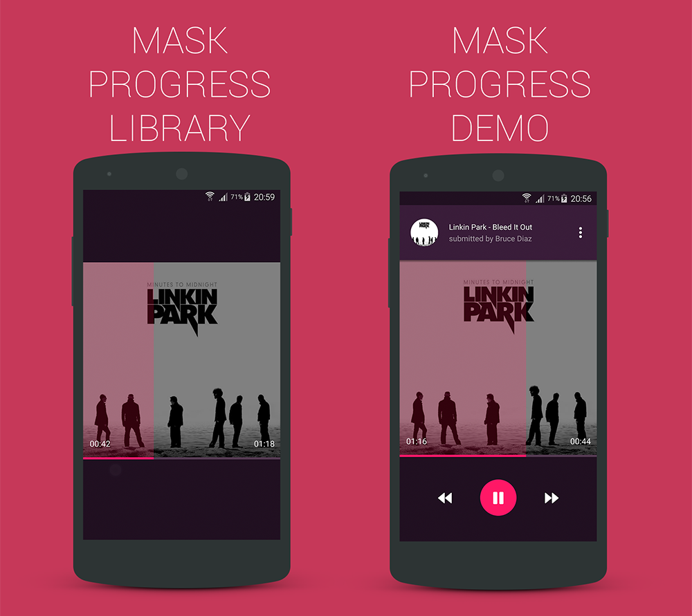
Yet another android custom progress view for your music player

MaskProgressView Yet another android custom progress view for your music player Demo Youtube Video Link Usage co.mobiwise.library.MaskProgressView

An android library to easily add circular progress bar into your Jetpack Compose apps.

CircularProgressBar for Jetpack Compose An android library to easily add circular progress bar into your Jetpack Compose apps. Have a Look Usage Circu

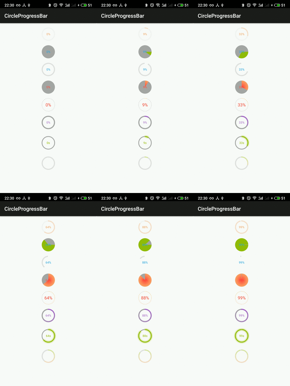
A circular android ProgressBar library which extends View,  and the usage same as ProgressBar,  It has solid,line and solid_line three styles. Besides, progress value can be freely customized.
A circular android ProgressBar library which extends View, and the usage same as ProgressBar, It has solid,line and solid_line three styles. Besides, progress value can be freely customized.

CircleProgressBar 中文版文档 The CircleProgressBar extends View, It has both solid and line two styles. Besides, progress value can be freely customized. I

A customizable, animated progress bar that features rounded corners. This Android library is designed to look great and be simple to use 🎉

RoundedProgressBar Easy, Beautiful, Customizeable The RoundedProgressBar library gives you a wide range of customizable options for making progress ba

Android - An action bar item which acts both as a refresh button and as a progress indicator

RefreshActionItem An action bar item that implements this common pattern: Initially it shows a refresh button. If the button is clicked, a background

A simple and flexible Fillable Progress Layout written in Kotlin

FillProgressLayout 🔥 A simple and flexible Fill Progress Layout written in Kotlin 🔥 Netflix button animation using FillProgressLayout Support Librar

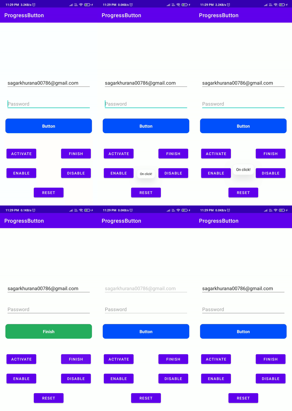
Progress Button is a android library for hanling different types state like active, finished, enabled, disabled and reset with a single line of code.

Progress Button is a android library for hanling different types state like active, finished, enabled, disabled and reset with a single line of code.

A progress bar with animation, gradient and colorful shadow.

Fancy Progressbar Android library providing a beautiful progressbar with colorful shadow, gradient and animation for Jetpack Compose. Download Add in

Owner
Basil Miller
Senior Android Developer Expert | Available ✅
Basil Miller
Present your progress bars in arc mode with information and total control.

ArcProgressStackView Present your progress bars in arc mode with information and total control. You can check the sample app here. Warn This library i

Devlight 1.3k Nov 29, 2022
This is beautiful color arc progress bar.

ColorArcProgressBar 中文版 This is a customizable circular progressbar.It can achieve the effect of the QQ health's arc progress with XML. What's more, w

PASSION 928 Dec 6, 2022
Arc pointer - simple customized progress bar in the form of an arch

ArcPointer Simple customized progress bar in the form of an arch Demo Quick start Step 1 Gradle: compile 'io.github.dvegasa:arcpointer:1.0.2' Maven:

Ed Khalturin 79 Nov 22, 2022
ArcProgressbar project let create Arc progressbar in android in simplest way.

Arc Progressbar In Android ArcProgressbar project let create Arc progressbar in android in simplest way. USAGE To make a Arc Progressbar add ArcProgre

Manish 40 Dec 11, 2022
An Android percentage chart that displays the progress of any single given task or information.

Percentage Chart View A Java-based easy to use and highly adjustable custom view that displays the progress of a single given task. Please feel free t

Rami Jemli 364 Dec 20, 2022
Android loading or progress dialog widget library, provide efficient way to implement iOS like loading dialog and progress wheel

ACProgressLite English Version / 中文版本 An Android loading widget library. Lite and easy to use, strong customizability. Can be used to implement 'iOS'

Cloudist Technology Co., Ltd. 234 Nov 24, 2022
IOSProgressBar is a progress-bar lib for android. And the progress-bar looks like iOS system style

IOSProgressBar is a progress-bar lib for android. And the progress-bar looks like iOS system style

heyangyang 6 Aug 25, 2022
A progress wheel for android, intended for use instead of the standard progress bar.

Deprecation warning This project is no-longer maintained, and has not been maintained for a few years now. If you're looking for an alternative librar

Todd Davies 2.7k Dec 29, 2022
:barber: [Android Library] Stacked dual progress indicator progress-bar

StackedHorizontalProgressBar Specs Featured in Show some ❤️ Android library with ability to show two progress indicators in one horizontal progress ba

Nishant Srivastava 98 Nov 11, 2022
Circular Slider UI Control for Android

Circular Slider What is this? Circular Slider is a custom-built Android View used for choosing numbers. It works similarly to the regular slider contr

Milos Marinkovic 309 Dec 7, 2022