SegmentedVerticalSeekBar
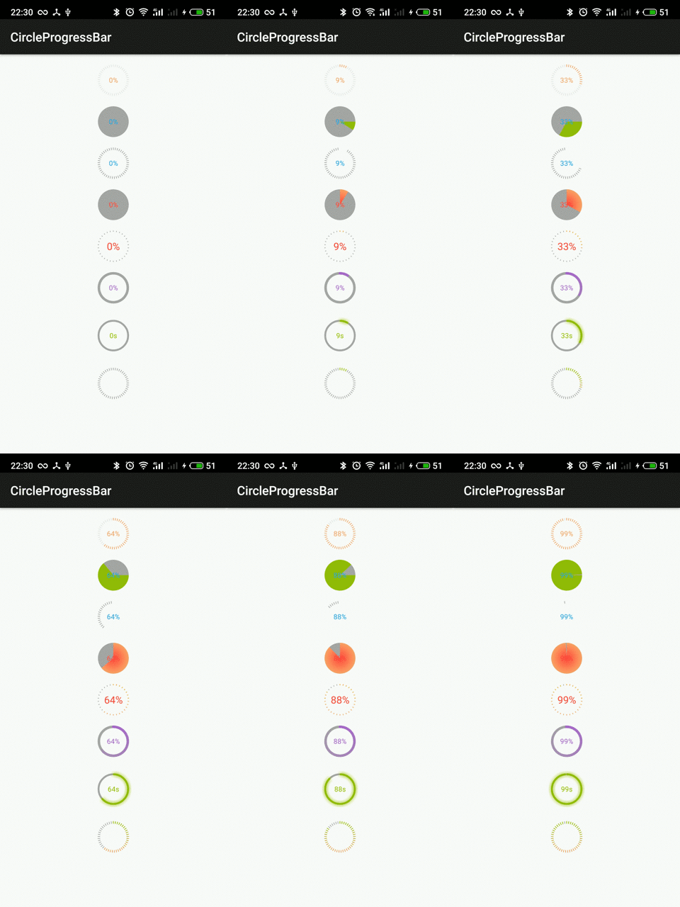
It is an Android Vertical Seekbar with segments developed in Kotlin. It offers multiple customization attributes to create a Slider/Seekbar based on your requirements.
Demo
Setup
Add the Maven Central repository to your project's root build.gradle file
allprojects {
    repositories {
        mavenCentral()
    }
}
Add the dependency in your app build.gradle file:
implementation 'io.github.smartsensesolutions:SegmentedVerticalSeekBar:1.0.1'
Usage
Sample implementation here
Use the view in your layout.xml by declaring:
	<com.ss.svs.SegmentedVerticalSeekBar
            android:id="@+id/svsLevelView"
            android:layout_width="150dp"
            android:layout_height="200dp"
            android:layout_gravity="center"
            android:layout_marginTop="100dp"
            app:backgroundColor="@color/color_background"
            app:clockwise="true"
            app:cornerRadius="10dp"
            app:currentValue="2"
            app:delimiterColor="@color/white"
            app:isAllRadius="true"
            app:layout_constraintEnd_toEndOf="parent"
            app:layout_constraintStart_toStartOf="parent"
            app:layout_constraintTop_toTopOf="parent"
            app:maxValue="5"
            app:progressColor="@color/color_progress"
            app:pyramidViewEnable="true"
            app:step="1"
            app:touchDisabled="false" />
Use setOnBoxedPointsChangeListener in your activity/fragment to get current progress of seekbar:
svsLevelView.setOnBoxedPointsChangeListener(object :
            com.ss.svs.SegmentedVerticalSeekBar.OnValuesChangeListener {
            override fun onProgressChanged(segmentedPointsSeekBar: com.ss.svs.SegmentedVerticalSeekBar?, progress: Int) {
                activityMainBinding.tvCurrentValue.text = progress.toString()
            }

            override fun onStartTrackingTouch(segmentedPointsSeekBar: com.ss.svs.SegmentedVerticalSeekBar?) {
                Log.e("MainAct","onStartTrackingTouch: "+segmentedPointsSeekBar?.value)

            }

            override fun onStopTrackingTouch(segmentedPointsSeekBar: com.ss.svs.SegmentedVerticalSeekBar?) {
                Log.e("MainAct","onStopTrackingTouch: "+segmentedPointsSeekBar?.value)
                activityMainBinding.svsLevelView.value = segmentedPointsSeekBar?.value!!
            }

        })
Attributes
Following are the various attributes available to customize the look and feel of the Seekbar.
maxValue: Maximum value of segments to be drawn for the Seekbar View.
currentValue: Current value of the Progress in Seekbar. It can be used to set the default current progress in the seekbar and using this attributes getter, the updated progress value can be captured
cornerRadius: Radius property for curving the borders of Seekbar
step: Incremental value for progress on user’s drag. For example, if set to “2” it will increase 2 steps of progress in the Seekbar.
delimiterColor: Color of the separator dividing the Seekbar into segments.
progressColor: Color of the progress in Seekbar.
backgroundColor: Color of the base view of Seekbar.
pyramidViewEnable: Boolean value if set to true will create Seekbar in the shape of the pyramid. Setting it to false will create a rectangular Seekbar which is the default case.
clockwise: Boolean applicable if pyramid view is enabled. Setting it to true will create a pyramid seekbar from top to bottom while setting it to false will create it from bottom to top.
isAllRadius: Boolean value to set the radius for all segments of the Seekbar, that is rounded views for all segments.
touchDisabled: Boolean value to allow the progress of Seekbar only using scroll motion and not the touch/press event.
enabled: Boolean to enable/disable the Seekbar view completely.
iOS Library
Check our iOS Library also SSVerticalSegmentsSlider
License
Copyright 2021 SmartSense Solutions
Licensed under the Apache License, Version 2.0 (the "License");
you may not use this file except in compliance with the License.
You may obtain a copy of the License at
   http://www.apache.org/licenses/LICENSE-2.0
Unless required by applicable law or agreed to in writing, software
distributed under the License is distributed on an "AS IS" BASIS,
WITHOUT WARRANTIES OR CONDITIONS OF ANY KIND, either express or implied.
See the License for the specific language governing permissions and limitations under the License.


